Top Website Design Trends This Year
If you have your own website, be it for personal use or for your business, website design trends will always find a way to seep into your platforms. Although trends shift and morph over the years, sometimes a touch of something more innovative could just be that one missing element form your page.
If you’re wondering how this is relevant to you since you don’t have a website, consider that it’s simply interesting to see how designers around the world are adapting new trends and proposing subtle solutions to help improve the user experience for you as a site visitor.
Websites can be complex, but somehow the design aspect of it is more clean cut and comprehensible for all – we either really like a design or we really don’t. More often than not, we pick out elements that stand out to us. Today’s article is precisely about that – all the elements that we’ve picked up so far in 2018 that are paving the road for website design trends this year.
What happened in 2017?
If we give 2017 a little overview, it was without doubt the year when all the focus was on shifting towards mobile friendly versions of websites, as mobile usage surpassed desktop browsing. Adapting designs to this format most of the hype last year and it’s safe to say this is still a very solid trend that will continue this year. Video and hero images prevailed, but 2018 is shaping up to be a year of more unconventional choices.
What to expect in 2018
Fast forward to 2018, and the focus is on storytelling and showcasing personality. Designers are looking to add a more artistic and creative touch to designs, making websites more relatable in an effort to captivate audiences. To follow or not to follow these trends is up to you, but staying on top of the latest innovations in website design is essential to eventually building or updating a website to make sure it is more relevant.
Website design trends in 2018
Animation
If there’s one prominent trend that is gaining momentum in the digital world in general, it’s animation designs. The reason why this format has become so popular is that animations can help convey complex ideas in a fraction of the time. This format is also more engaging, attention grabbing and certainly unexpected.
We can all agree that animations are quite mesmerizing. They add a more dynamic element to the pages that are static, as we’re used to them. Users get drawn into this more complex part of the overall website design.
Animations and animated logos are more fun in general and help pack visual content with meaning. Tools like Crello, for example, have taken the trend and made it accessible to those that don’t know as much about design. Crello’s animated designs allow you to customize ready-made designs for projects, making animations accessible to both designers and professionals from all fields.
Keep in mind that using animations for the sake of animations is never a good idea. It is a very new and up-and-coming trend, but it should be used with a purpose and as a means of storytelling in order to add an extra layer of meaning or a fun and interactive element to the overall design.
Custom illustrations
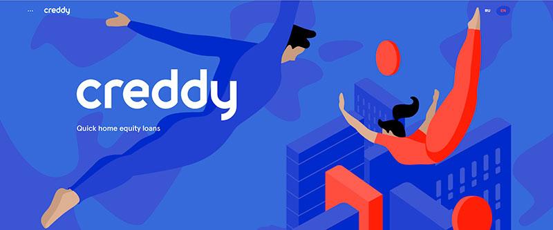
Custom illustrations are another way to show some personality on your personal or business website. Custom illustrations allow designers to get more artsy and inventive, showing something completely new, original and different.
One of the great things about custom illustrations is that they don’t get in the way of the visual hierarchy on the website. On the contrary, they are easily integrated into designs. They also make websites more memorable.
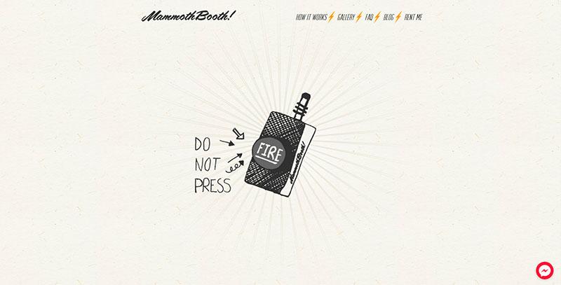
If you’re going for a more artistic look, this is a great format to work with if you want to stand out from your competitors and have an entirely different look. Custom illustrations are about the perfect marriage of personality and functionality in website design. Even little hand drawn elements could easily become the one thing that distinguishes the look of your website.
The comeback of the gradients
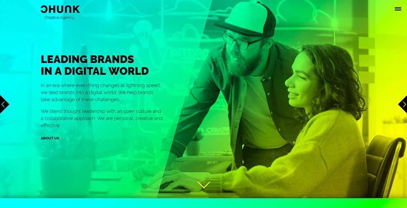
Gradients were a trend a few years back, but they’re making a major comeback in 2018. This year there are tools that are solidifying the trend, making creating gradients easier to use and adapt. Web Gradients successfully launched on Product Hunt, becoming a popular new tool with web designers.
Gradients also help viewers navigate on the web page, directing the eye in a very natural way. Gradients are perhaps also a little contradicting to the previous strict minimalism trend, but they really are a designer’s best friend at this point. If you can combine two colors in a way that showcases your brand colors, it’s just another tool you can use to be in line with your brand aesthetics.
Clean sans serif fonts vs experimental typography
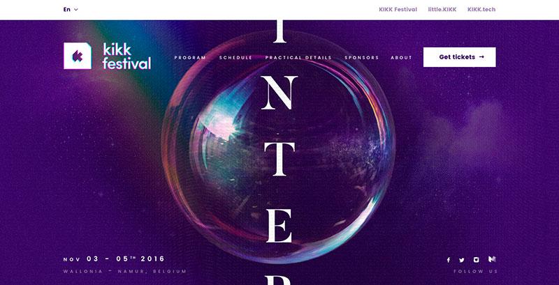
When you’re battling to captivate attention, fonts actually trump colors and visuals. This year, it’s especially true because designers are going bold with simple sans serif fonts. While sans serif fonts are quite clean and sophisticated, scaling them to a much larger size creates a very defined and obvious focal point.
More and more websites are using simple, yet bold and scaled sans serif fonts that are screaming for attention but not to the point of being distracting to the overall design. It’s an ideal font type because it captures attention without taking center stage. Pairing serif and sans serif fonts is also becoming popular as a more minimalistic approach.
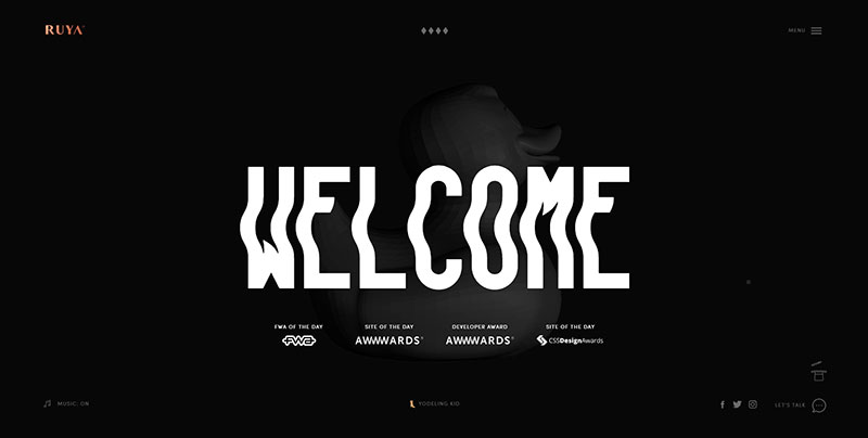
Although there is a clear shift back to basics in terms of using fonts, designers are also getting creative with typography cutouts. It’s a technique that uses a block of color, an image ior a motion design that is placed behind the lettering, making the letters take on different patterns.
It’s hard to ignore the other movement in website design which is experimental typography. Designers are investing more time to create fonts that also have personality and reflect brand aesthetics. We’re seeing brands invest into their own fonts, a trend that will surely flourish in 2018.
Asymmetry
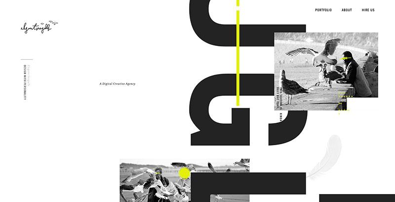
Asymmetry, when carefully curated with a professional eye, is very much about braking traditional rules of website design. An asymmetrical design adds an element of surprise that does not throw the eye off. It’s one of the more complex website design trends because as you can imagine, a lot can go wrong.
That being said, there are designers that work in their comfort zone and designers that are interested in pushing established boundaries with something a little bit more rebellious. This experimentation with layouts and grids is a more unconventional approach that makes some websites extremely appealing. An unexpected off balance is sometimes all that’s needed to surprise viewers and evoke curiosity.
Creating depth
Some designers create depth with something as simple as a back shadow. Whereas flat design was big a few years back, designers are toying with the idea of depth for a new visual experience. Adding this 3D aspect to specific elements on your website makes objects and subjects stand out, almost like you could just reach out and grab them.
With diffused drop shadows, objects appear to jump off the screen. It adds this ‘pop’ effect, giving objects the illusion that they’re separate from the webpages. It’s a great technique to add layers of depth to website designs and make objects stand out from the background.
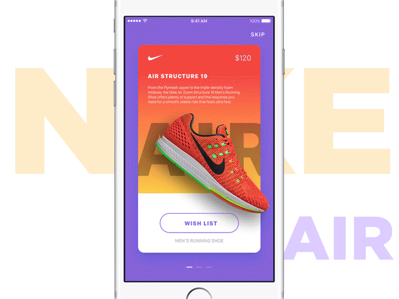
Image source: Made by Speak
Bold colors
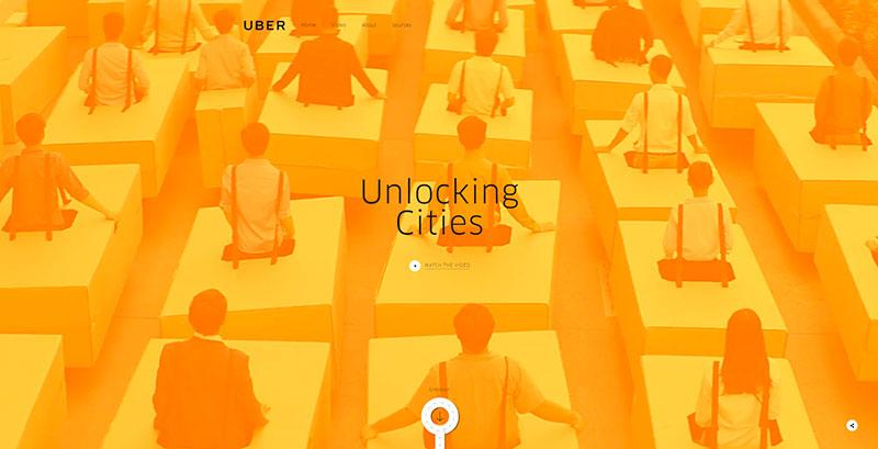
As we predicted in our visual trends report for 2018, bold colors are back! Digital platforms thrive on the choice of bolder and more attention grabbing hues. Again, it’s very much about the mission of getting a viewer’s attention and making them want to linger on the page more.
Designers continue exploring how color influences people and how it can be used to enhance the user experience. Bold colors evoke emotional responses, making pages memorable but it almost always is a risky choice.
Fluid, organic shapes
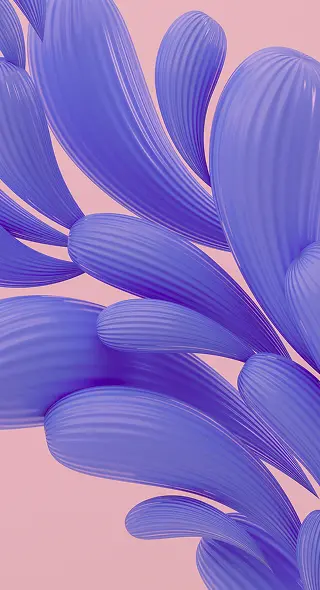
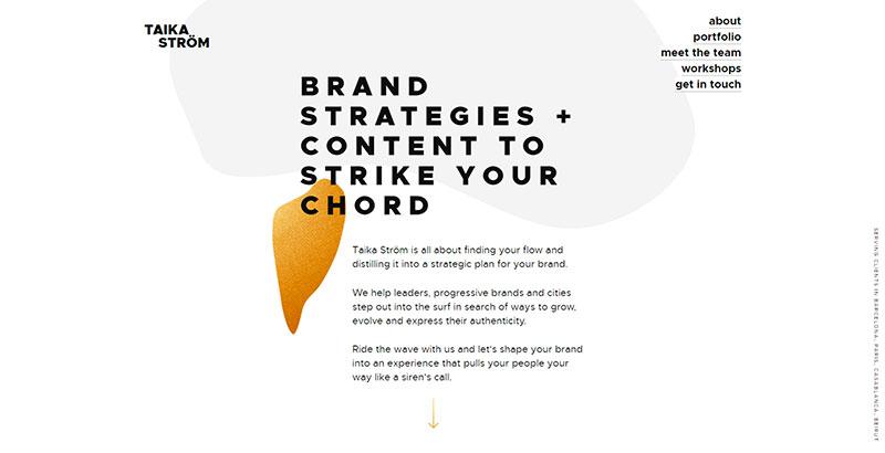
Lastly, we wanted to touch up on design elements you’ve been seeing a lot of this year. There has been a noticeable shift from very clean, symmetric and geometric website design trend to including more organic shapes that are often animated or interact with the cursor.
At the essence of it, this is just a matter of aesthetics and a designer’s personal preference. Geometric shapes will continue to be used in website design, however a combination of organic and fluid shapes is becoming more popular because there’s the possibility of animating them in a way that is more mesmerizing to the viewers.
Our short trends report doesn’t end there. Other notable website design trends worth mentioning is the integration of bots to websites, sticky elements on pages, the growing number of videos as backgrounds and of course, stock photography that seems to always have a place in website design.
These website design trends can also be applied to other projects. It’s always a good idea to stay on top of trends if you want to pleasantly surprise your users and improve the overall user experience with your trendy redesign.
Have you spotted any website design trends that we’ve missed? Let us know in the comments section below.
