Don’t Fall in the Trap of Cliche Stock Photography

Do you ever look at a photograph and immediately know it’s a stock photo? It’s in the lighting, the smiles, the composition. As you surf the internet, these pictures just stand out. Certain stock photos have become so widely used and recognizable that they carry almost no meaning.
To reverse the hands of time, we have to hand pick imagery that is unique, sophisticated and most importantly isn’t a cliche. These images should be powerful enough to ignite an emotional response or depict something relatable for your audience.
Sometimes cliche stock photography is chosen unintentionally, but here’s a great way to improve your choices even when you have time and budget limitations.
Using photos in context
The images you choose don’t have to be direct references to your main ideas and keywords. You want to find an image that will compliment your content and not be too obvious. It should set the right mood and evoke certain emotions. Remember that visuals are another opportunity to communicate a message using images and not words.
Quick tip: Instead of illustrating “family holiday meals” with a photo of a family at a table, choose a natural-looking photo of a mother with kids in the kitchen. The photo on the left has a more personal touch and resonates with viewers much more than the staged image on the right.

Consider details
Another way to customize your stock photos and make them stand out more is to crop them. A single image may have elements that are worth emphasizing on. When you download an image, it doesn’t mean that you have to use it as it is. Changing the composition of an image is a great way to add visual interest to your content and zoom in on more detailed and relevant parts of the picture. This guarantees that your image is relevant and gives you more room to experiment with.
Quick tip: You can also consider details when searching for themed photos. For example, for the topic of hiking, use an image with details instead of a standard group portrait in the woods. The cropped image is visually interesting and captures hiking in the woods just as well as a literal image of hikers.

Say ‘no’ to common cliches
Stock photo cliches are images that have been so widely used that they simply lose all meaning. They are also the images that are too cheerful, too bright and frankly too obvious. Common cliches include the business handshake, groups of people in suits, fake charts, happy employees and other individuals with exaggerated facial expressions. The general rule of thumb is to avoid these images altogether. Your aim should be to find images with natural lighting that are also closer to real life situations and emotions.
Quick tip: Check out our quick guide of creating unconventional stock photos for popular topics.

When you can’t decide
Choosing the perfect stock photos is a tough judgment call. However, there is a technique to filter images and determine their success. The one trend that will never go out of style is minimalism. Stock photos that reflect good aesthetics are uncluttered, minimal and tasteful. A simpler image will also give you more room to add any necessary text.
Alternatively, you can refer to the latest trends to help you choose the right images. Some current trends include contextual images, street style photography, perspective, and mobile photography as well as images that are authentic.
Quick tip: It also helps to find authors that work in a style that suits your projects. Check their profiles and choose from a variety of images that are similar in style.
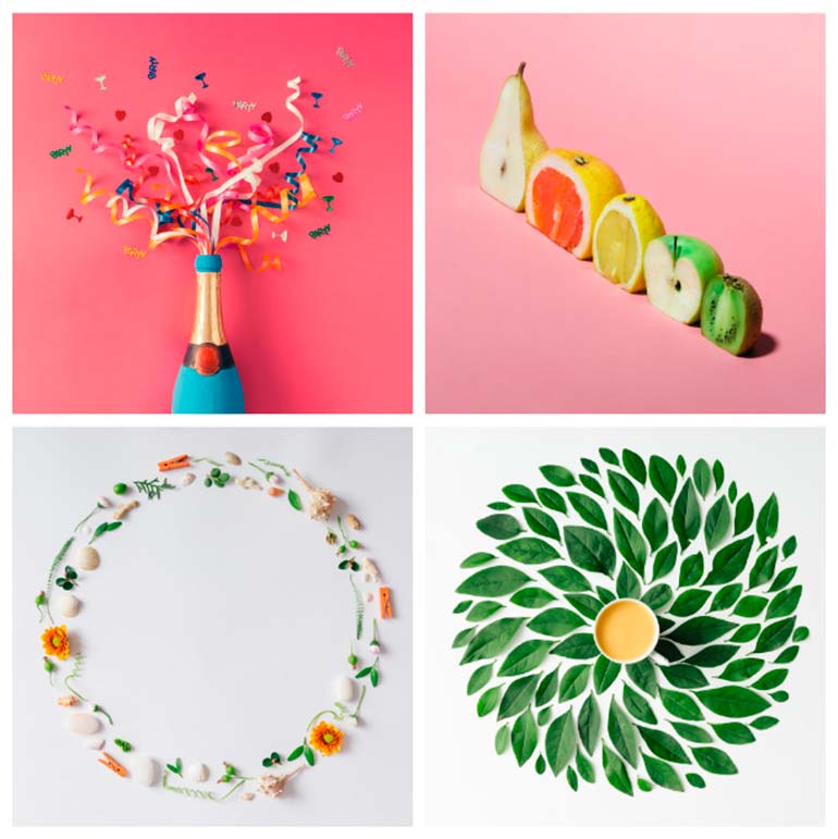
One of our contributors that works in a minimalistic style is Zamurovic. He has great collection of flat-lay shots that could be fitting for a number of occasions and projects.

Quality is key
Aside from cliche stock photography, the next worst thing is a bad quality image. It is worth your time to invest into images that are of better quality. You can use them for a variety of purposes, which is why a large format is always better. Don’t cut costs with smaller images because a high-quality photograph will only benefit you in the long-run. Be on the lookout for high-resolution images with natural lighting.
Quick tip: Natural lighting makes all the difference when it comes appealing and trendy photos.

Our mind processes images much faster than words. We flip through magazines, scroll through pages and sometimes even skip text. Keep this in mind when you’re looking for visuals for your content. If you find yourself committing some of the mentioned mistakes, go back and edit your content.
The combination of these tips will ensure that you never again fall in the trap of using cliched images. Think outside the box, be clever about your choices and definitely don’t resort to obvious and conventional photos.


