7 Mistakes to Avoid When Using Stock Photography
Vibrant, colorful and creative images are vital to the success of both a small blog and a large scale business. What unites these two examples is the fact that neither would succeed without the support of visual content. Getting your audience to linger on your site starts with the visuals you choose.
Did you know that on average, people take a few seconds to scan content before they decide to stay or leave? This means you have precious 20 seconds to convince them that you are worth their time.
In light of this, we have gathered the top 7 mistakes that you should avoid when using stock photography for your projects and campaigns.
Mistake #1 – Using irrelevant photos
It is easy to find excellent and visually appealing photographs in large databases. However, keep in mind that no matter how great the photo is, if it doesn’t enhance your content, chances are you’re making a mistake using random stock photographs.
To be successful in this respect, you should choose images that are relevant to your content and that help enhance your overall message. When a stock photograph is correctly used, it strengthens and unifies your content.
For example, for a blog post with a hypothetical title “Unbearable Lightness of a Single Life”, it would be interesting to use an image that metaphorically expresses the same thoughts implied in the title and text. It’s better than opting for blunt and standard photos that are literal representations of your ideas.
Mistake #2 – Choosing images similar to those of your competitors
Stock photography databases are available to everyone, including your competition. Before purchasing an image, you want to make sure you’re buying unique content that is in no way identical to that of your competitors.
The other common mistake is deliberately using images in the same style, aesthetics and composition as your main competitors. It is more important that you have a unique style that is also consistent in your campaigns and publications.
For example, you have a mobile app consulting business, and you look through industry leader’s promo to get the idea of how they present themselves.
The image on the left is a banner by Fiksu company. The image on the right is an example of a visual you can use, drawing inspiration from a similar illustration.

However, it will be much more interesting and beneficial to reinforce your unique brand style and think of something completely new – like this:
Mistake #3 – Compromising on quality
When presented with a choice between a low quality and a high quality image, always choose the later. Although it is not the cheaper option, a high resolution image will give you more room to experiment and at the end of the day will stand out. One of the most important things is that your images are sharp, appealing and always in high resolution.
Note the difference in colors, composition and style of the two photographs. It’s easy to spot which one would be more appealing to an audience.
Be mindful of using only professional images. A trained eye can quickly tell you whether a picture is produced by a professional or not. You have to pay attention to things like natural lighting, quality and proper composition. The little details in the photographs matter as well. Make sure the image does not feel tacky, unnatural or outdated.
Mistake #4 – Missing a creative opportunity
When you download your (high res) image, you do not have to use it as it is. Many clients seem to think that once they have the image, they can only use it in one way – by directly pasting it into their website or blog.
To make a better impression on your target audience and clients, use stock images creatively. The aforementioned point is important because in later stages of the visual content selection process, you can crop images in interesting ways to add more appeal to your page.
Note how this image is cropped to change up the composition of a seemingly plain picture. You can use this technique to tell a story, add variety and alter compositions in creative ways.
Don’t be afraid to use colors on your page. Bold, colorful images are a great way to add more visual interest and perhaps even surprise your audience. A quick way to find images is to head to our featured collections – Pantone colors and the Color Spectrum collection.
Mistake #5 – Choosing overused and cliche images
The next worse thing you can do is choose images that are so overused that they have lost all meaning. These images are boring and quite frankly won’t benefit you and your brand in any way.
To learn more about cliche stock photography, refer to this article. Keep in mind that in order to attract readers or clients, you’re going to have to diffirentiate yourself from the crowd and you simply can’t do so with overused or cliche images.
Mistake #6 – Ignoring trends and hot topics
When it comes to visuals, you want to be memorable. This means staying on top of the latest trends and knowing how to effectively apply them to your publication.
For instance, if it is the holiday season, ignoring seasonal topics and trends is a giant misstep. Using seasonal images and visuals on trendy topics will help you enhance user engagement and produce visuals that are more relatable to the masses.

Mistake #7 – Choosing the wrong stock photo license
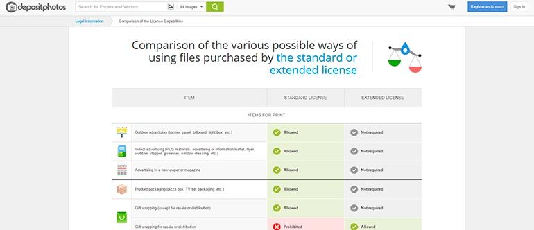
The most common and silly mistake is one that may not be so obvious. Once you download your image, you have to pay attention to your distribution rights. Our website has two options – the standard license and an extended license. Do visit our comparison of standard and extended licensing and details on the photographs you purchase.
When you’re looking for an image, try a more creative approach to keywords. Search for symbols, use adjectives before your keyword and think outside the box a little. And remember, the perfect images are just a click away.


