How to use Stock Photos on Social Media (so They Don’t Look Like Stock Photos)
So you’re ready to use more stock photos on social media, but you’re not sure how to do it without them looking like… well… stock photos! Fear not, because, in this post, I’ll share some tips and strategies for using stock photos seamlessly as part of your brand. And a few pitfalls to avoid.
It can be a challenge to produce enough quality photos for your business or brand. Not only do you have to find visual content for your blog and website, but these days it seems we have to have to churn out an endless stream of visuals to our Facebook feeds, LinkedIn articles, Twitter, the ever-perfect Instagram (of course!) and all the social things.
So, you turn to stock photos and you – like most of us – struggle to pull off a ‘look and feel’ for your brand that doesn’t scream “stock photo cliché”.
Yes, finding photos can be a drain on your creative juices and time. Especially if you’re not a designer.
Luckily, it’s not all doom and gloom and tacky stock photo clichés. Stock photos can actually be eye-catching, engaging and fun… if you know how to use them. This post has come to your rescue!
I’m going to break down 7 Tips for using Stock Photos on social media (and in your marketing) so that they don’t look like stock photos at all!
And I’ll share a few traps to avoid when working with stock photos. Let’s jump in:
7 Ways to Use Stock Photos on Social Media
In order for stock photos to go undetected as ‘stock photos’ in your social media posts, they should be
- relevant to the content you’re posting about
- consistent with your branding
- unique enough so that they catch the attention
That’s easier said than done, but the following tips will help you from the outset when searching for (and posting) stock photos on social platforms:
1. Think Outside the Box with Search
Stock photography is designed to be used for multiple uses by multiple users. This means that the stock images you choose are not special unicorns. They are not exclusive to your project, product or ad, your business or even your industry.
With that in mind, it’s more important than ever to search for photos using specific or unusual keywords. This is so you have the best chance of the images showing up in search being less likely to show up everyone else’s newsfeed.
For example, instead of choosing this image from page 1 of a search for summer:
Or this classic hat, flip-flops, and sand-on-the-beach image:
I can go deeper with my search and use extra keywords. Going on a hunch, I tried the keywords miniature + summer, to turn up this photographic gem:
And if I scroll down, I can see more fun ‘miniature’ images in the same series by the same photographer, @nito103.

If beach sand is more your thing, there are plenty more images where these came from.

The same approach works for video footage too — the more specific you are, the more unique (and engaging) the search results will be.
Use search terms like these to find unusual images:
Viewpoint — use aerial, drone, birds-eye view to find images from above. Use worm’s eye view or ground angles for images from below. And use POV for images taken through the lens of another person’s point of view.
Time — use time periods like the 50s/fifties, 60s/sixties or words like retro or nostalgia to find images from back in the day. Use sunset, sunrise or golden hour to find beautiful images lit with that just-after-sunrise and just-before-sunset glow.
Age — use child, senior, adult or teen and more to narrow down your search.
Association — use related words or categories. Heart for love, dove for peace, wanderlust for travel. Brainstorm ideas to get creative.
Color — from teal to pink to black and white and everything in between, adding colors to your search filter can help you quickly find images that match your brand.
Fun Photography — use fun photo terms like miniature or tilt-shift (the photographic effect that gives the ‘miniature’ perspective we saw above). Use bokeh or blur or streak exposure (for long exposure shots) to name a few.
This is just a taste of the many search terms you can use. You’re only limited by your creativity. And don’t be afraid to mix a few keywords together to find images that are truly outside-of-the-box!
2. Choose Photos to Match Your Feed
Take some time to think about the look and feel that you’re aiming for (and where you want to go with this moving forward). Then search for images that match that goal.
If you choose stock photos that match the style of your existing photos or images, then they will look less “stocky” and your followers will begin to recognize your style.
Tailwind has a bright, cheerful Instagram account that uses quirky, unusual images that stand out. The images are chosen to match the color style of the feed, namely lots of bold, bright colors.
Using stock images with a difference makes the stock images look less like stock images and more like something you want to click on:
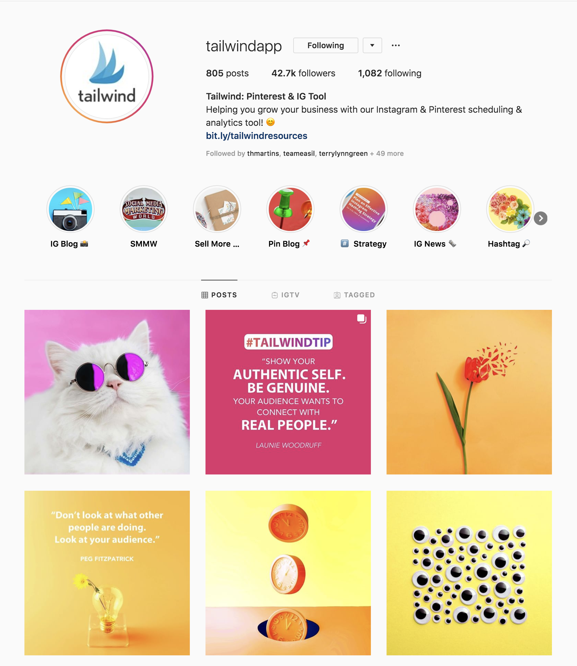
They follow-up the fun images with great captions:
https://www.instagram.com/p/B0qZx6on2ox/
Notice how the posts without text are super eye-catching. This post doesn’t include any text but it still catches our attention with a bright, attractive and quirky image that screams “it’s time”.
https://www.instagram.com/p/B0on6Ohnk82/
The post announces that Facebook Live is about to start. Once an image catches your attention, you are more likely to stop and read the caption… and watch Facebook Live.
Stock images can make us stop, read and take action – when you choose the right ones.
How can you start using stock images to match your brand? Maybe your brand is quite feminine with pink tones, and you’re looking for some photos to add inspirational quotes to. You could use the keywords flatlay and pink to find images to choose from, like this:
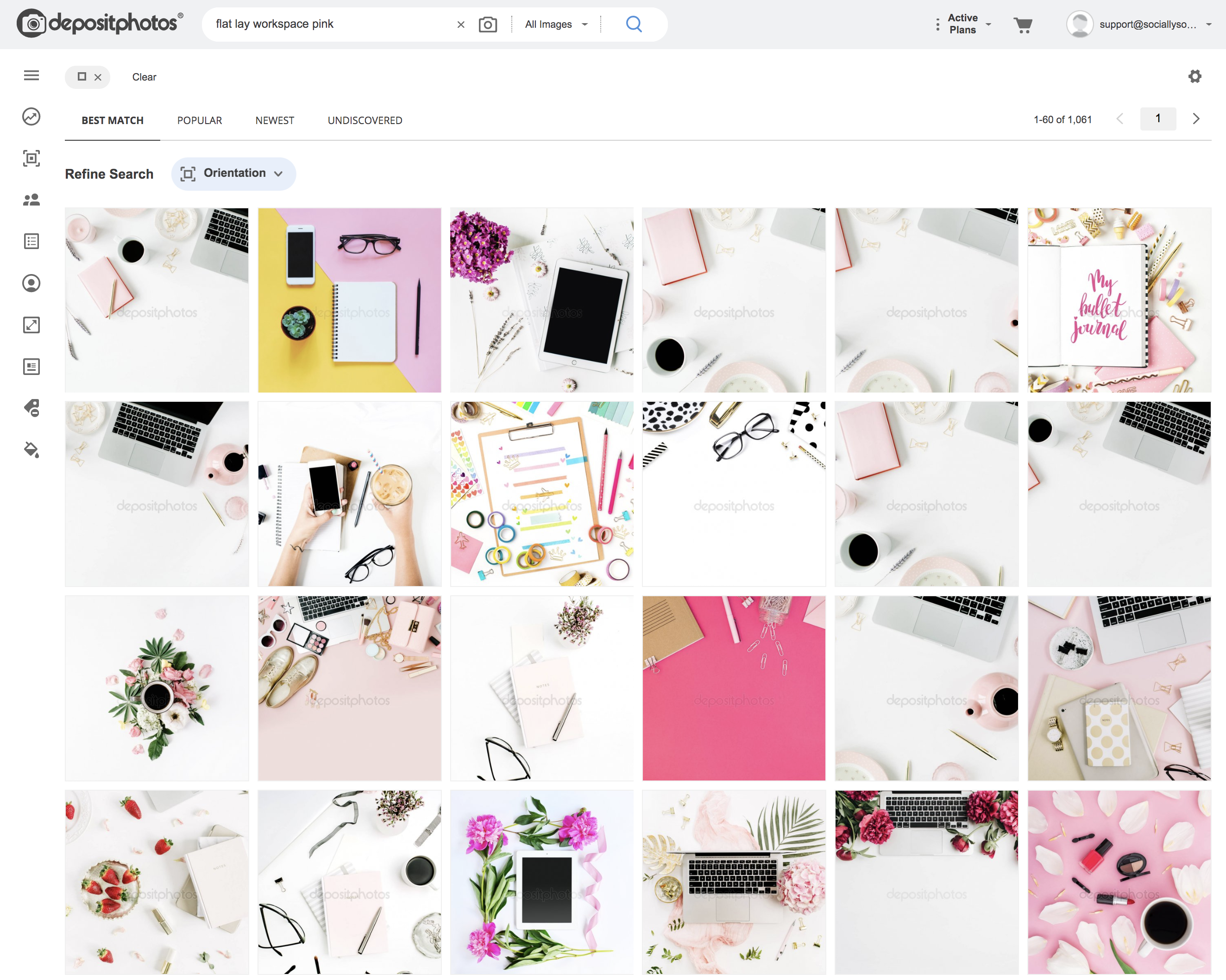
Alternatively, you might post a lot of brightly lit or ‘white’ images that are very clean and fresh. You can search for that style too:

From neon to retro and classic to black and white, get savvy with your search to find images that match your vibe.
When you have a color theme to match, it can make it easy to narrow down your choice of stock photo and match them to your feed. Just add the color to your keyword search (or use the color tool available in most stock libraries) and you’ll be good to go!
3. Use Photos from the Same Photographer or Series
Once you’ve decided on an aesthetic for your images – and you find a stock image to match it – go back for more. You’ve already done the hard work finding the right style, look and feel with the first photo. Chances are that the same photographer will have more similar photos ready for you in their gallery.
In the following example on Instagram, you can see that the last 6 photos on the @Depositphotos feed have a similar filter or aesthetic quality:
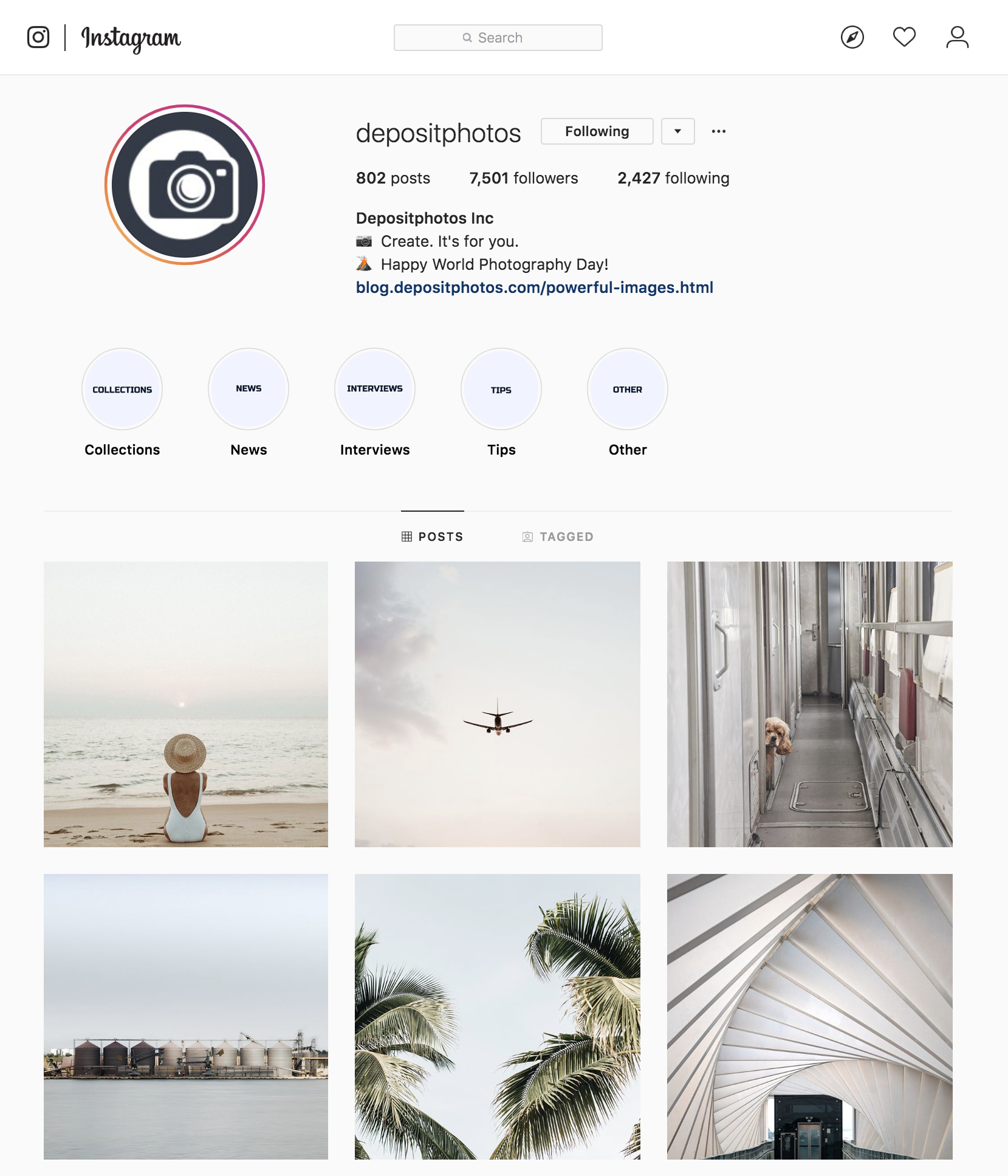
If you look closer, the 1st, 2nd and 4th photos in this series are all taken by the same photographer – @maximleshkovich.
If I search for the same photographer in Depositphotos, I see dozens of images that would match perfectly to the same Instagram feed style:
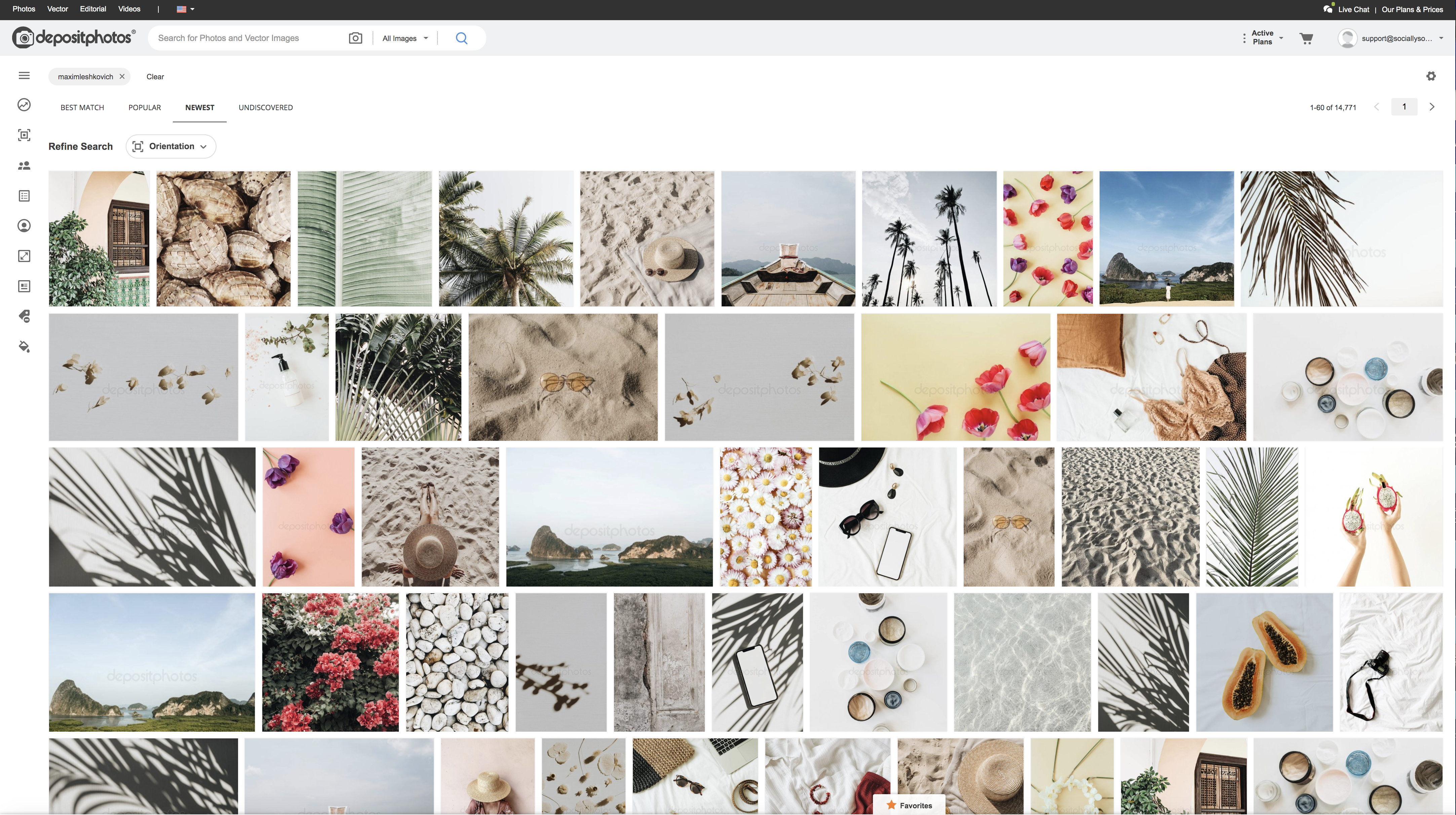
Next time you find photos you like, don’t forget to search for more from the same photographer!
4. Mix the Stock Photos with Your Own Photos
Don’t blast your feed with stock photo after stock photo. Mix them with your own photos or photos from custom photo shoots that you do for your personal brand or product photography. You can add in some user generated content too (with permission).
The key to using stock photography sparingly is to plan ahead. For instance, if you are posting to Instagram, determine how often you will use a stock photo vs your own images. Stick to a schedule and use some of the other tips in this post to ensure that the stock photos blend in well with your main images.
5. Choose Photos that Allow You to Add Overlays
From adding a header to your Pinterest image to creating a quote image, we often add text to images on social media. We can also add icons and illustrations and design elements.
When you add text and illustrations, it can take a simple stock photo and transform into something that doesn’t look so “stocky”.
Stock photos can be fabulous for adding context to quotes. Simply search for images with white space that relate to your topic. In the following example, I wanted actual white space on the image, so the final design would match my Instagram feed:
https://www.instagram.com/p/By8r0jGH8aO/
When searching for suitable photo stock images for adding overlays, use terms like copy space or white space to find images that allow for space to add text.
It can often be a good idea to use your brand fonts on stock photos if creating images for Pinterest, so that your followers can recognize and identify with your content.
Another great example of a company that uses stock photos effectively on their feed (with overlays) is Later with this post:
https://www.instagram.com/p/BrQ8MNKHGbS/?utm_source=ig_embed
Using a stock photo of a plane was an effective way to showcase Instagram’s new Countdown Sticker feature for Instagram Stories – adding the graphic sticker for effect.
Later’s feed is a mix of their own photos, user-generated content from their community and carefully selected stock photos:

Mixing up stock photography with other custom and curated content on your Instagram feed can be a smart move. Later pulls it off with style.
Hot Tip: Plan your content ahead so that you can find stock photos that fit the vibe and aesthetics of your feed – on any platform.
6. Don’t Forget Illustrations
It’s tempting to focus on the “photo” side of stock photography, but there is so much more hiding behind your keyword search, including illustrations and vector graphics. You can find some very cool graphics and elements that you can use in your designs (or even alongside stock photography).
I recently searched and searched for photos of teams for a blog post I was writing. But I kept coming up empty (other than finding a bucketload of clichéd photographs).
So I flipped my search to use the term hipster + people + vector for a little fun, and some illustrations popped up among the suggested stock photos. Including this one:
Using my own advice from Tip #3 above, I then clicked on Same Series by Kublo and found a lot more of their hipster images I could use.
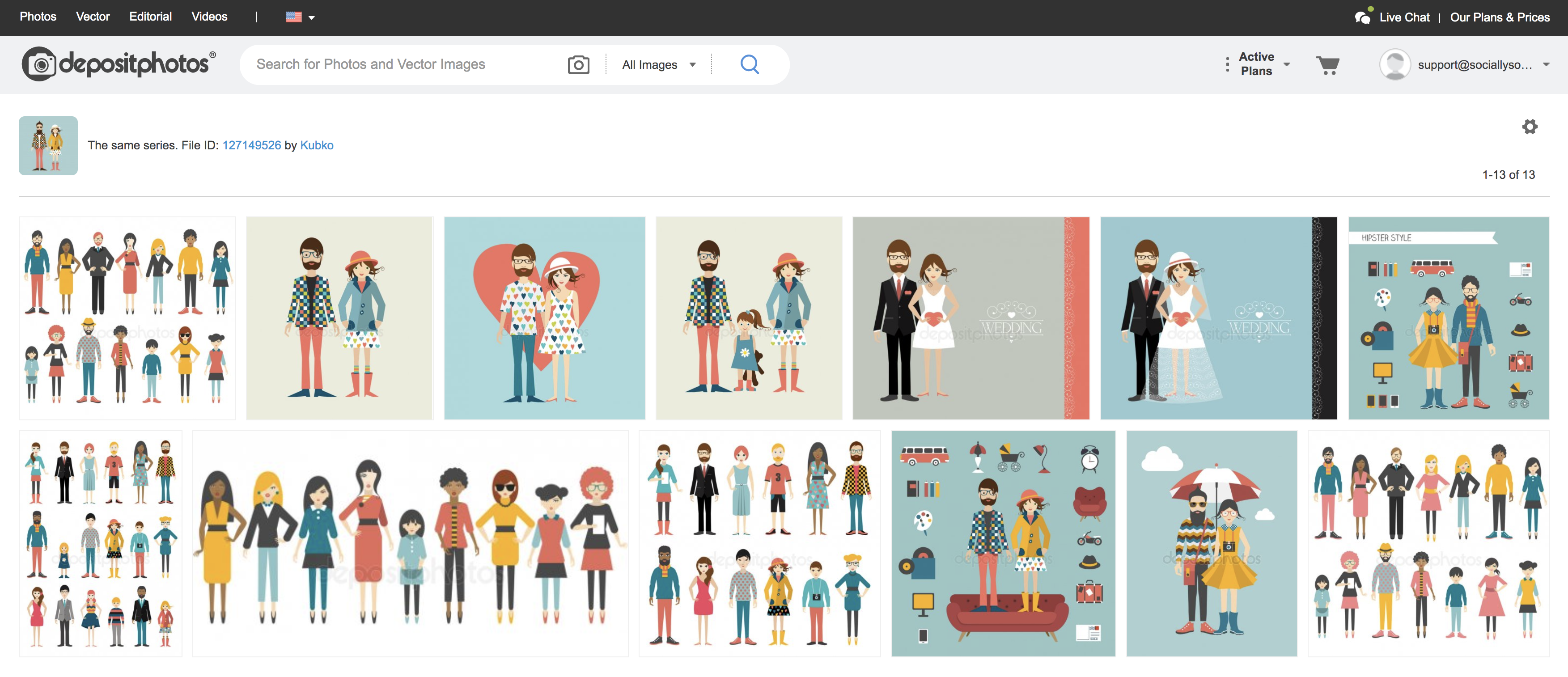
I even found hipster accessories, which made me giggle. Sadly the avocado toast icon was missing {wink}.
Back to my blog post… I was able to use two different images and combine them into the one design to portray a “team” of hipsters. In doing so, I created a unique image that stands out on social media.

So, the next time you’re stuck and want to create something a little different – check out the amazing vector illustrations in your stock library.
7. Use Mock-up stock images
Use stock photo ‘mock-ups” in your social posts. These are the stock images that feature a product (such as an iPhone, laptop, iMac screen, T-shirt or coffee cup – with the option to add an image to the placeholder technology screen, T-shirt or coffee cup.
If you need to add an announcement or showcase something on your online platforms, mock-ups can work really well.
I can search for a mock-up using keywords. For example, if my brand has yellow in it, I could search for mock-up + iMac + yellow. The result gives me images like this;

You can also do your own photo shoot, and use the resulting photos just like you would for stock photo mock-ups. Here is an example by the @TheInstagramExpert. Just switch out the screen-capture that you want to showcase and repurpose the image for different platform and posts over time.
Final Quick Tips:
Here are a few extra quick tips to help you find stock photos that don’t look like stock photos on social media.
Use Curated Collections — of photos (like this one and this one) to find ideas.
Crop and Zoom — if there’s a portion of the photo that you don’t like or doesn’t allow you to be cohesive with your brand, crop it! Zooming in on one part of the image changes the perspective.
Add a logo to make it your own — don’t over-brand your images, but adding a small logo helps your followers to recognize your content and click on it!
Use non-cheesy human photos — go for relatable, authentic “human” images. They do exist, and if you use Tip #1 you’ll be able to find them. It all comes down to clever search strategy and using the right keywords or advanced search features.
Use a color overlay – if you can’t match a stock photo to your color scheme, this is a great hack! In your design software like Photoshop or Crello, add a shape or color layer over your image in your brand color or preferred color. Then reduce the opacity so the image shows through, but with a new hue!
Ready to start getting creative with stock photos? Now you know how to start using eye-catching, engaging stock photos that will make us stop the scroll and pay attention!


