The Role of Photography in User Experience Design
The UX pros claim that stock photos can become huge space-eaters on your website or social networks. This statement is somehow backed up by the eye-tracking research results, presented by Dr. Jakob Nielsen, saying that irrelevant, unnatural, and low-quality images don’t contribute to make your message clear and attractive, as users usually ignore them. How does one avoid these possible consequences? Is it actually possible to improve the overall user experience of a website, using stock photos? Let’s do a little digging.
Another side to the argument
A friendly looking person taking a customer service call, a perfect mom or dad with a glossy-looking kid, a multicultural group, having a meeting or a party, or just beautiful people smiling at the camera. These are the types of images that can become an obstacle to making information about your products and services persuasive. As a result, your marketing department will face a real challenge while trying to stand out in a pool of competition, while also trying to attract new leads.


“It’s worth noting that humans are really good at picking up emotional queues and transferring them onto unrelated products and services (known as the halo effect). However, we’re also good at spotting insincerity, so best avoid those cheesy stock photos.” – suggests Andy Budd, a leading authority on interaction design, and one of the founding partners at User Experience Design Consultancy, Clearleft.
Use shots that complement your text
Candid and authentic photographs can be quite powerful in the sense that they add a layer of meaning to your website or ad campaign. It’s yet another way to communicate with your audience. However, this is true only in case they are not constantly irritating users, but rather if they are focused on creating a calm experience. Plainly put, the photos you use should help customers better understand what you are talking about and help reinforce your ideas.

The expert highlights that your product or service should still be functional without images, as may be the case when you are surfing the web on a slow connection or from a screen reader. Moreover, if you finally decide to use photos, it doesn’t mean you can omit text. Far from it. Your message should be a priority and should never lose its value if you remove the image.
What are the types of images that can contribute to better user experience?
Your customers don’t want to come across typical stock photos anymore. They need images that are closer to real life real life and relatable; those are the images that that appear natural and authentic as opposed to posing, artificial studio shots.
According to Andy Budd, people still respond well to images of people and especially faces. However, it does not mean that you should use similar images just for the sake of using them, and because they’re trendy today. It depends on the specific situation and the behavior or response you are trying to achieve from your target audience.
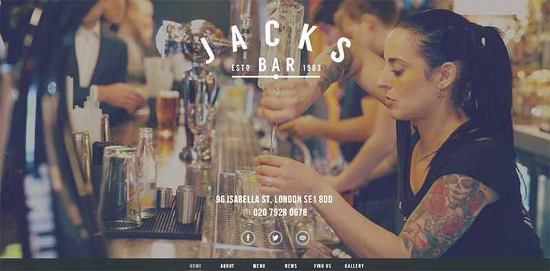
“Take a travel site for instance. You could be trying to elicit a sense of calm serenity, in which case an empty beach may do the trick, allowing folks to imagine themselves in the situation and build their own narrative. Alternatively, you may be wanting to create an emotional response, in which case it may be better staging a scene with an individual of a similar demographic sharing a moment. Both bare valid outcomes, so it does depend somewhat on the brand.” – says Andy.
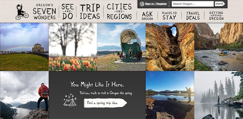
Andy also adds that it is a good idea to use a multi-variant testing, and see which images will be the best option for your ultimate goal, especially if it is to increase conversions. As a hint, you may choose current significant trends like IoT, DIY, Gen Z, space, drones, and authentic photography. This will easily help you to discover what is in demand today, and maintain a consistency in your visual communication strategy.
Learn more about photography trends in our Visual Trends Guide 2017.
Bottom line
To summarize all the important points we have mentioned here, first of all, we want to place an emphasis on the fact that it really is possible to improve user experience using stock photos. Optimized correctly, they will make your marketing campaigns and web sites more conversion-friendly, and drive your company to greater success. For this, you need to remember the following ideas:
- Avoid irrelevant and not realistic shots
- Use a few large impressive photos instead of lots of little ones
- Post professional, high-quality images only
- Be smart about optimizing your photos. This will help drive more traffic to your site
- Choose images that stimulate the imagination
Every page, ad campaign or blog-post is a small piece of the overall story. So choose a strong image that will complement this story, and aim for a more personalized, human connection with your customers.
