‘The Making Of’ Series: Sergey Serebrennikov Designs the ‘Back to Black’ Record Cover
Sergey Serebrennikov was one of the artists invited to participate in the project Reimagining Record Covers. Although you might have already seen the project, a lot of what went on behind the scenes of making the record covers was unseen.
We had a little chat with Sergey about his work, the making of his record cover so that you could appreciate the artistic process and thought that went behind producing the final pieces.

Tell us a little bit about yourself, your day job and your creative pursuits.
Being a creative graphic designer, I work in my unique style of retro and Art Deco. I have a wide range of works in advertising for various companies.
In 2014 I moved to the USA, leaving Russia from the position of an art director on the TV-channel “Moskva24”, and started working on creative projects.
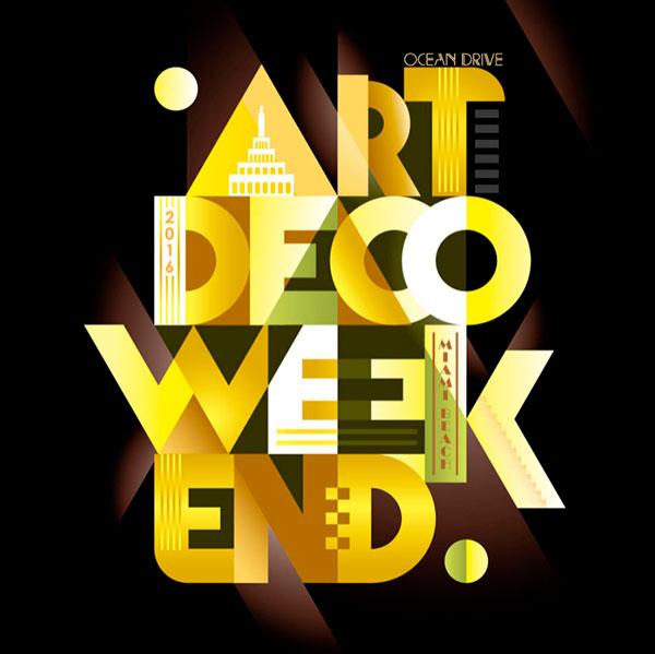
In 2016, I won the contest of posters for the famous festival “Miami Beach Art Deco Festival”, which takes place on Ocean Drive in Miami beach. It’s been going on for more than 40 years, and I became the official artist of 2016. Now I’m working mostly on projects to promote my art deco style in graphic illustrations.
What were your initial thoughts going into the Reimagining Record Covers project?
It is new and interesting project for me and I am happy to be a part of it. Previously I didn’t have possibility to work on the image of some famous person.
Did you know right away you wanted to create an album cover in your signature style?
I didn’t have an aim to create the cover of some album before this project. But I always wanted to create an illustration in my unique style for some celebrity. Thanks to Depositphotos I got this opportunity.
Did you go back to listen to the whole album when you started brainstorming? What were your thoughts and your initial concept for the project?
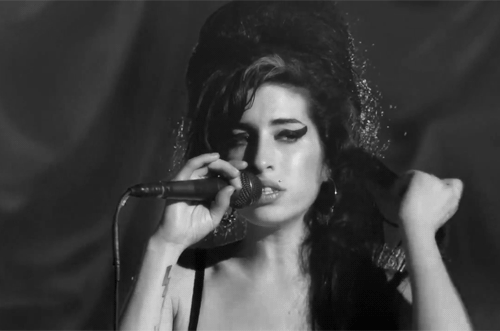
I started my work on the creative idea of the cover from listening over and over the Amy’s album Back to Black. It was easy to get started with a sketch like that. And after I have finished the cover, her songs didn’t leave me for a while. Amy’s music helped me find an understanding of what the album cover should look like.
What did you want to translate in your artwork of Amy Winehouse?
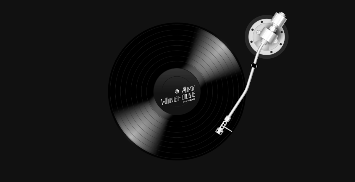
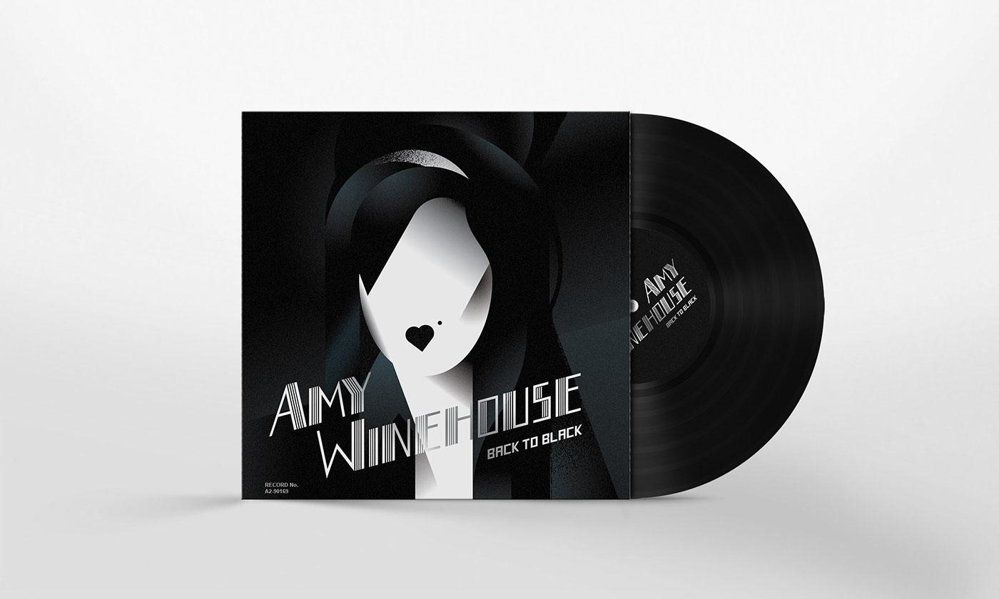
I think that her album could have the cover like that in the times when Art Deco was popular.
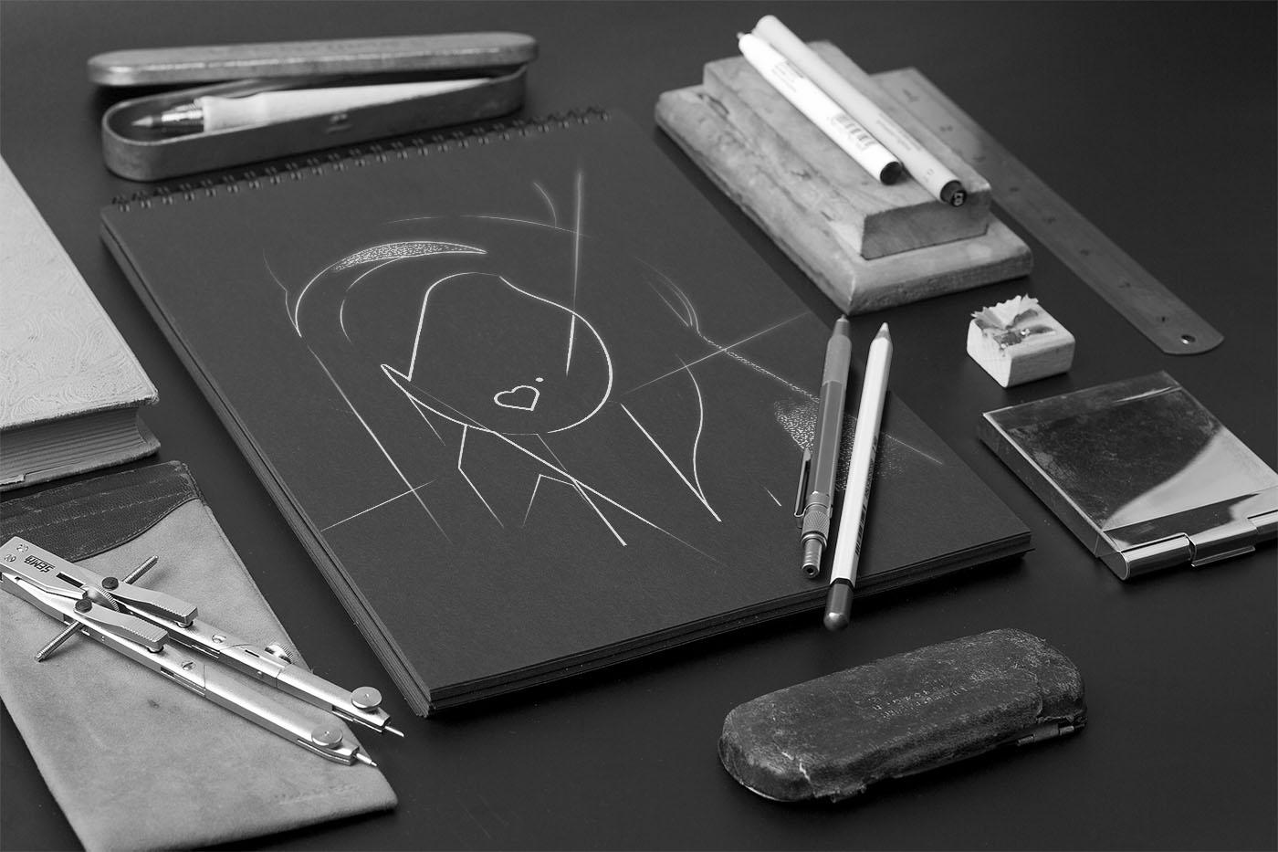
Could you share something from the initial stages of ‘the making of’ of this particular project?
How long did the process take you?
The process didn’t take me too long. I have been creating the cover for a day, and another day I was upgrading it to the final image.
How do you feel about the finished product of the Reimagining Record Covers project?
I am proud and happy that I could bring to life what I planned. I won’t be ashamed to show this a cover to Amy Winehouse.
What are some of your other successful projects you’d like to share?
You can find out more about this project here.

What’s your favourite part about being an illustrator?
I like the actual process of creating illustrations, when you have just the idea, inspiration and desire to create something new. You are watching how the illustration comes from nothing, from a white, clear piece of paper. And then I like to make it perfect and final.


