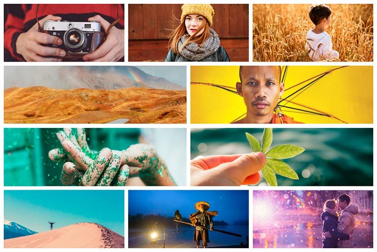
Photo Collection: Color of the Year is Living Coral
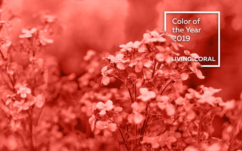
Pantone manages to surprise us with their color choice of the year. For 2019, the Pantone Color Institute selected a specific shade called Living Coral (PANTONE 16-1546). It’s a warm hue that exudes positivity and comfort and is a relieving break in the digital space.
This influential color is said to dominate not only graphic design and fashion, but interiors and website design as well. The Tilda team was on point when they selected a shade of coral for our 2019 visual trends, so it’s safe to say that the color will influence many design disciplines in the coming year.
As with every year, we put together a carefully selected Living Coral collection to help you enrich your projects with an awakened wonder for the shade that reminds us of the beauty of ocean life. We included dozens of images that will help you with your projects – be it graphic design, website design or simply color inspiration.
Linked to the natural world, here is Pantone’s inspiration with a focus on the beauty of coral – the color and the living organisms that we have to work towards preserving:
Lastly, here are some standout images from our Living Coral collection. The images are of various themes but there’s one thing that unites them – the trendy shade that will dominate 2019.
*By clicking on the images, you will be redirected to the Depositphotos website where you can purchase them.
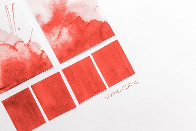
Living Coral color palette
Blossoming spring branch in Living Coral shade
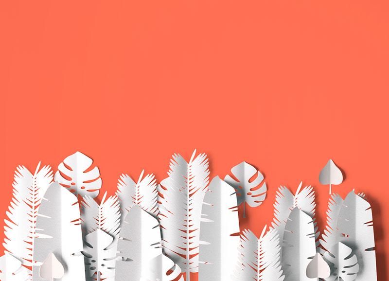
Minimalistic Living Coral background
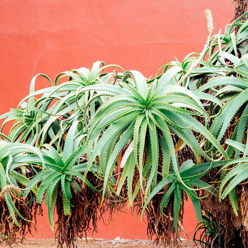
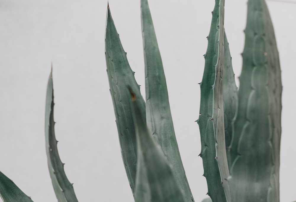
Plants against Living Coral background
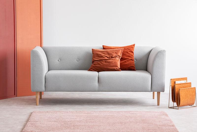
Living Coral in interiors
Living Coral in fashion
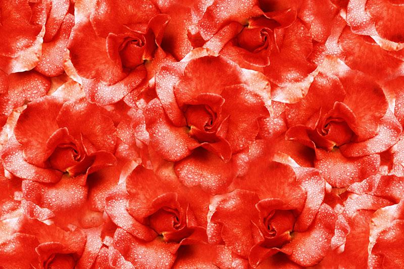
Deep shade of Living Coral
See the rest of our Living Coral collection and find images that will become an integral part of your projects next year.
