30 Trendy Neon Color Palettes for Bold Designs
One of the biggest challenges every designer faces is choosing one hue amongst dozens of variations. In all honesty, freedom of choice may give you a headache. Now, imagine having to pair different colors and hues!
By experimenting with shades and tones from our neon color palettes, you can liven up your designs with trendy solutions and thus, appeal to a very broad audience; neon is quite trendy right now.
We have also included a hex code to every color, making it easy to find the exact shade you’re looking for. We hope to make the process of selecting the perfect color just a bit easier for you.
 To get free downloads, click the banner above, switch to «Annual Upfront» subscriptions, and press the «Free 7 Day Trial» button.
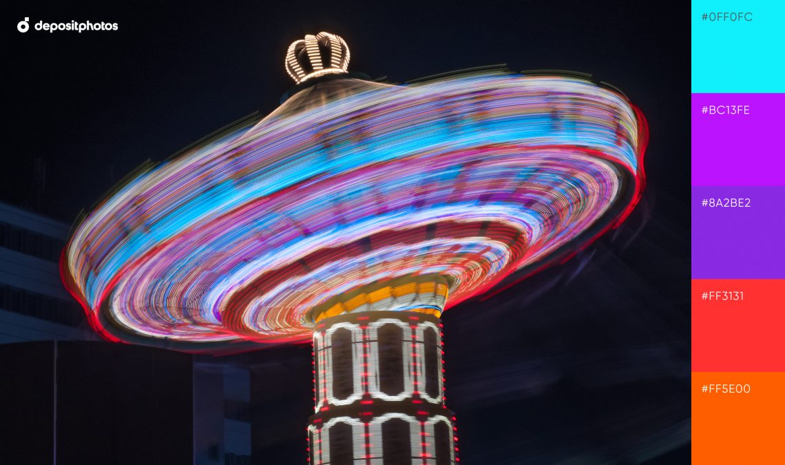
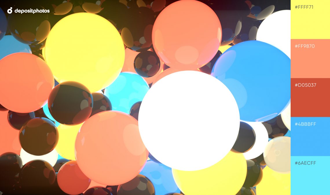
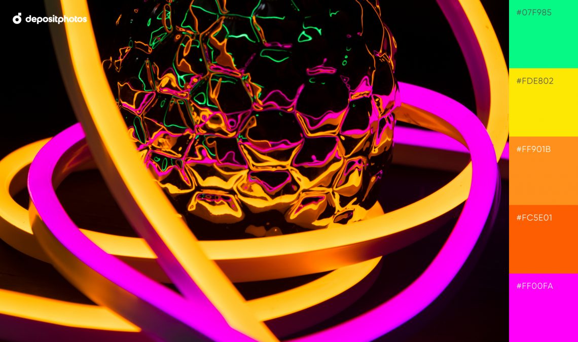
1. Fluorescent Carousel
Explore our fluorescent neon color palette. Bright purple, orange, and vivid blue unite to create a classic neon mix.
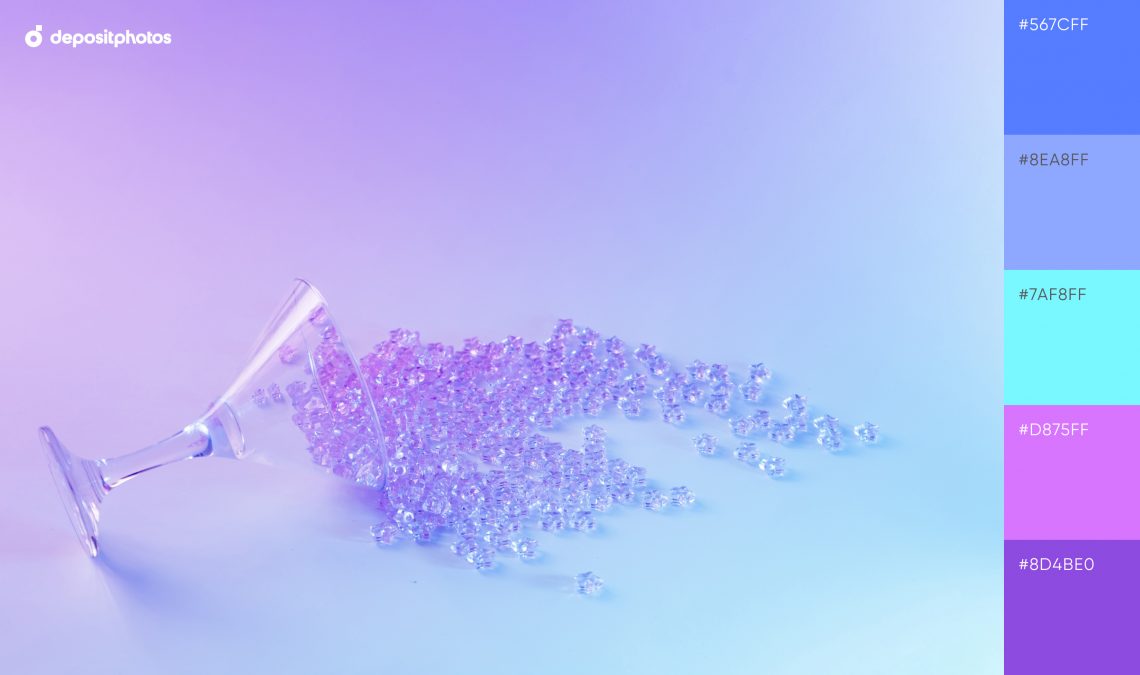
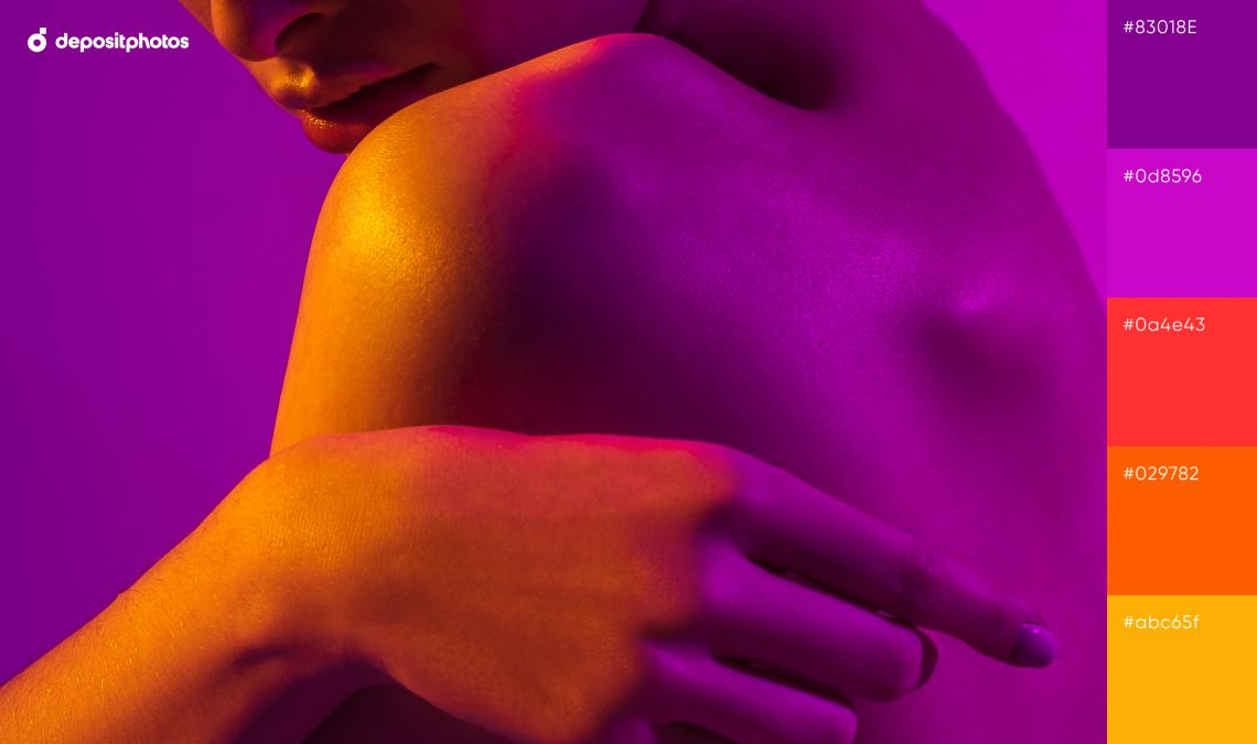
2. Lively Violet
Use delicate violet shades of a brand new Pantone color—Very Peri—to stay on top of trends in 2022. These five hues are an excellent choice for creative designs with pearlescent aesthetics.
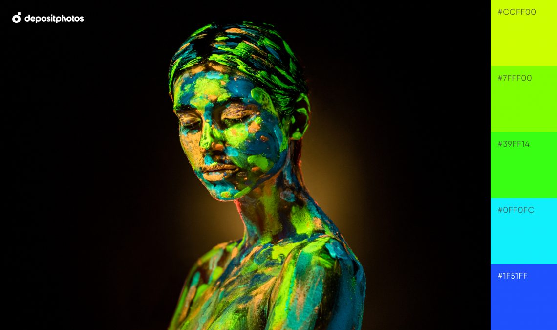
3. Bright Strokes
Highlight key visual elements with a coral orange and unconventional shades of green.
— Want more inspiration? Dive into the history of neon signs and colors.
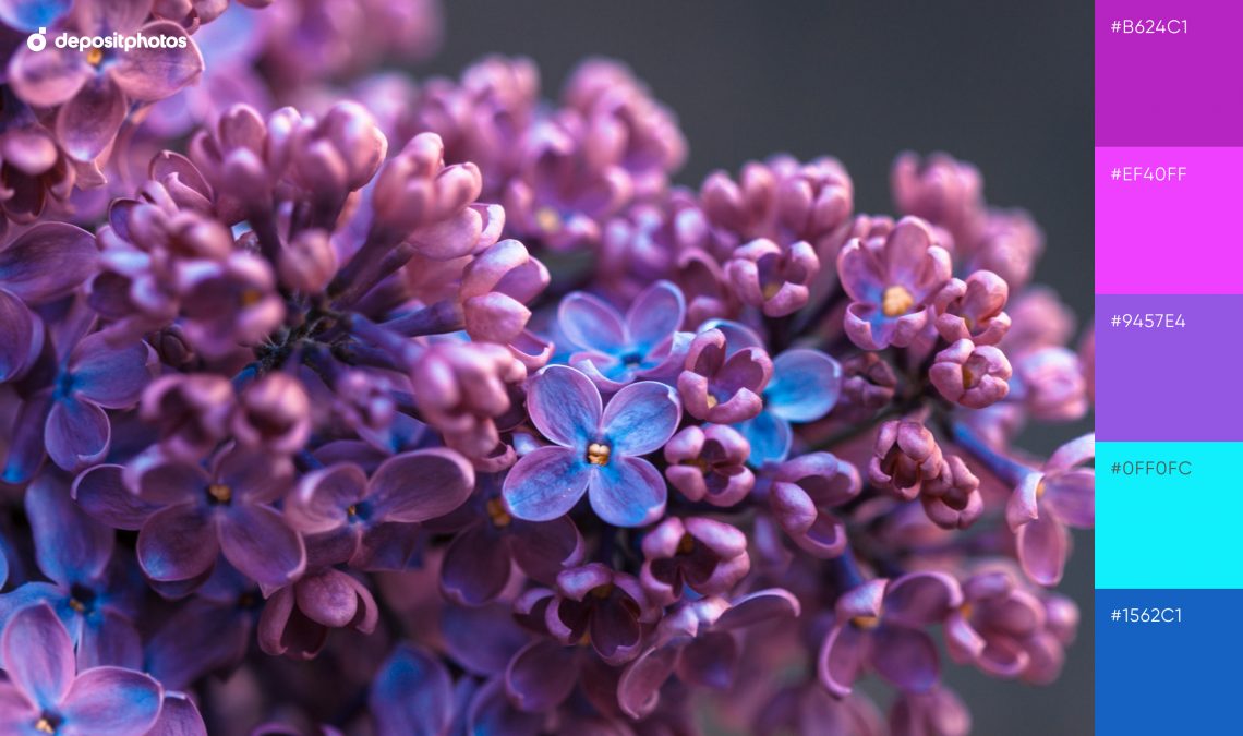
4. Gentle Lilac
Nature-inspired lilac tones and Aegean blue will help add a touch of contrast to your designs and create a refreshing aesthetic.
5. Playful Pops
Brick tones, balanced by a dim yellow hue, are part of the Spring Color Trends 2022. Express enthusiasm and vitality in your graphics by using the trendiest shades of this spring.
6. Elegant Touch
Get inspired by an elegant color scheme with butterscotch, jam, and marmalade tints. They are a go-to solution for your thematic projects.
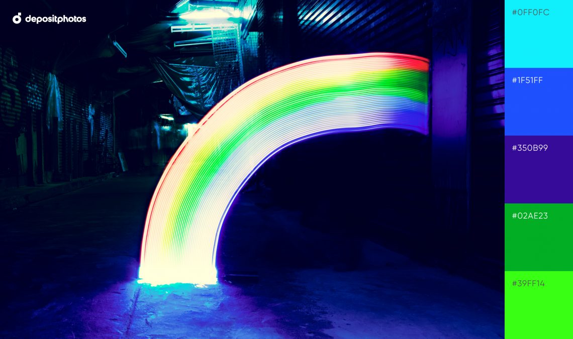
7. Rainbow Gleam
Create a neon rainbow aesthetic with eye-catching and bold colors perfect for standout designs.
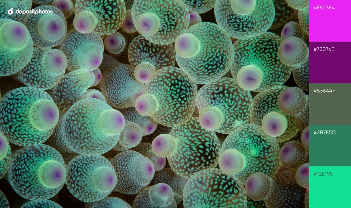
8. Radiant Bubbles
Combine five shades of aquatic green to make your graphics bright, but monochrome at the same time.
9. Dreamy Vibes
An unexpected combination of fuchsia, carrot curl, and turquoise green can be found in this palette. Together, these colors will allow you to create vivid, visually rich designs.
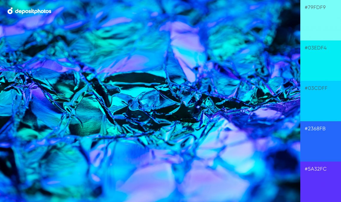
10. Electric Blue
Experiment with trendy and hypnotizing shades of electric blue to manifest life in your visuals.
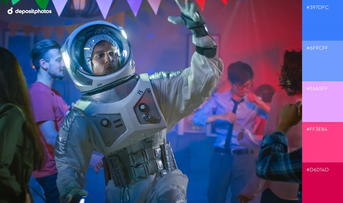
11. Funky Celebration
Mix and match pale red, blue, and pastel pink to convey funky vibes.
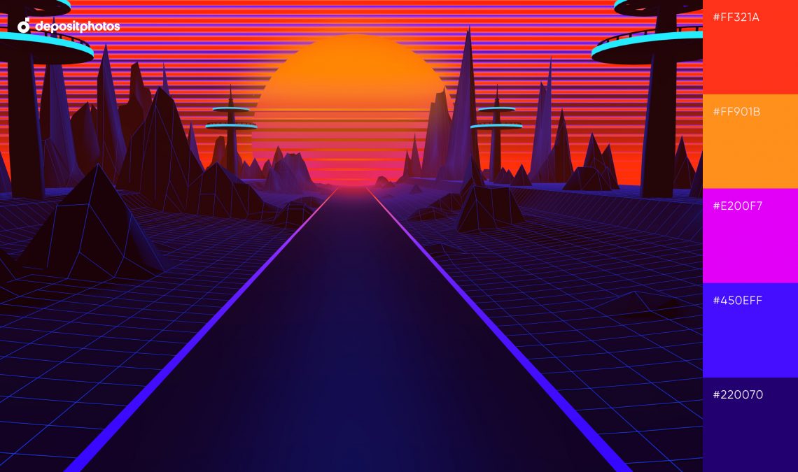
12. Cyberpunk Aesthetics
Add intensity to your imagery using this dark neon color palette. Create artworks with a unique vibe full of mystery and futurism.
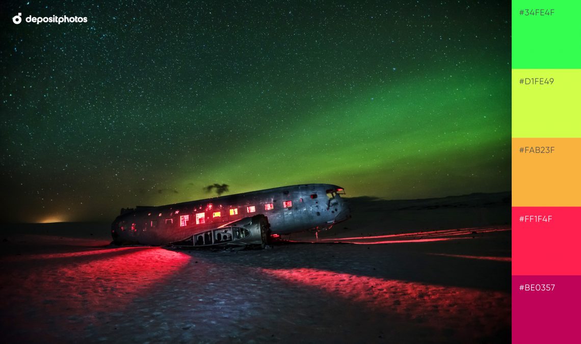
13. Vivid Night
This color scheme resembles northern lights with deep red, mild orange, and yellow accents. Experiment with a neon palette provided by nature if you want to create ambient designs.
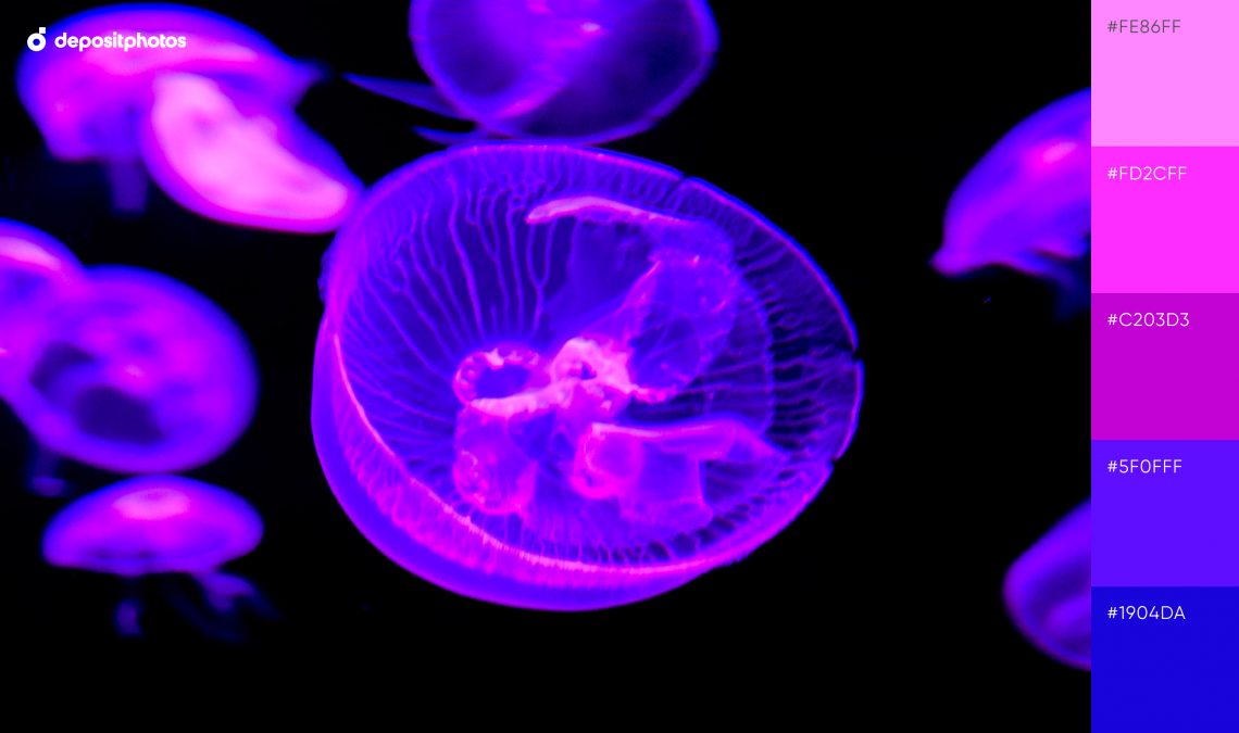
14. Purple Jelly
This combo with a vivid purple color scheme reminds us of deep ocean waters and their unique inhabitants. It is ideal for creating bold designs with intense and dynamic accents.
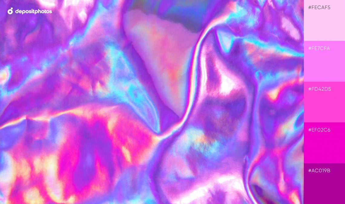
15. Glowing Holography
Feel nostalgic with Y2K aesthetics. A classic Barbie pink combination will aid in the creation of lush, maximalist visuals that evoke happiness and positive emotions.
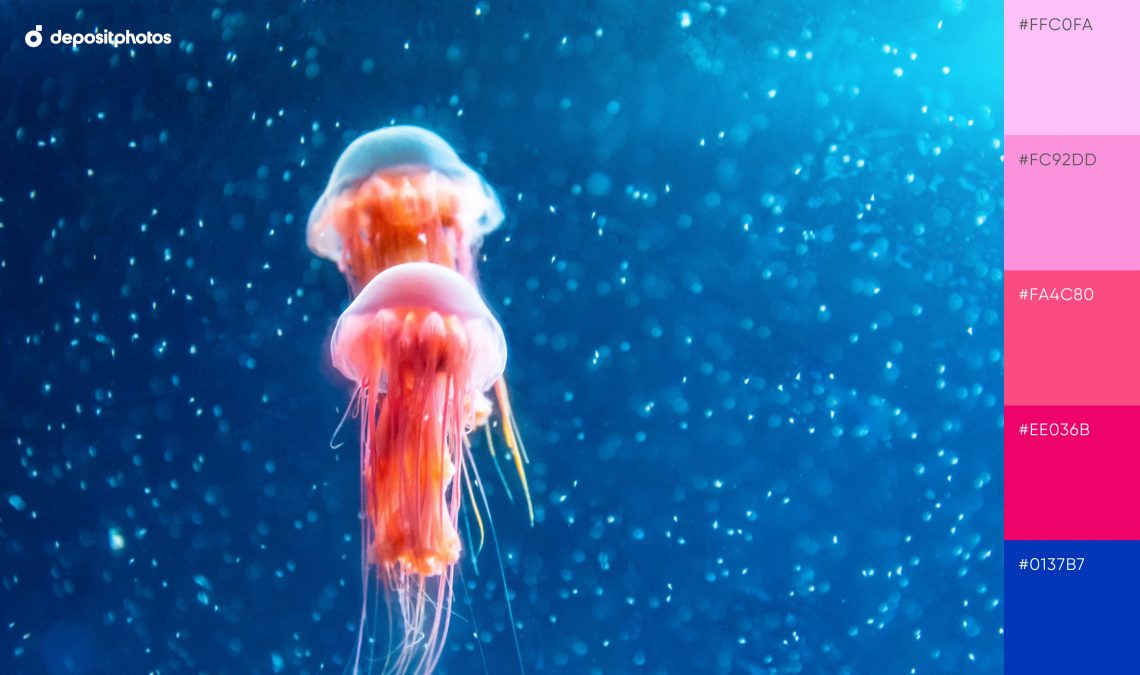
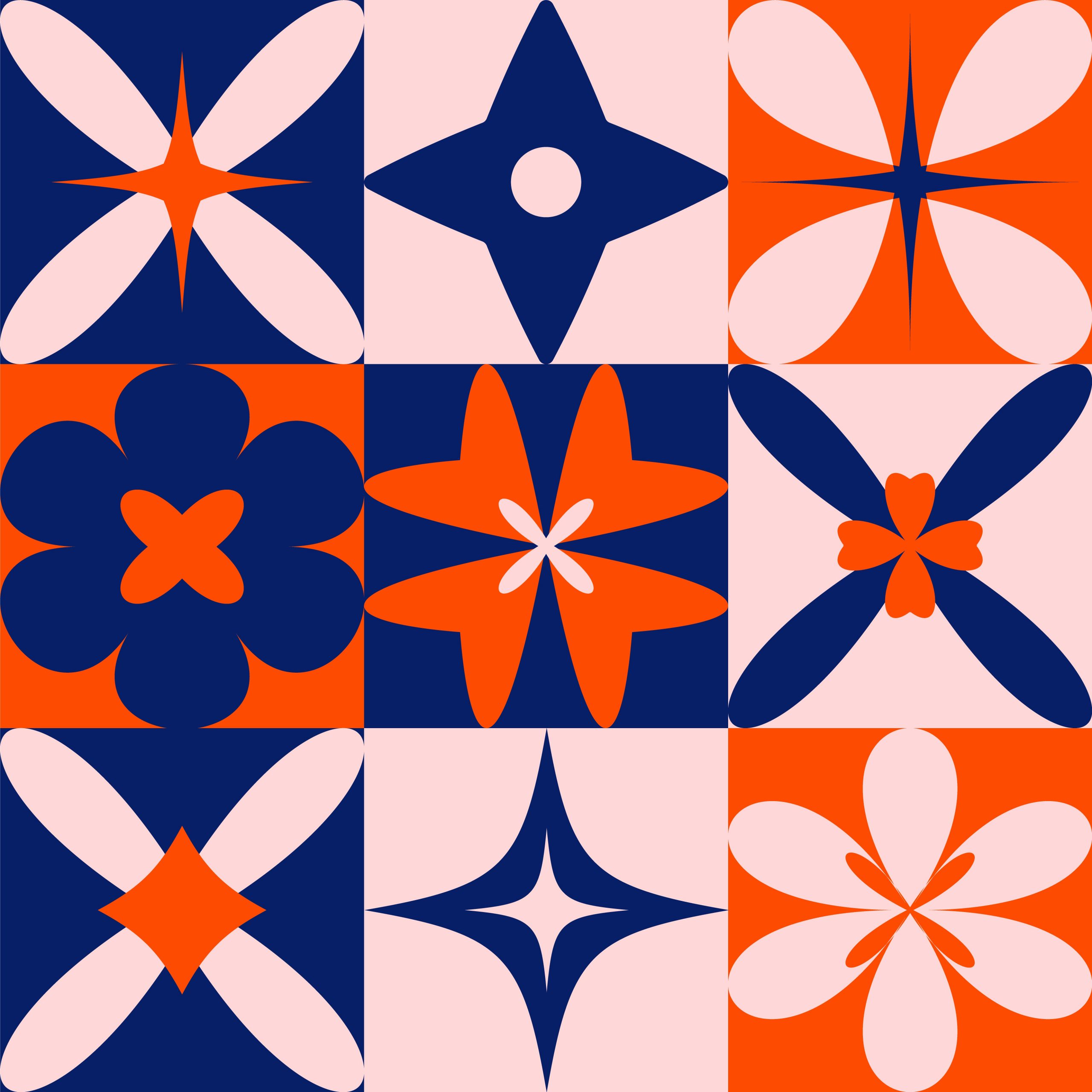
16. Glistening Waters
Embody your craziest design ideas with coral pink and navy blue. Contrasting neon visuals will help wow your viewers.
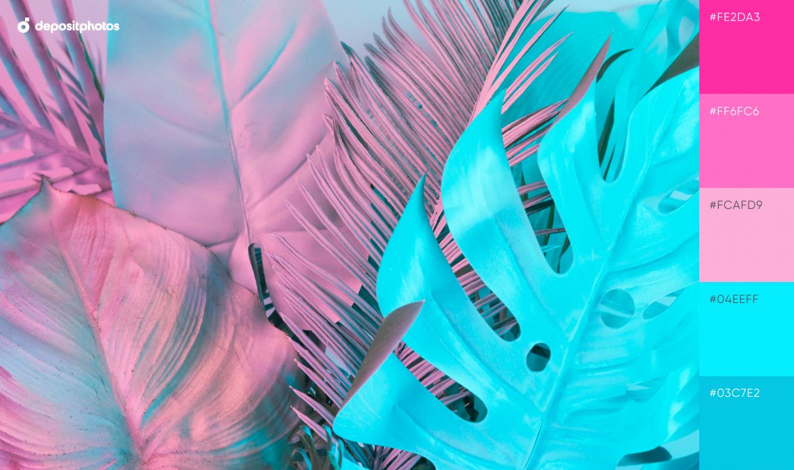
17. Minty Leaves
Vibrant gradient with neon mint and pale pastel pink will serve as a strong base for summer-related projects.
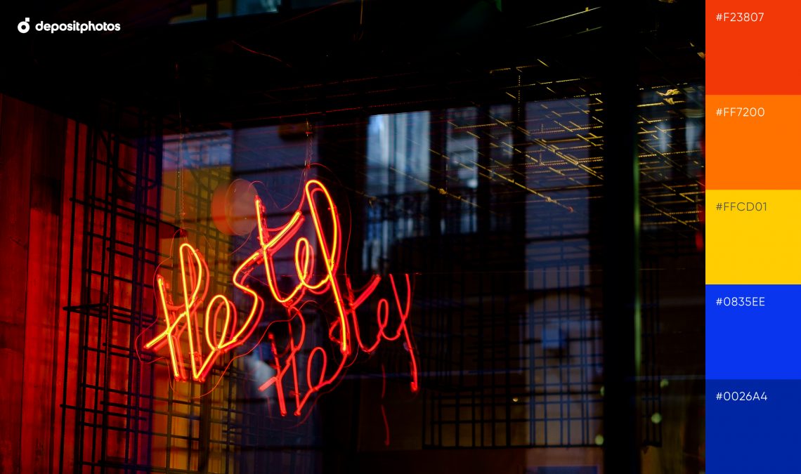
18. Neon Lights
Communicate important messages with this expressive mix of orangish red, sunflower yellow, and cobalt blue.
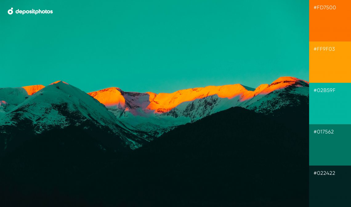
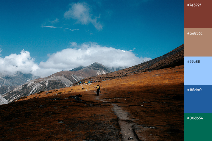
19. Colorful Peaks
Matte ocean undertones are intertwined with sunset shades in this palette. Together, they form an intriguing combination for your thematic designs.
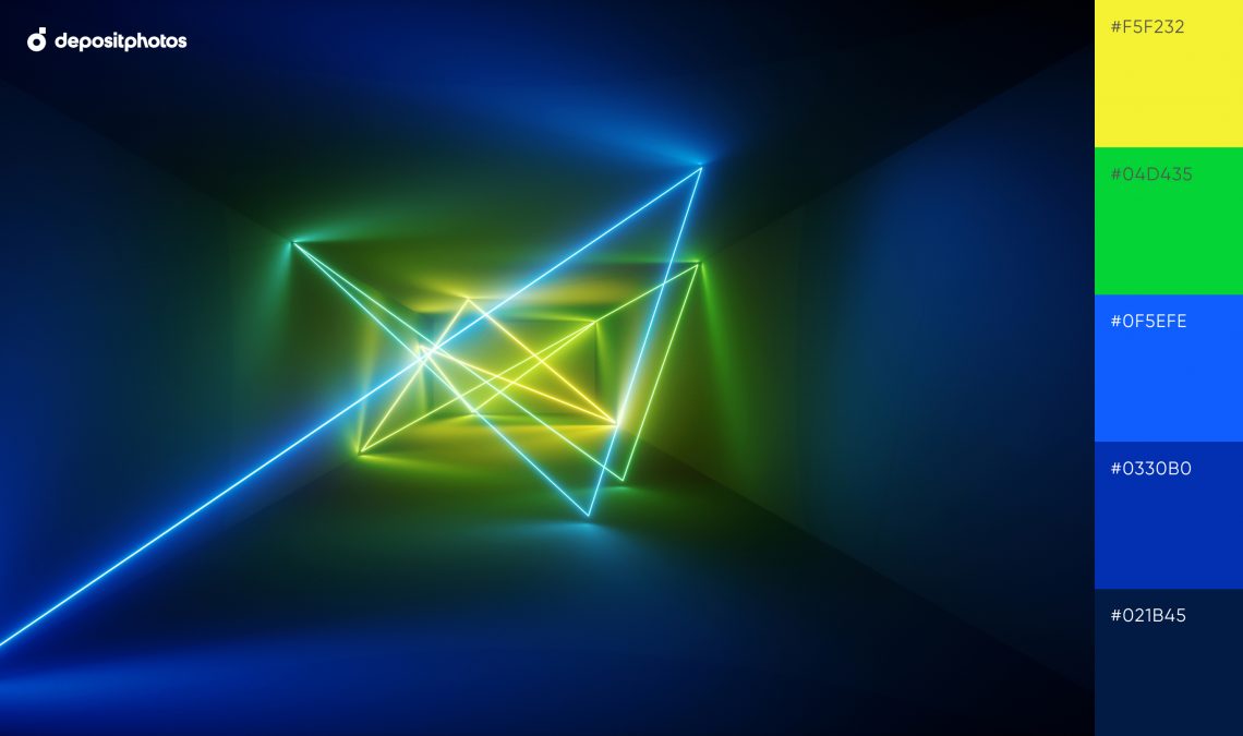
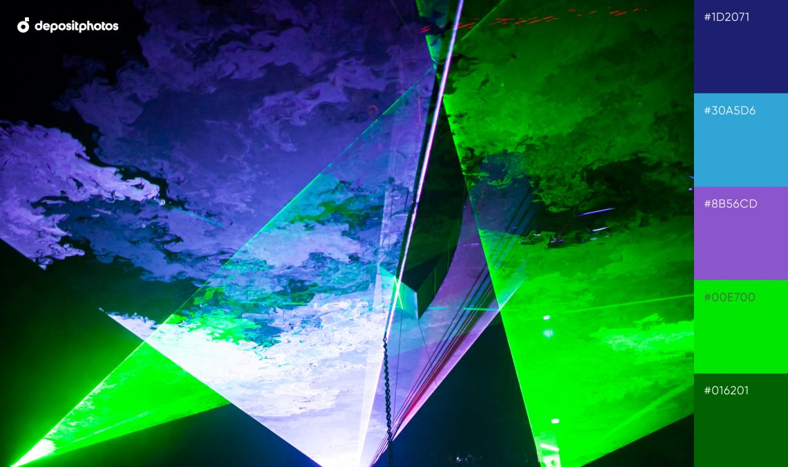
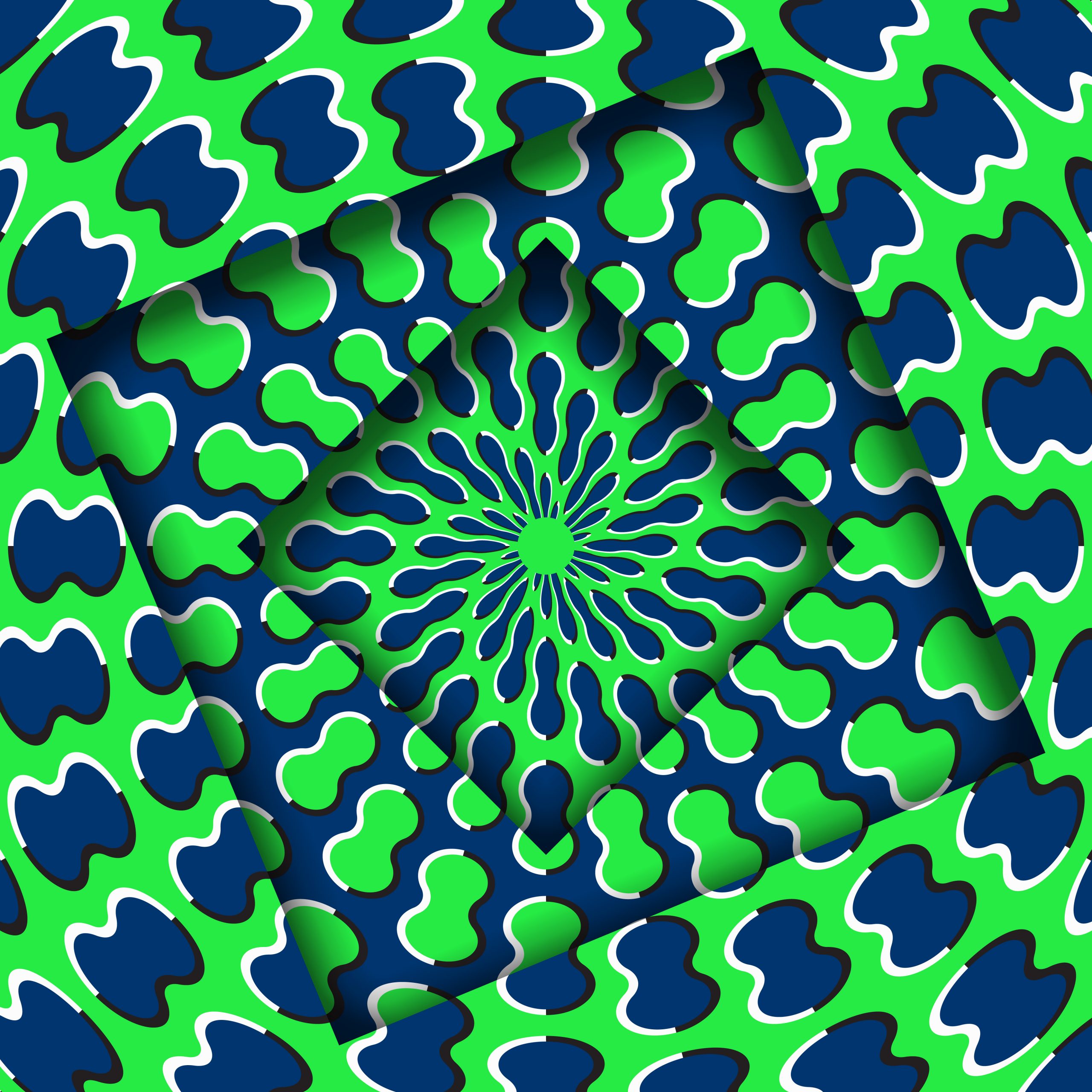
20. Geometric Glow
This bright neon color palette of banana yellow, royal blue, and virulent green is ideal for accentuating details in your projects.
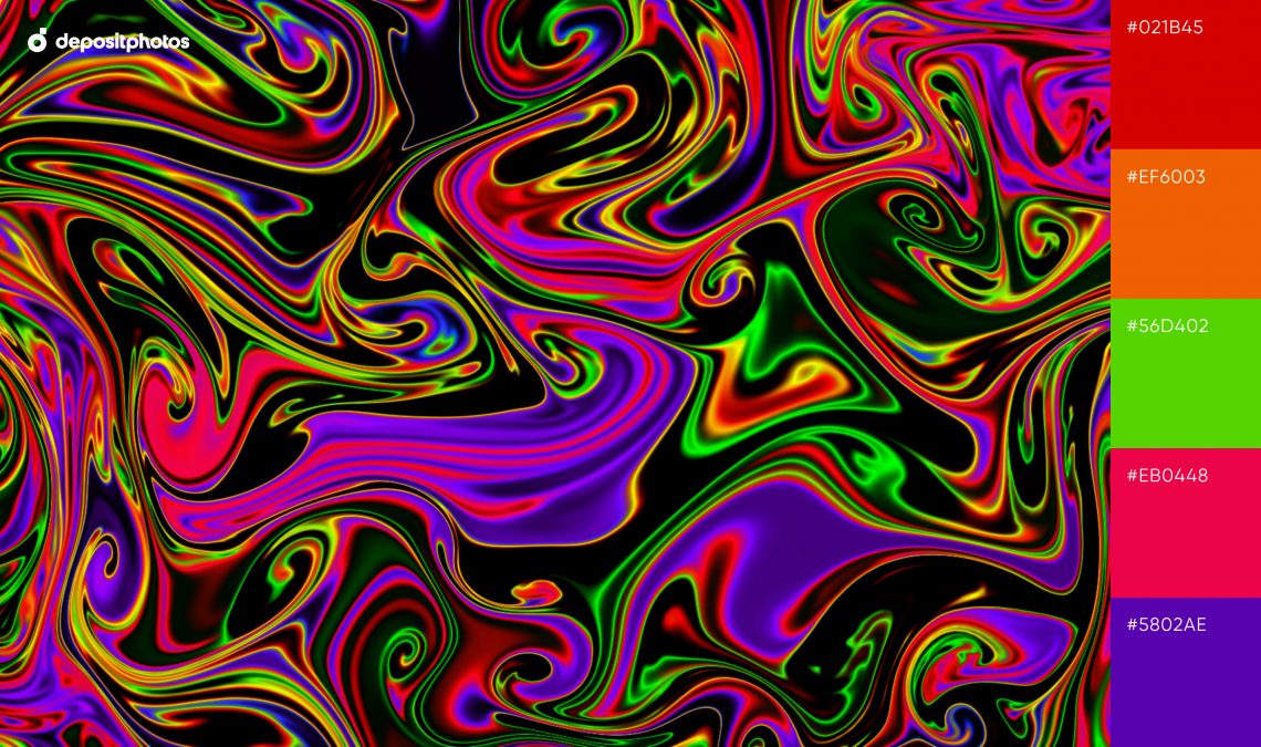
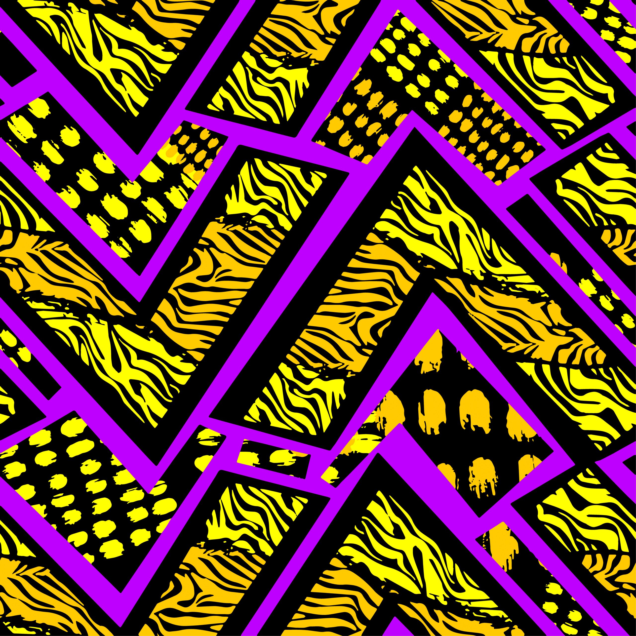
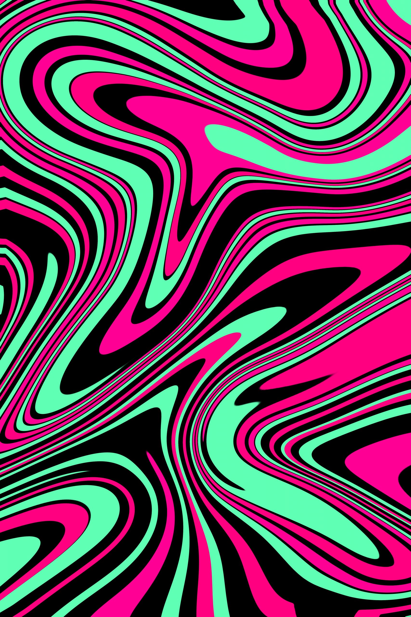
21. Psychedelic Motifs
A rich mix of neon color combinations, hypnotic patterns, and bold motifs. Inspired by Psychedelic Art, one of our 2022 Creative Trends, this palette will grab viewer attention and help you stand out from the crowd.
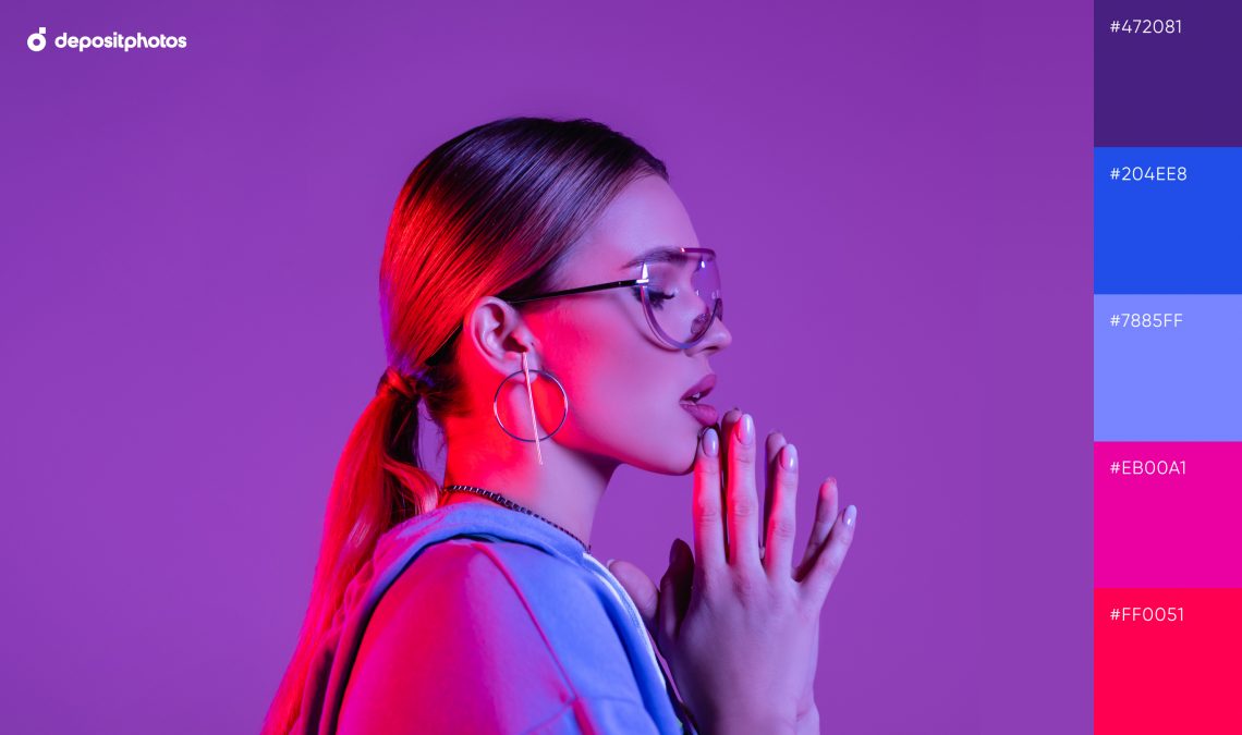
22. Trendy Magenta
A moody palette with violet and red backlight tones is what you need to create a great first impression.
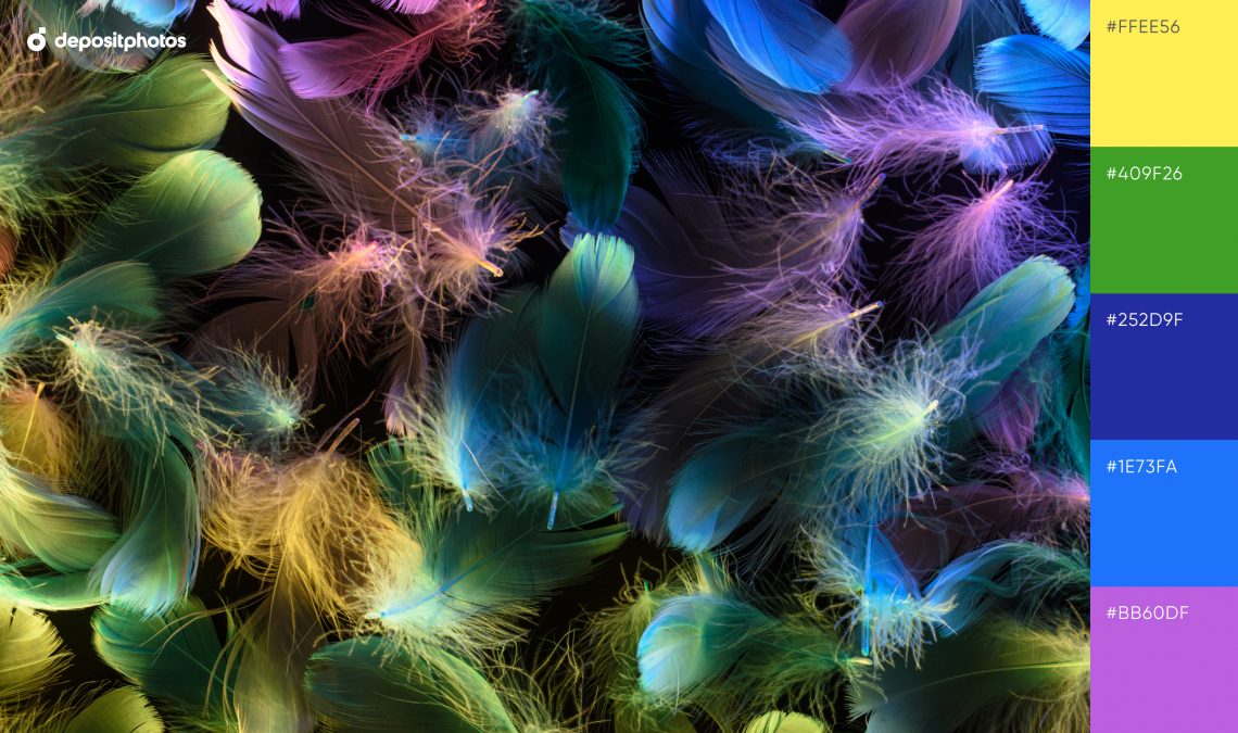
23. Vibrant Feathers
Neon colors from this scheme are all about freedom of spirit. The combination of yellow and blue embodies confidence and power.
24. Futuristic Vibrations
Looking for a cyberpunk neon color palette? We’ve got you covered! These 15 themed color schemes will immerse you into the world of cyberpunk.
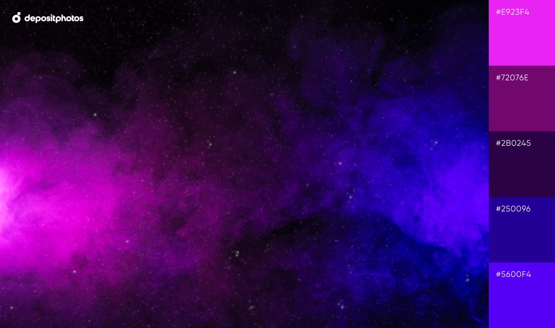
25. Abstract Universe
Experiment with these neon color codes for universe-inspired designs.
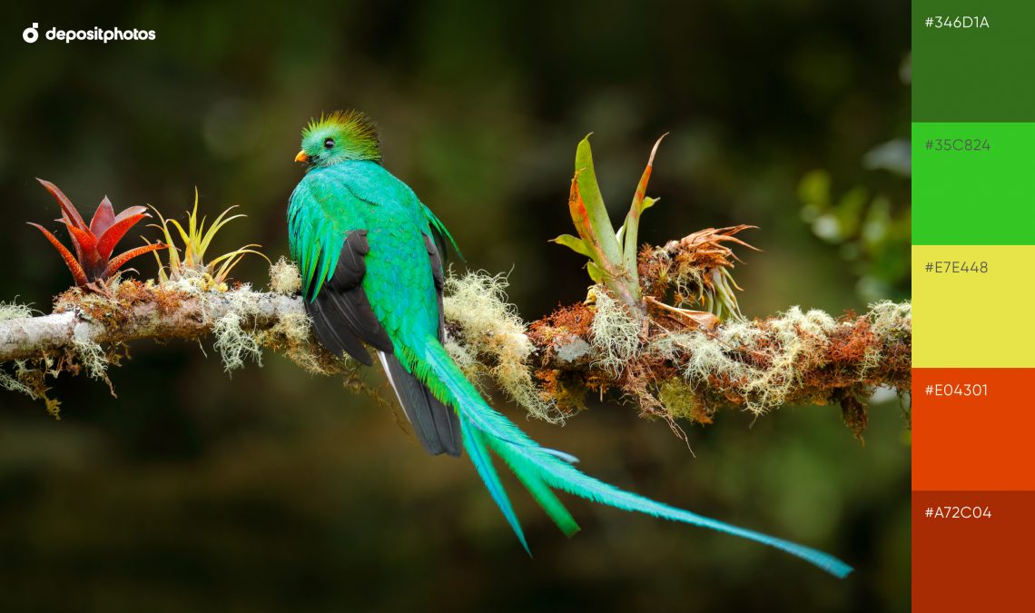
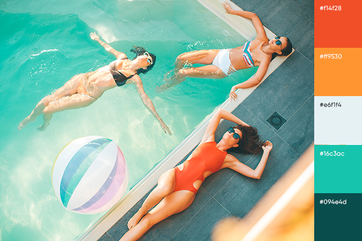
26. Exotic Green
Bright tones reminiscent of tropical birds will help you create a summer aesthetic for your ads and campaigns.
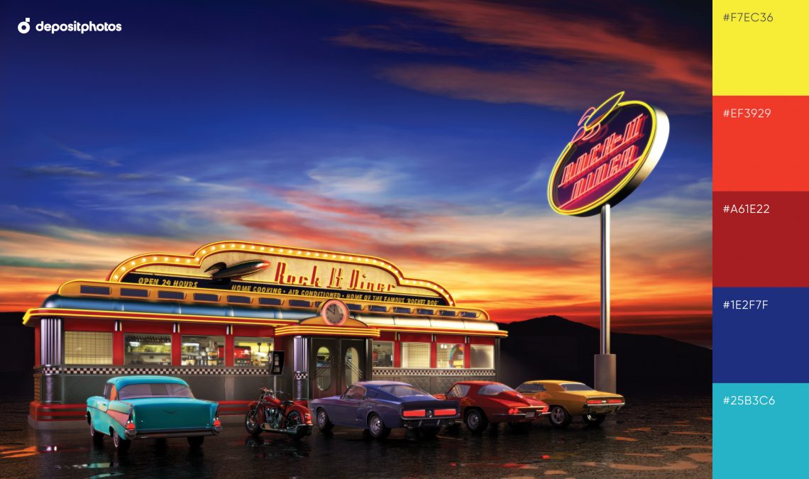
27. 50s Nostalgia
A neon retro color palette is the new black. Embody shades of cozy billboard lights, roadside diners, and America of the 1950s in your designs.
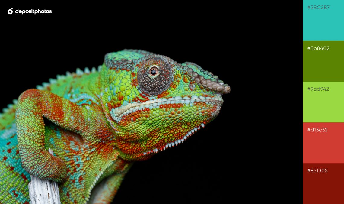
28. Extraordinary Chameleon
Realize your unusual ideas with these leafy green shades. Deep merlot with a grassy undertone and dim blue contribute to the wild impression.
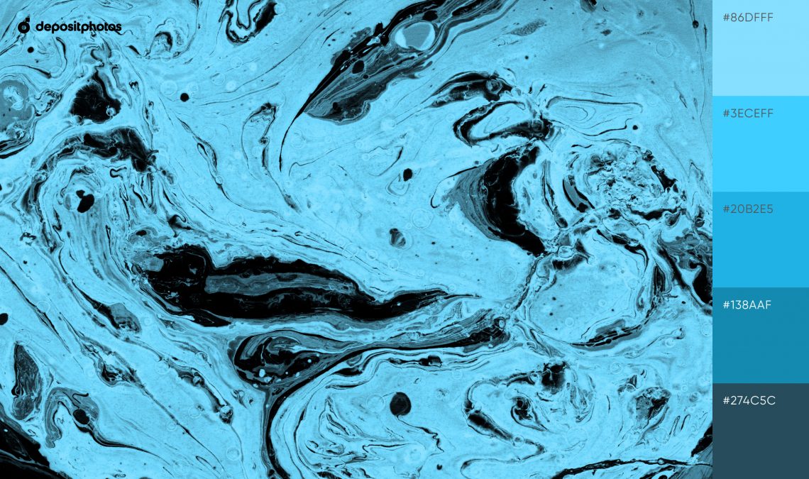
29. Magic Marble
Enhance your visuals with vibrant and catchy shades of cyan that translate into liveliness and optimism.
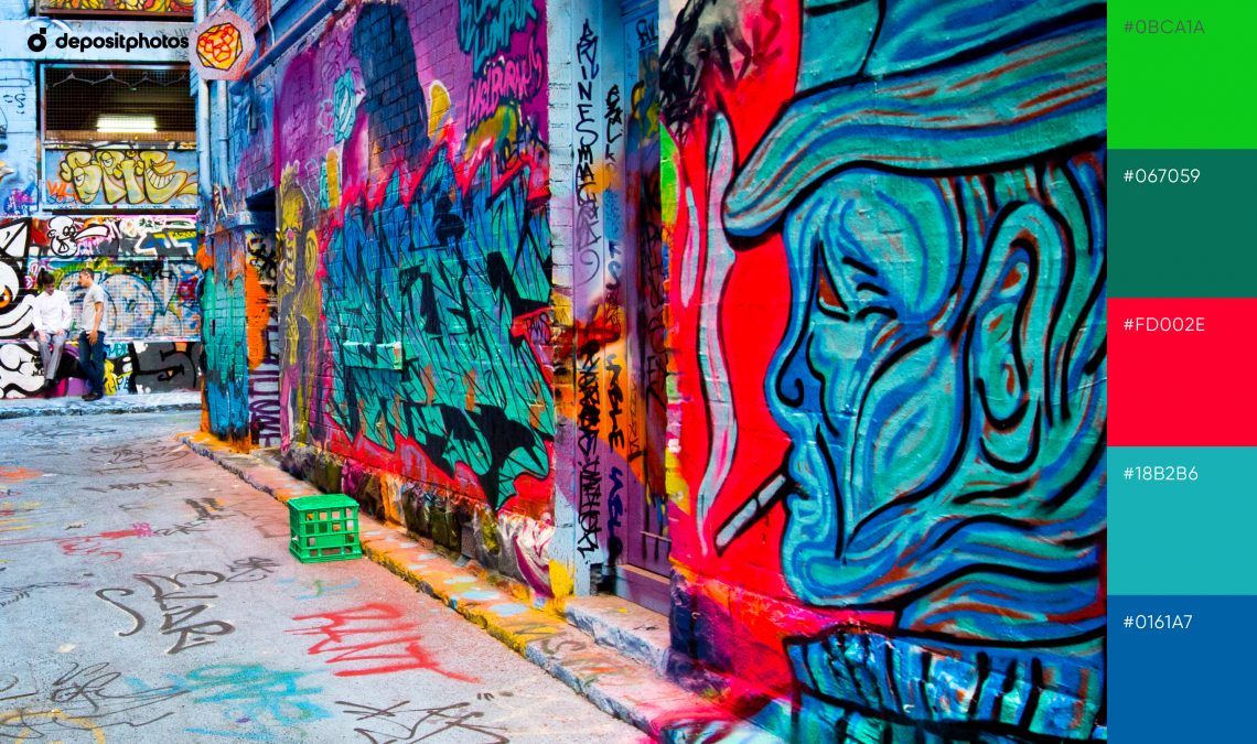
30. Creative Artistry
This color scheme is inspired by the works of street artists. It will help you if you want to make a bold and slightly bizarre impression.
See collection
How to use a neon color palette
The neon color wheel can be used to liven up your designs, attract attention, and wow your audience. However, for the best results, you should consider what purpose each shade serves. Depending on the goal, creatives like you can apply the entire palette to produce eye-catching, provocative, and energizing designs, or use one bright hue as an accent.
If you opt for bold designs, only mix neon shades that complement each other. Neon colors that go together are:
- yellow and purple,
- blue and orange,
- green and purple,
- pink and orange.
Reduce the brightness with a single neon hue for trendy, yet calmer visuals. For example, mix neon pink with white, light blue, or pale pink. Combine bright orange with olive green, brown, burgundy, white, cream, or golden yellow. Electric blue works well with muted shades of blue, white, silver, coral, and orange.
 To get free downloads, click the banner above, switch to «Annual Upfront» subscriptions, and press the «Free 7 Day Trial» button.
Wrapping up
To find even more unconventional color choices, feel free to match warm and cool hues from these neon color palettes. They will help you speak to audiences that are looking for something original and bold, and interest those who are fond of muted shades and soothing designs.
FAQ about neon color schemes
What are the main neon colors?
Neon colors, often known as fluorescent colors, are bright versions of primary and secondary colors, such as red, yellow, green, blue, and purple. They are the main neon shades, along with pink and orange.
What is the color code for neon colors?
Neon colors come in a variety of ultra-bright hues, each with its unique code. Main neon color hex codes are:
- red (#FF3131, #FF5E00),
- yellow (#FFF01F, #FFF01F, #E7EE4F),
- green (#39FF14, #7FFF00, #CCFF00),
- blue (#1F51FF, #0FF0FC),
- purple (#BC13FE, #8A2BE2),
- pink (#FF1493, #FF44CC, #EA00FF).
Which colors go best with neon?
Bright neon colors pair better with calmer tones. The best matches for electric blue are white, silver, coral, orange, and muted shades of blue. Bright orange mixes well with burgundy, brown, white, olive green, cream, and golden yellow. Neon green looks great with different shades of pink, light blue, white, yellow, and teal. Bright yellow is best used with various shades of purple, white, black, gray, and navy blue. Colors that go with neon pink are yellow, cyan, white, light blue, and pale pink. Neon red is paired with gray, mustard yellow, cream, teal, pink, yellow, and subdued red.
Which color is the most eye-catching?
Red and yellow are the most eye-catching colors. The background color also affects how humans perceive the color of the text. For example, yellow writing stands out more against a black background than the same text placed against a white backdrop. Both white and black backgrounds look well with red writing. The combination of yellow and red catches the human eye the most.
