Common Photography Editing Crimes You Might be Committing
Today we get into the cringeworthy, the unspeakable, the much too common (sad but true) editing mistakes both beginner and even some professional photographers make. There’s a common thread amongst all these mistakes which we will cover as we discuss them For now, let’s study what you really shouldn’t be doing with your pictures as to avoid these photography editing crimes once and for all.
First things first – going too far or over-editing photography
Lighting is the most important thing you should be paying attention to when editing. How the lighting illuminates your subject, the balance in the image, the colors. One too many times photographers take it that one step further where images no longer look natural. That’s the dangers we’re speaking of and the crimes we’re referring to.
Know when enough is enough because more often than not, less is more. Your images should be close to perfect in camera. Your editing tool is just a little bit of an extra edge you have to add interest and balance to the shot, making it pleasing to the eye.
1. More contrast is impressive
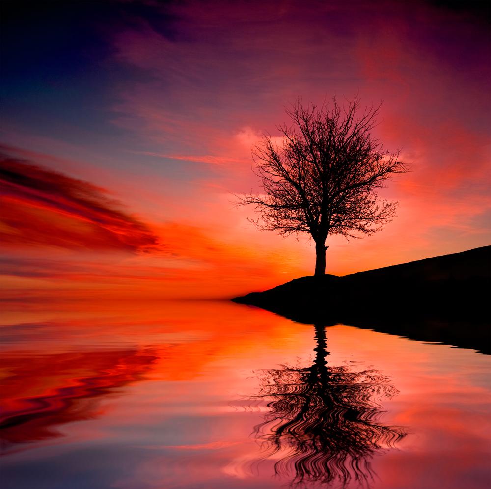
How to say this lightly? Just no. One of the tempting things with photo editing software is to take your images to the next level – aka ‘up that contrast’. Although some contrast can provide a more vivid, lively shot, be careful with the colors in your images. No one is going to praise an image for unnatural colors unless you’re experimenting with computer graphics and the digital arts.
2. Smoothing out skin to robot level
With portraits, editing blemishes and little imperfections with skin is okay. However, when skin editing is overdone, portraits of people start looking robotic, surreal and unless that’s the effect you’re going for (alien), avoid it at all costs. Keep an eye on the original image as you’re editing so as not to stray too far from someone’s natural facial features and little imperfections that make the person unique.
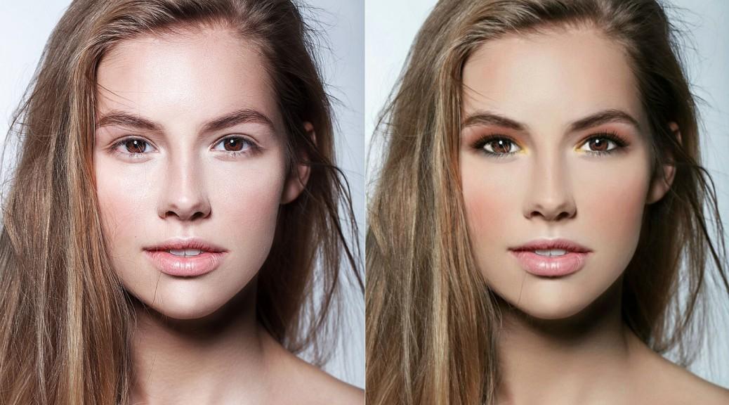
Image credit: BT
3. Cropping
Know where and how your images will be used. Keeping in mind the end result (will it be used for sales, galleries, websites?) because more often than not the best image is the full one or cropped at most 20%. It doesn’t compromise in quality for the sake of the perfect composition and will give your clients more room to creatively crop the image themselves. Clients may not know what’s best, but they should be allowed to make their own mistakes (or masterpieces).

Image credit: WoodWing
4. Forgetting layering
This rookie mistake will take your edited image and ruin it in about 30 moves in Photoshop until there is a point of no return and you have to start over. Ignoring layers can result in amateur looking images. Layering and understanding the necessity of layers for different tasks will one day save you. Spend some time studying the basics and you’ll perfect your skills resulting in more seamless images.
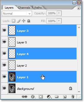
Image credit: Photoshop Essentials
5. Selective color trap
Selective color trap is one of those images where one color stands out in a monochrome shot. You got this image immediately, sometimes it can be kind of refreshing but more often than not it’s quite tacky. It’s safe to say that it’s a dying trend. Instead of focusing on selective colors in your shots, work on that perfect black and white image or fix the colors and lighting in the original color shot.

Image credit: Pinterest
6. Blurring backgrounds in post production
This is another case where your depth of field should be fixed in camera. Slightly blurring parts of the image is okay, but when you set out on the impossible mission to create that blurred background, things can quickly go wrong with photo editing software. This kind of editing makes shots look unnatural but don’t hesitate to try it and see for yourself.
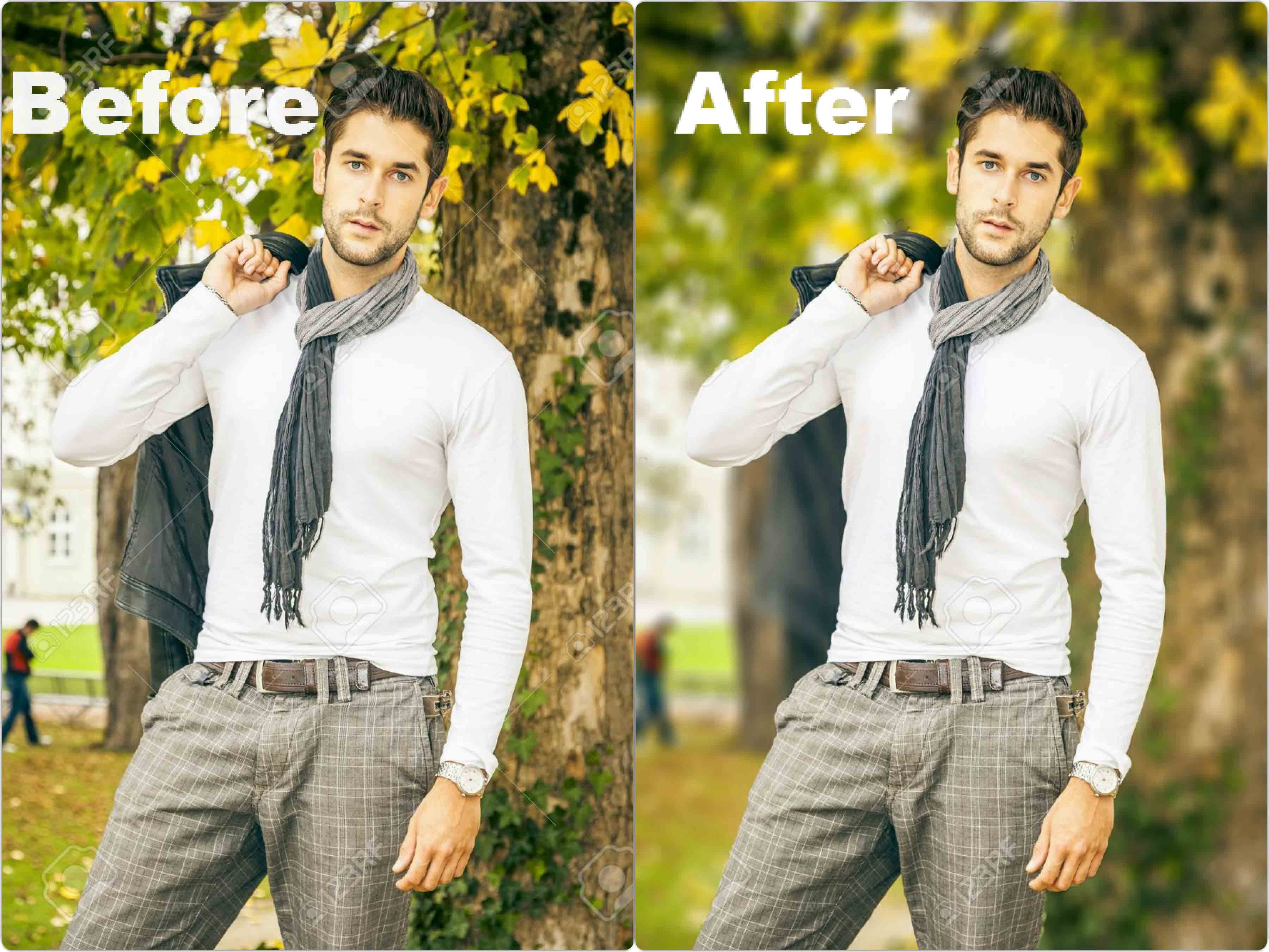
Image credit: The AnimeWorld
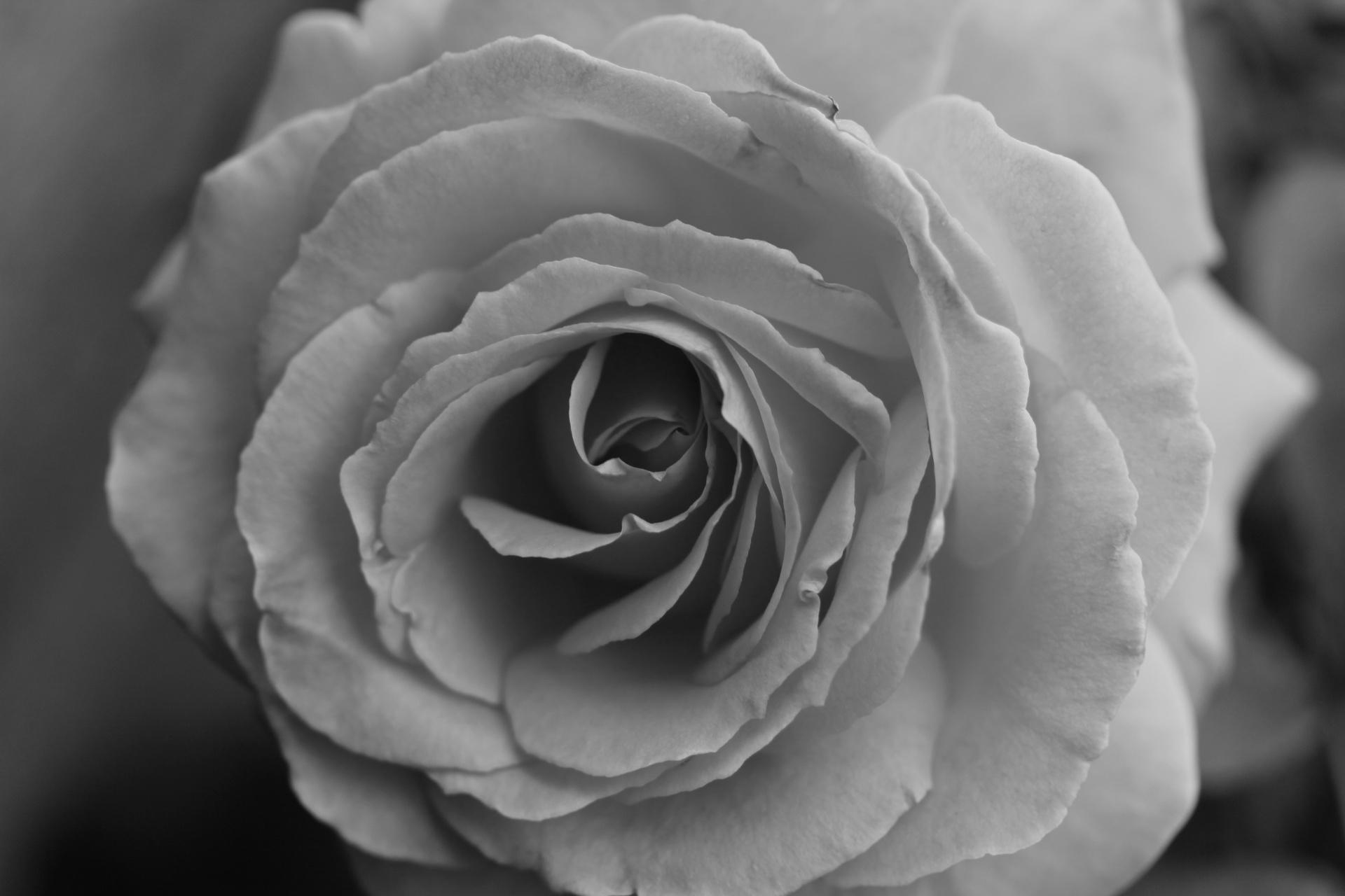
7. Faulty black and white conversion
If you’re a fellow worshiper of the art of black and white, you know too well that it’s tempting to turn an image monochrome and kind of hope for the best with lighting. A common mistake is taking an image that is a bit ‘muddy’, meaning has washed out grey and brown undertones and turn the image grayscale. This creates a dull image and know there’s no salvage. Time to move on.
8. Curves? What are those?
What sometimes happens is that layers and shadows get overlapped, creating blurred colors. Mastering curves takes a lot of practice to understand how curves work and especially different channels to make your picture’s hues as close to realistic colors as possible. This should only be used if something was off with your lighting in the shot.
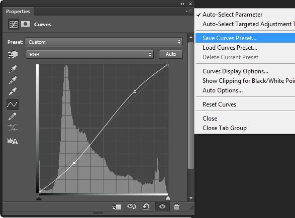
Image credit: Digital Photography School
9. Eyes on the prize
The next popular place to spend about 90% of the time in a portrait is someone’s eyes. Yes, they’re the windows to the soul but there’s no need to make eyes look like a creepy doll on the shelf. Keep things natural. Prioritizing natural beauty and imperfections in general should be more welcome than something that looks ‘picture perfect’.
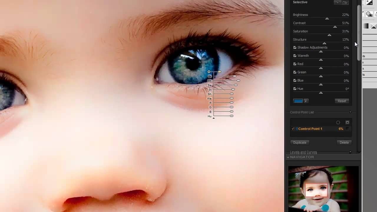
Image credit: Pinterest
10. Teeth like pearls
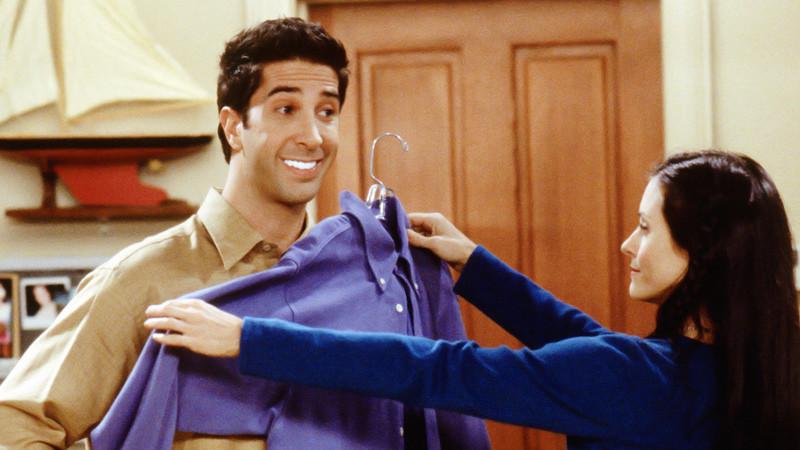
Do you remember that episode in Friends where Ross got his teeth whitened and when the lights were off, he was like the only light source in the room? Yes, well turns out that’s also possible in post production with big smiles and isn’t as aesthetically pleasing as you’d like. But you should really watch the episode to understand.
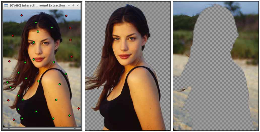
11. One word – extractions
If you weren’t using green screen originally, extractions in post productions will be the death of you. It’s close to impossible to do the same effect, to substitute a different background. This is true for some of the most praised professionals even. Create the photo you want the first time around, not in post production.
12. Too many textures
In photo effects can be tempting, and unless you’re working with graphics meant to be innovative, too many textures can confuse the eye in the final image. It’s also tricky to make textures work together and is best avoided if you’re looking for a clean shot.
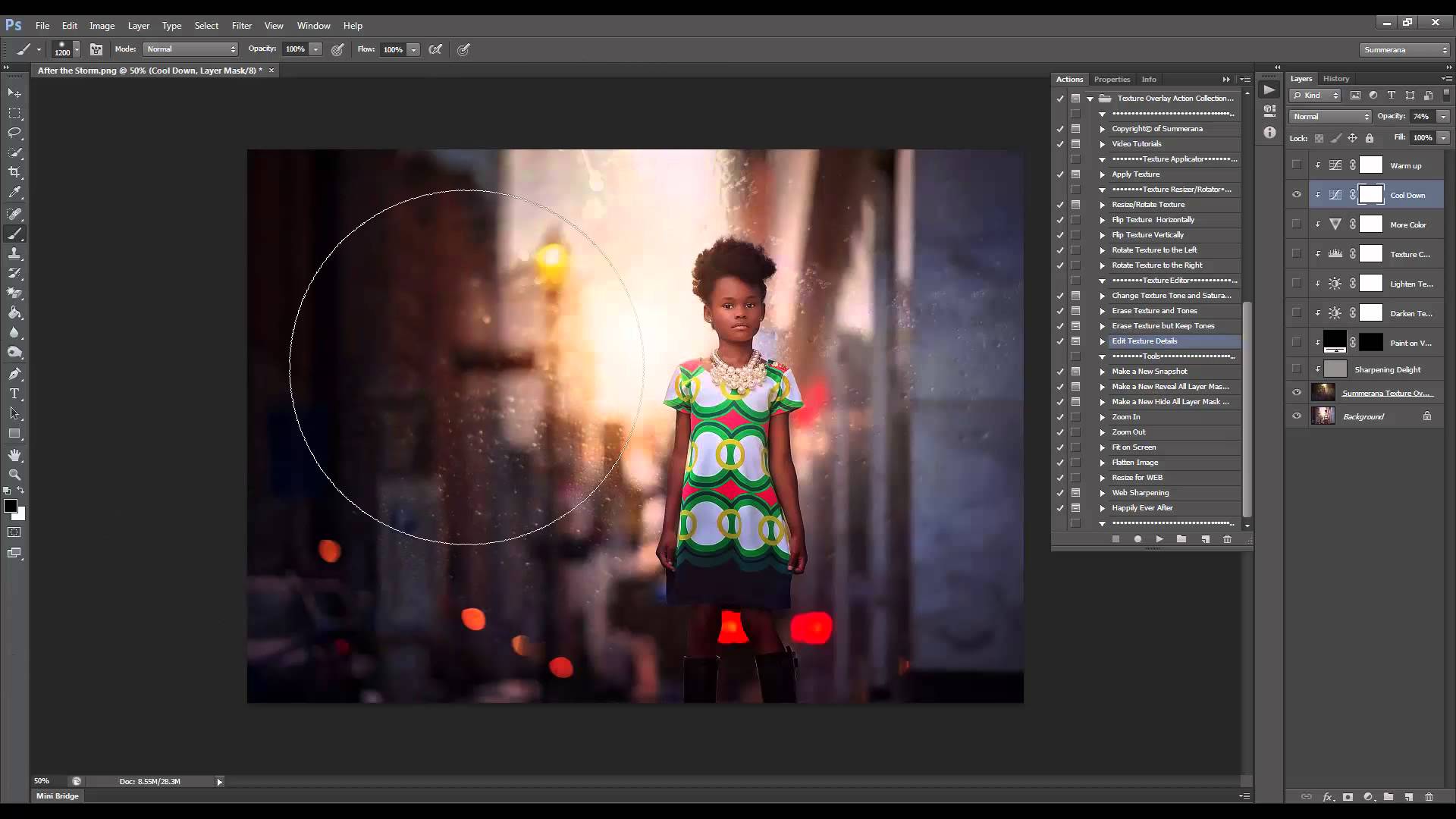
Image credit: Grace Pamela
13. HDR misstep
HDR aims to flatten things to make an image look the way a human eye would perceive it but this is far from the truth. HDR kills natural light, produces harsh color hues and generally makes images look unnatural. There is a time and a place for HDR, and experimenting is fun just maybe not for professional work for clients.

Image credit: G Adventures
14. Sharpening an out of focus image
If you don’t have a shot to work with because it’s blurry, make your peace with it and move on. Sharpening an already blurry image makes for a very painful sight to the human eye, because you can immediately tell the photo is overworked. Big no-no in post production.

Image credit: Alien Skin
In conclusion
The editing program you use – learn it inside out. Some try too hard with their hunt for the next best thing but it compromises in quality, as you have to master a program to be able to produce consistently well-edited shots. Consistency is key at the end of the day. Mastering one tool instead of 20 will help you in this regard.
As an afterthought, a photographer once told me that photography is a whole other language. The beauty of it is that it comes with limitations. Knowing how to work with these limitations is the toughest lesson you’ll learn. On this note, pay attention to how you edit your shots and where you place accents and priorities when the most important thing in a photograph is what you get in camera.
