Rebellious Design: Breaking Brand Identity Rules Like You Mean It
When you think about brand identity, you immediately associate it with logos and brand style guides. In reality, it is so much more than that. It’s your opportunity to stand out from competition, and if you’re interested, break some rules to do it better than everyone else.
Brand identity has a lot to do with influencing consumers. As you read this, remember that even when you’ve set out to break rules, your ideal clients should be your guiding compass. Brand identity influences how they view you and how they differentiate you on the market. With the right attitude and investment into brand identity, you can win over clients by establishing trust. To top it off, a little bit of attitude and innovation in design can go a long way in helping you achieve this.
A potential consumer can glance at your website, leaflet or card and make a split decision – ‘Do I want to engage with this brand?’ This is precisely where design comes in. You can cast a good impression, but ‘picture perfect’ just won’t do. Playing it safe will only get you so far. Let’s dig into the things you can consider that will help you with your brand identity if you’re just starting out or if you’re considering rebranding.
Building brand identity – the basics
We look to notable brands for guidance. Think about how far Apple has come with their brand identity, how solid of a brand LEGO is, how Levis became a household name based on design. Every industry has clear winners, the fuel behind their innovation sheds light on the fact that brand identity is a fluid process. It can be changed, it should be thought about on a daily basis and executed to perfection with room for flexibility if need be.
Building your brand identity should never be taken lightly. It’s not an afterthought because the visual presentation of your company is what will result in new and loyal customers that will want to tell others about you.
Brand identity requires deep thinking. You need to have a sit down with all the key team members to first of all brainstorm on what is your message, what you’re trying to communicate and what you’d like to stand for as a brand. Involving designers is key and if you are one, then you know the next step is to approach brand identity with some rebellion if you want to stand out.
Based on your brand and these ideas we’re discussing, every rule in design is breakable based on your brand characteristics. Next, we’re going to discuss the areas of design that have this kind of flexibility to fit in personality, innovation and some of that rebellious attitude.

Image credit: Airbnb
Color treatment
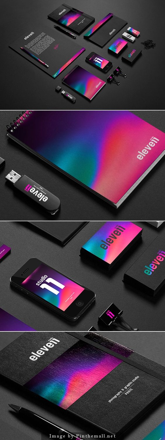
One of the first design decisions is likely going to be your color palette (after the message and tagline development). Breaking the color choice rules can be both good and bad. You have a tough choice to make with color in terms of fitting in with the industry. Do you go against the grain with unexpected colors drastically different from all your competition? The answer should be yes. We’re not talking about psychedelic visions here, but you should give some creative freedom and flight into a color palette that is complementary yet unexpected.

Image credit: pinthemall
Layout
With layout, consistency and repetition is key if you want to be remembered. We talked about some design trends this year, and although it was about website design, some things stay true for other types of design. Asymmetry and new formats are more than welcome in 2018, and layout is another place where you can go against the grain and push for innovation.

Image credit: Gabriel M. Ramos
Taglines
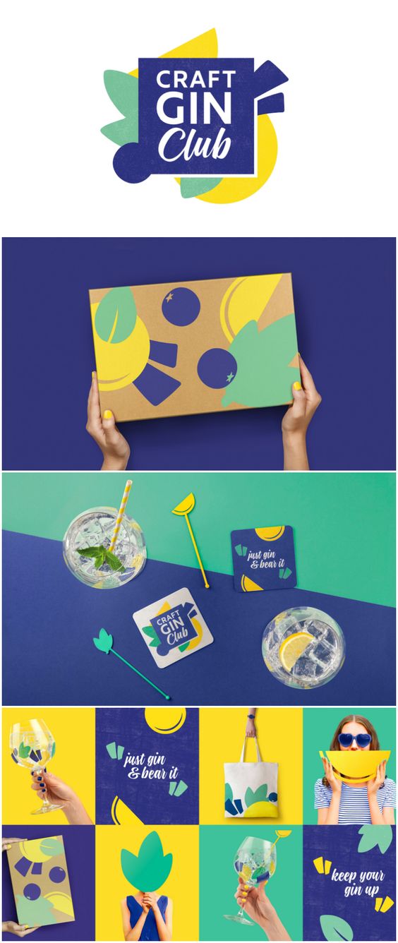
It may be hard to draw a parallel to design when we think about taglines, but consider that the words you use as part of your design are also a piece of the attitude and vibe you’re giving off. The copy and the design go hand in hand to achieve this task. Does your gagline need to be wordy or can it be one word that’s the ‘punchline’? It’s key to how you will be remembered. If your brand’s tagline is informal as is the message, you have even more room to experiment with the design that compliments the copy.

Image credit: worldpackagingdesign
Remember to respect the rules as you’re breaking them
Something that perhaps isn’t said enough times with materials that cover rebellious design is that you have to know the rules by heart to break them otherwise it borders on actual mistakes and a design disaster.
Like with other fields of art and design, you have to know the rules by heart to know where you can bend them a little. It is this kind of knowledge that can empower you to push boundaries. Many great artists have succeeded based on this premise – knowing the rules perfectly which helped with innovation when thinking outside the box.
Breaking rules actually requires setting new rules as well
As contradictory as it is, you want to avoid a hot mess so setting some boundaries is essential. The last thing you want is chaos. Your rebellious design has to live and breathe consistency and communicate a sense of control.
That’s something that designers know to be too true – the value of consistency. Without consistency, the message can get lost in the noise which defeats the purpose of being innovative with your design. The consistency in your design has to reassure your message to keep it strong.
Being the rebel you are, you need rules to play these kinds of games. You have to have a clear understanding what the classic rules our, just how you’re going to break them and what new rules you’re establishing with your design. It’s about clear communication. Anything beyond that is counterproductive.

Image credit: Webneel
The fear of pushing it too far
One of the last points to cover is that you need to maintain your control in designing brand identity materials. You can quickly weaken your integrity by combatting to break too many rules. You’re investing a lot of time and good money into building your brand identity so build it to last.
The more rules you break and the more areas you take on to do so, the more risk of an actual disaster. Rebellious design has to be clever and witty so remember that as you’re smirking at how clever you are with a design that’s different. Breaking one rule is fun, two is adventurous and three might be pushing things too far.
Bottom line – what will work for your brand?
Breaking design rules with brand identity still has to consider many things about your brand, the message and the vibe. You need a good understanding of what you’re trying to achieve and what means you’re using to subtly communicate those messages.
You might find some brands that are already getting on top of this, being innovative with their designs. Don’t get trapped in the mindset that you should do something similar. That’s not the definition of a rebel, is it? Best of luck, and share your thoughts on the creative process with building a brand identity with us!


