How to Promote Your Content Using Animated Designs
Animation is a simple and fun way to attract your audience’s attention as they scroll through their social media feeds – it can be silly and lighthearted, bringing entertainment value to your post or ad. Unlike traditional video, animation is inexpensive and requires little to no original video content to showcase said product or service, so that’s another upside of using animated designs to market your product or service.
Let’s look how you can create animated designs to promote your content using pre-designed templates from Depositphoto’s graphic design tool Crello. The platform has just launched a set of advanced animated editing tools, including two new animated formats – Full HD Video (1920 by 1080 pixels) and Facebook Video Cover (851 by 315 pixels). The third available animated format is a square Animated Post (1080 by 1080 pixels).
Trust us, your event announcement will look that much cooler in an animated format:

Selecting the format
Before you get started with your design, go to Crello All Formats page and choose one of the three available animated formats most suitable for your post or ad. I chose a Full HD Video format pictured on the top left here:
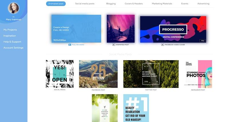
After choosing your design format, you are taken to Crello’s editing suite, where you can browse hundreds of available animated templates and select the one to use for your design:
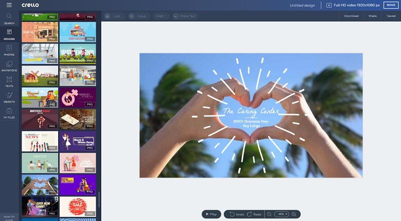
Editing the template
You can customize the text within your design, add additional text fields or remove default ones, remove or add animated elements, change the background or include static graphic elements.
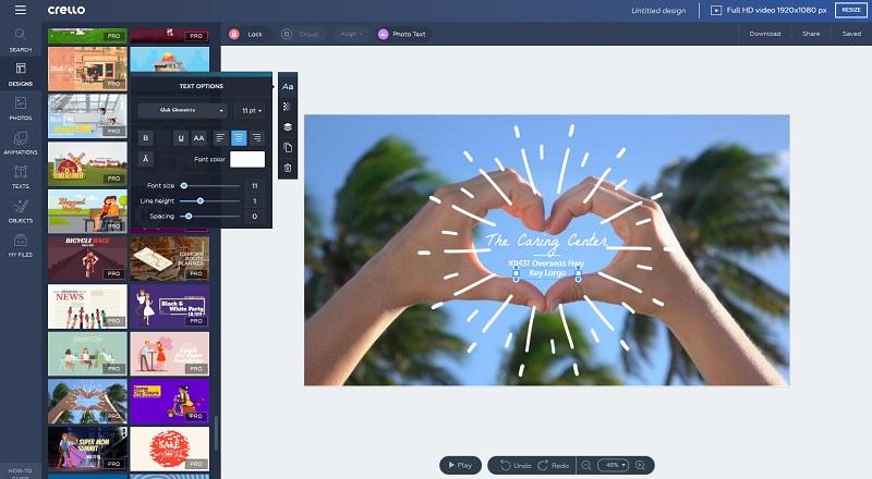
With this cute template, let’s change the custom template font to Knewave:
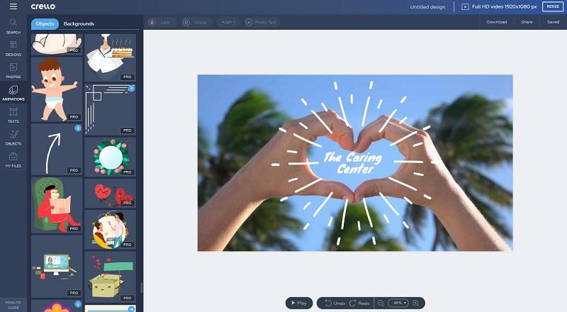
Next, let’s head on to the Animations section and select an animated object to highlight our design:
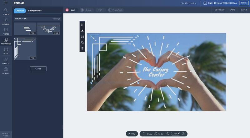
We chose the animated corner – resizing it to fit the design and duplicating to create a visual frame for our design with four identical objects:
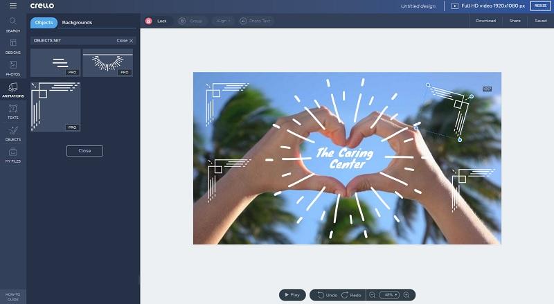
Now, let’s align all the corners to make sure our design is symmetrical:
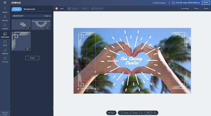
Next, we can upload own images to the design (convenient if you want to add, say, a logo), move elements between layers to put some items in front of the others, add other animated objects, or use stock photos to enhance the design as a background or an illustration.
We’ve decided to enhance the visual with some extra loving:
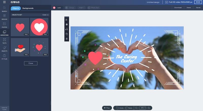
This animated heart will look even better if duplicated to place on both sides of our design:

Saving your design
After you are done editing the template and are happy with the result, you can either keep the saved project in My Projects folder (or move it to a suitable one within Crello interface), download the .mp4 file with the design or share it. Let’s try downloading the file:
Psst, here’s a quick pro tip: instead of choosing the Download option, you can press the one right next to it – Share – and post your design directly to Facebook:
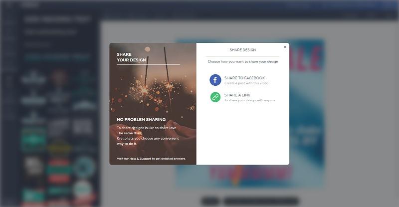
And here’s our end result:
Finding ideas
Now that we’ve looked at the technical side of producing animated designs, time to think of conceptual ways animation can help you lift up your content and promote it online!
Animation is a very memorable tool because it can help visualize complex concepts in a simple, dressed-down way. It commands attention which makes it great for teasers, announcements, headers, and covers. Brands like to use animation for its lighthearted, unsophisticated tone that’s so appropriate on social media where people don’t just do business but seek entertainment, connection and fun.
The very first bit of advice on incorporating animation in your content promotion would be, of course, to have a individualized content plan and see where animation fits best. Some ideas we can toss your way include:
- using animation as an illustration for your CTA in emails,
- creating announcements and ads to run on various social media platforms,
- dropping some animated hints and teases about upcoming content or events,
- hyping up a gallery of images from your latest shoot by creating an animated cover for a gallery of photos you are uploading,
- posting an animated Instagram Story linking to your content, for business profiles.
By the way, CTA is not the only way to use animation in an email – produce themed messages for your contact list and send themed animation, making it your signature move. You can use Facebook Video Cover format to create animated email headers.
As animated designs are entertaining by default, add educational, how-to or discount value to your image by including useful information, instructions, promo codes or discount information.

