10 Tips on How to Choose a Color for Your Logo
Choosing a color palette is one of the most important decisions in the process of developing visual aesthetics for your brand. The right color choices can emphasise the advantages of your business and help attract the desired audience, while an unsuccessful color palette choice can results in the opposite effect.
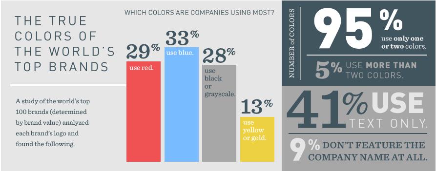
According to the psychology of color, colors determine our emotions and behavior. For example, yellow is the color of joy (because the sun is bright and yellow), and green has a calming effect (imagine laying around on a lawn and looking at the green tree tops). The question is, do these ‘rules’ work for logos?
Having studied this topic, researches Lauren Labrecque and George Milne came to the conclusion that in relation to logos, only some of the color connotations work. It’s true, the color yellow will give your brand an aura of freshness and availability, but a green logo won’t convince buyers that tranquility is a characteristic of your company. So it turns out that to choose the correct color palette for your logo, it’s necessary to study a number of scientific works?
Not at all! We did it for you, introducing below – 10 tips from the logo blog Logowiks that will help you choose a color for your logo.
What is your brand associated with?
No one knows your brand (the strong sides and goals) better than you. While choosing your color palette, think about the message that your business needs to communicate.
First of all, think about the individual characteristics of your brand. Which advantages do you want to emphasize? Speed, bold innovations, efficiency, compassion, intuition? Some researches show that, for example, shades of blue emphasize competence, and red – courage and energy. It’s therefore obvious that a company that helps the elderly and a manufacturing company for automobile parts will choose different color palettes for their logo. To choose the right color, here’s a way for you to get familiar with the value and meaning of every color.
What do the different colors mean?
If you want your logo to be associated with a specific feeling and emotion, you have to understand the influence of each color on a person’s perception.

A universal symbol of distress, passion and anger. If it’s relevant to call your brand bold, light, modern or youthful, than red is definitely your color. If your brand is more classic and serious, you should consider other options.

It’s the color that fills one with energy and focuses on cheerful harmony. Do you want to stand out from the other companies? Then don’t hesitate and choose orange. Orange is used more rarely than red, but doesn’t diminish the energetic saturation.

A sunny and friendly color, thanks to which your brand will radiate energy. It would be a tough logo color not to notice!

You can’t really call green ‘universal’. It has a limited number of connotations. Nevertheless, this color can evoke very strong associations. If you’re in the business of finances or gardening, definitely consider a green color palette.

Blue is considered king amongst all the colors. You will notice more than half of all logos out there are blue. Blue symbolizes trust and maturity; rest assured that a company with an icon in a shade of blue will be taken seriously.

Purple is the most magnificent color of the rainbow. Purple looks both modern and reserved. This color is also associate with femininity.

With a brown icon, your brand will translate courage and seriousness. As brown is rarely used, you’ll definitely stand out amongst other companies.

Do you want your brand to look stylish, modern and elegant? Choose black, you really can’t go wrong with this color. However, if you want to translate something more ‘budget’ and availability, stray away from black.

The absence of color. White symbolises youthfulness but at the same time will fit almost any brand. As it is a neutral color, you can use it as a secondary shade.
You don’t have to use just one color!
Remember that your choice isn’t limited to just one color. Using several colors is an excellent way to emphasize the wide range of your products or services (like Ebay for example). Using 2 or 3 colors, you can point out the unique qualities of your brand.
The Coors logo is a goldish, brown color (it’s not only the color of beer, but also a combination of courageous brown and inviting yellow) which is combined with a more serious, blue color for the font.

It’s the perfect combination for their target audience. Don’t be afraid to experiment when choosing your color palette. Check which combinations work for you and which don’t. “It’s about the feeling, mood, and image that your brand creates. This is what plays a big role in persuasion, so colors come into play when they can be utilized to match your brand’s desired personality” – says Matthew Roda in his article on color psychology.
Decipher the language of color
If your brand has international coverage, you should think about the symbolic value of your chosen colors and how they’re perceived in different cultures. For example, in many of the western cultures, the color white is traditionally considered a symbol of purity, but in the eyes of some eastern cultures, it’s associated with death. Therefore, if you want to create a really great logo, definitely do your research about the different associations with the different colors.
Try to stand out amongst competitors
The essence of a quality logo lies in brand recognition. If you want to stand out from other companies, do make sure that your chosen color palette is obviously very different from the color palettes of your main competitors. Even though Ford’s well known blue oval is more than a hundred years old, it remains a symbol of reliability and is instantly recognized by an audience.

Let’s also take a look at another oval logo of a car manufacturing company – Land Rover.
With the help of a green color palette, the brand highlights that their cars are down for any adventure, including tough routes.

Use visuals with double meanings
A perfect examples of this tactic is the WinePlace logo.
Some of my favourite icons demonstrate an interesting design trick which I like to call ‘double entendre’. In other words, these logos beautifully combine two images, translating an interesting concept or idea.

This logo illustrates a pin, which indicates the location but it also looks like a turned over wine glass. Logos like this one have an interesting look and are easy to remember. An audience will appreciate these types of logos with dual meanings.
In one of my previous posts, there are 50 logos similar to this one. If you’re as passionate as I am, and you find this topic of interest, do have a scroll!
Avoid cliches
Every few years, there are new trends in logo design. I like to investigate into all the new trends, and even advise my readers to stick to certain trends to ‘keep with the times’. But what I personally dislike is when the same idea is repeated in many different logos.
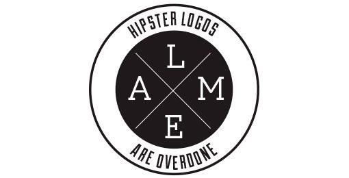
The above type of logo has been around long enough to be annoying. Why not come up with a unique design on your own instead of copying others? Below are examples of similar logos in terms of colors and design.
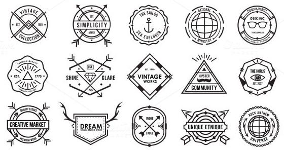
Cliche logo design has it’s own separate article. Do get familiar with it if you don’t want to have a boring logo on your hands.
The simpler, the better
Remember the golden rule: the simpler, the better. It’s simple logos that are also interesting that end up the boldest and stand the hands of time.
Let’s take a look at Nike’s logo. It might seem that a simple check isn’t anything special or memorable.
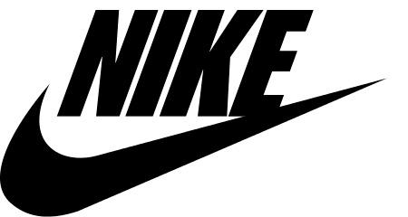
In reality, the logo looks great on different objects – sneakers, sportswear, etc. Therefore using one color can sometimes be a winning decision. Besides, remember that if your logo has several colors it might not look as good in a smaller size (as on a business card for example).
Use negative space
Aside from dual meanings, there’s another design tactic that works really well. This tactic involves the deliberate use of negative space. A classic example is FedEx’s logo which conceals an arrow.
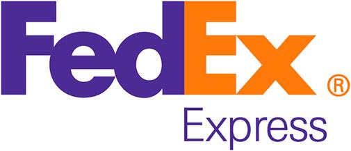
Can’t see it? Look closer! I really like the subtle use of negative space in their logo. Even though inhabitants of the US often see the FedEx logo on passing by trucks, not many know about the hidden arrow!
Use these tools to choose your color palette
Luckily, you don’t need to manually pick colors for your logo because there are many special tools which will help you make the choice in a matter of minutes. We chose 10 of the most useful (in our opinion) services.
Logomak
Choose colors and fonts for a logo in just a few minutes! Choose your branch and specify what associations your logo has to create! According to developers, Logomak has analyzed logos which are used by leading companies in various fields.
On the basis of results from Logomak, it has some of the most clever algorithms which help you pick the perfect combination of colors and fonts for a very accurate representation of your brand’s character.
COLOURlovers
COLOURlovers is not just a service for creating color palettes. It’s a platform where users can discuss relevant topics and read interesting articles about color.
ColoRotate
The ColoRotate service can boast about their interesting interface and working with it is a sheer pleasure. The color palettes are available as a 3D image and in real time.
Color Scheme Designer
Color Scheme Designer has only recently switched to a new interface and new algorithms for creating color schemes.
Copaso
Capaso is an instrument for creating palettes from COLOURlovers. Thanks to the wide choice of functions, you can save colors in a notepad, use colors from photographs and even share your palette with other users.
Color Blender
Pick a color and Color Blender will generate 6 color palettes based on your choice. Choose any shade from the palette and alter it as you’d like.
Color Wizard
Pick the main color and Color Wizard will create color schemes based on the supplementing color, find supplementing colors, similar colors and other variations.
Color Explorer
Color Explorer is a new instrument for creating color palettes with a well organized collection of useful functions.
That’s it! I hope these tips will come in handy and be of use to use. If you have any questions, lets chat in the comments section below!
