10 Impeccable Projects From 2017 Red Dot Awards
Looking for design inspiration? Red Dot Design Award is all about ideas, innovation and simply great design. Every year, designers submit their work to the prestigious awards. Red Dot Award is an international product design and communication design competition that gives out quality marks to the best submitted designs in their respective fields.
Due to the diversity in the field of design, the awards have 3 categories: Red Dot Award: Product Design, Red Dot Award: Communication Design and Red Dot Award: Design Concept. Every year, products and projects are judged by the Red Dot jury. Red Dot Award tracks trends and awards some of the most creative and innovative designs from around the world.
The awards and winners are many, as there are 749 winners from 8,500 submissions from 50 countries. We picked out 10 projects and designs from across different categories in the ‘Communication Design’ section that are outstanding and truly impeccable.
1. Gemini 2 – The Duplicate Finder
Category: Interface and User Experience
Gemini 2 received an award in UI design in the Communication Design category, which marked the first win for macOS apps on Red Dot. Gemini 2 is an application that finds duplicate files on your Mac and helps you free up space by deleting them. The application design is very minimalistic, making the app easy to use and fun.
2. Media Violence
Category: Illustrations
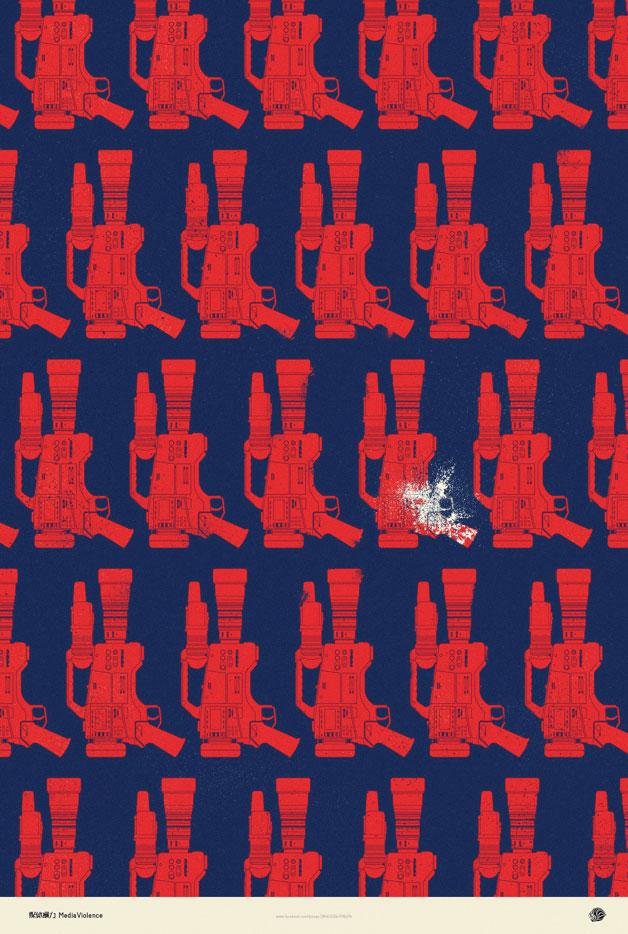
A bold, impactful and subtle poster series entitled “Media Violence” sends a very loud message using altered illustrations. The ethics of contemporary journalism is in question, as well as the role of journalists in today’s world. The series communicates that companies alter news in order to benefit their goals and receive dramatic responses. With tools of journalism turned into weapons, one is left to question whether things we hear and read in the news truly reflects the objectivity journalists strive for.
3. Guiding Zodiac Old Tree Tea
Category: Packaging Design
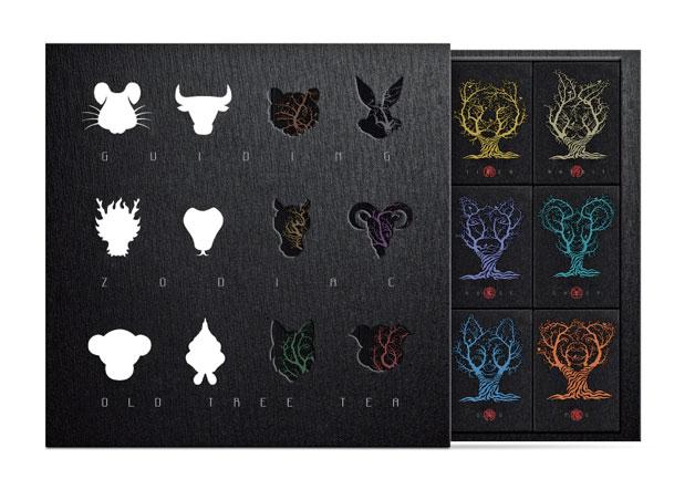
Tea has always had a strong influence on Chinese cuisine culture. This particular packaging design brings together cultural symbols (the Yunnan tea tree) with Chinese zodiac signs. The design itself is fascinating because the silhouettes of the animal heads appear to be colored designs but as one pulls out the box, the silhouettes merge with the ancient tea trees. The clever design, technology and aesthetics come together in a very sophisticated combination truly worthy of praise.
4. Open Air Cinema National Museum
Category: Posters
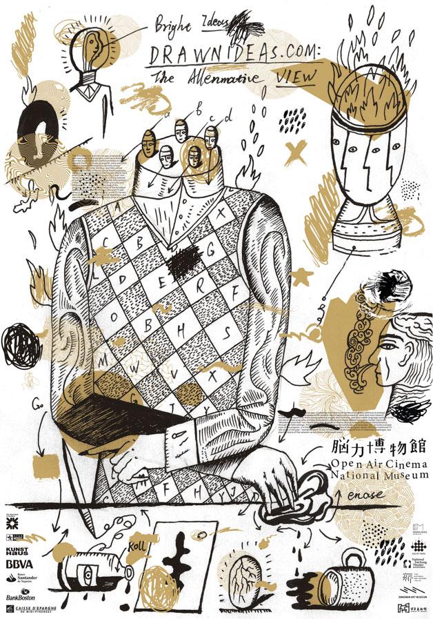
This design seems to illustrate that state of mind familiar to everyone when bizarre ideas continue to swarm around in your head. The drawings in the poster explore the process of taking in information. The artistic strokes in this design show ideas on paper, and how elaborate our thought processes can be. Thinking too much is something we’re all engulfed by and this design beautifully captures the idea.
5. The Mystery of Victim Blaming
Category: Social Responsibility
This short animated film was inspired by real events that happened in Taiwan in 2015. It deals with the very real phenomenon of ‘victim blaming’. Symbolic images are used to illustrate a hard topic to tackle, explaining the human motivations behind certain behavior. The film sheds light on how victims feel receiving blame for something out of their control. It’s a beautiful design for a short film, leaving an impression and talking about something that often is silenced.
6. FEEDitBAG
Category: Social Responsibility
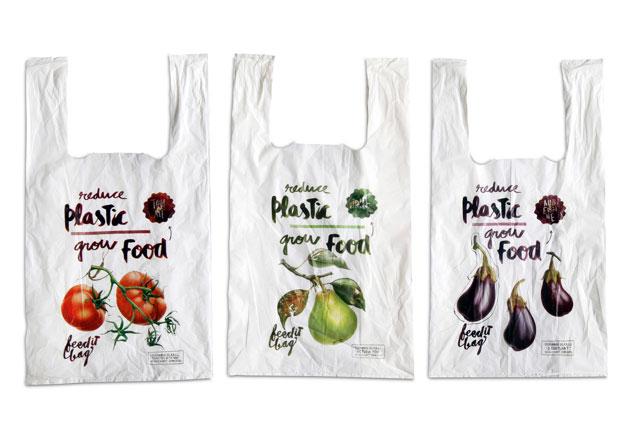
Raising awareness about plastic waste requires creativity, and FEEDitBAG is a clever idea that puts a new spin on things. Instead of opting for the thin plastic bags at supermarkets, this bag offers a degradable bag that also holds seeds. The bag decomposes with other organic waste but also sprouts seeds after a few weeks. Beautiful illustrations contribute to the excellency of the design and also spreads a very powerful message, urging everyone to be more conscious about waste.
7. Hyundai Sound Branding
Category: Sound Design
Hyundai’s new sound branding is based on a sound concept that compliments the visual identity of the brand. It’s memorable, catchy and symbolic. It’s about a positive outlook on the future, using welcoming and warming sounds. It’s quickly evident that Hyundai went beyond generic sound logos to create something memorable and outstanding by design.
8. Eurovision Song Contest 2017
Category: Corporate Design & Identity
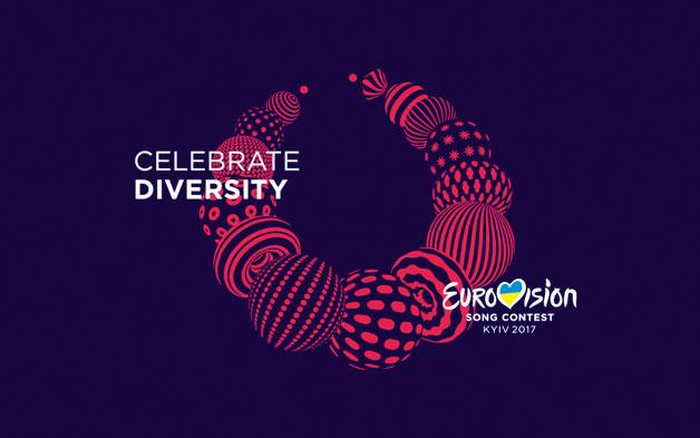
The jury found the idea of Eurovision’s Song Contest design powerful and outstanding. To capture diversity in an illustration is not an easy task. Using a traditional Ukrainian necklace as a symbol of visual identity, the design itself stands for individuality of all the participating countries, artists and individuals. The design also brings together the spirit of the Eurovision competition, with the idea of “Uniting Europe, bead by bead.”
9. TITANIC
Category: Spatial Communication

Highlighting a great disaster from the past, this exhibition evokes an emotional response from viewers. Visual elements play together to translate an experience and emotion that is truly submersing. The lighting of the exhibition and the grand scale at which the design is executed becomes a very grasping, and impactful visual experience.
10. 3M Forever Sticking Billboards
Category: Typography
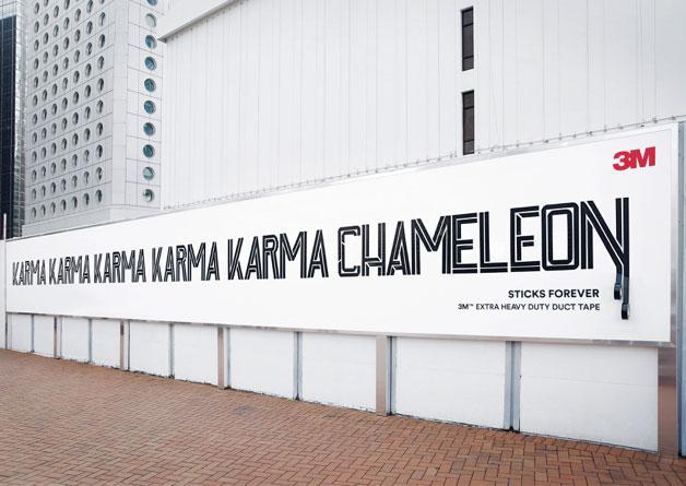
The billboard campaign “Sticks Forever – 3M Extra Heavy Duty Duct Tape” toys with different ideas, introducing a fascinating way of communication. The new typeface is quite attention grabbing, playing on the nature of ‘adhesiveness’ or the ‘catchy’ element of songs to illustrate equally catchy messages. It’s an example of a simple idea and excellent design that might just ‘stick forever’.
