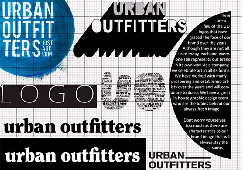
Brand Style Guide Done Right: Key Rules of Consistency + 10 Examples
Think of world-renowned brands like Google, Netflix, or Coca Cola. It will likely take you seconds to recognize them. Why? Probably because their visuals, colors, and messaging are so incomparable and consistent that they’re hard to forget.
Today’s world of business requires having a unique brand identity to stand out among competition and truly connect with your audience. A strong, cohesive brand doesn’t just boost recognition—it builds trust and loyalty, which are key to long-term success. One foolproof way to keep your brand consistent across all communications is by creating a solid brand style guide.
In this article, we’ll explore the definition of brand guidelines, break down what goes into a rock-solid style guide, and highlight examples from some of the world’s most successful brands. All to inspire your own creative projects and help you build a brand that is easy to remember.
What is a brand style guide?
A brand style guide, sometimes called a brand book or brand manual, is like a rulebook for your brand’s visual and communicative elements. It’s the go-to resource for anyone interacting with your brand, as it covers everything from how to use your logo and color schemes to typography and tone of voice.
Brand style guides are a big deal for a few reasons. First, they help create a unified image, which is crucial for brand recognition and consistency. They also save time and resources by providing clear guidelines. Plus, a well-crafted style guide ensures that all brand-related materials, whether produced in-house or by external agencies, stay aligned with your brand’s core identity and values.
If you’re working on a complex product and have several creative teams up your sleeve, you might find it easier to organize processes in these teams around their own guides: Copy Guide, Design Guide, Media or Press Kit, and other style guides. For example, Apple has different guides, depending on what you’re working with: Apple Style Guide, Developer Guide, and Design Guide.
The key to building a consistent product or service is to tie all these guides together with the help of one Brand Guide, which usually states high-level ideas, mission and promise, core beliefs and values, key audiences, etc.
Building blocks of a brand style guide
A comprehensive brand style guide usually includes these key components:
Brand Overview
Start with an introduction to your brand—its mission, vision, and values. This sets the tone for the entire guide and helps everyone understand your brand’s core principles.
Logo Guidelines
Here, you need to provide detailed instructions on how to use your logo, including acceptable variations, spacing, and placement. To keep your logo looking sharp, include examples of what not to do in this section.
Color Palette
This part of your guidelines should showcase a well-defined set of primary and secondary colors that represent your brand. Include color codes like HEX, RGB, and CMYK to ensure consistency across digital and print media.
Typography
The typography section usually provides guidelines for the fonts you use in all brand communications. Here, you should be able to find details on the specific fonts, sizes, and styles for different types of content, like headings, subheadings, and body text.
Imagery and Graphics
You might tie this part to your logo guidelines or make it a separate section in your style guide, if you have a lot to point out about your visual communication. Include instructions on the style of images, illustrations, icons, and graphics that align with your brand. This can include guidelines on photo processing, styles, and common do’s and don’ts.
Looking for top-quality images, vectors, and sounds for your branding? You’re in the right place! Check out our library of 300+ million licensed files. Download as many as you need, or text us to get a custom solution for your creative needs.
Tone of Voice
Provide guidance on the brand’s communication style, including preferred languages, writing rules, and key messaging points. If your business is working with people from all over the world, make sure to add specifics on cultural peculiarities of your audience and sensitive topics to avoid. This ensures that all written content reflects the brand’s personality and values.
Examples of use
Add real-life examples of how to apply your brand guidelines in various contexts, such as website design, advertisements, social media posts, and packaging.
Additional Elements
Depending on the complexity of your brand, this section can include guidelines on animation, sound, video, and other multimedia elements that are part of your brand’s identity.
The key rule in creating a working style guide—don’t be lazy! Mention everything that’s important to know when working with your brand. The good thing is, you need to be scrupulous just once, and then you can be consistent for good (or at least until your brand needs a revamp).
10 examples of inspiring brand style guides
Now, let’s look at brand style guides of the world’s greatest brands and see how their key branding components come together for the ultimate consistency.
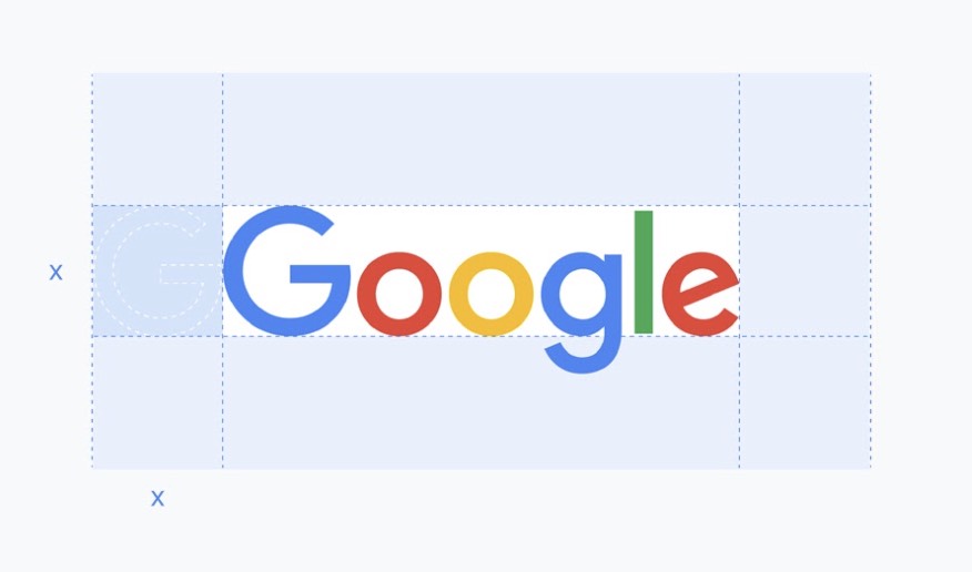
Google’s Brand Resource Center is a detailed guide created to ensure consistent and proper use of Google’s brand assets. It includes general guidance on which Google brand elements you can use and whether you need permission, how and when you can use a specific Google product or service brand in your work, and answers to all your brand-related questions. This is a great example of a mature and detailed style guide. What’s interesting, Google starts their guidance with don’ts, and only then shows us the do’s.
Bolt
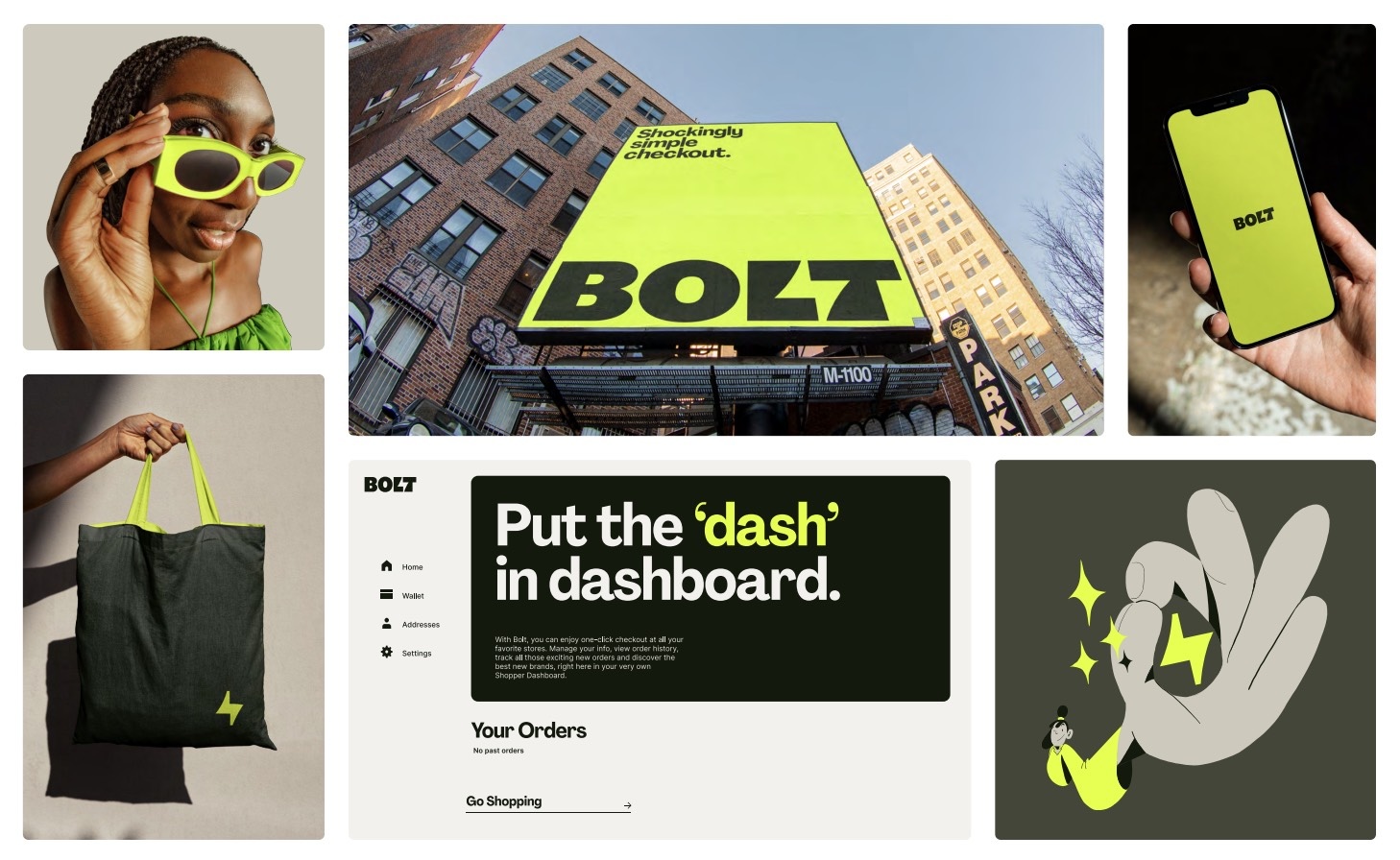
Bolt’s brand guidelines are designed to convey simplicity and speed, aligning with the brand’s focus on efficient urban mobility solutions. The guide includes clear instructions on the use of their logos, color scheme, and typography to maintain a consistent and recognizable brand identity. Check out how they wrap a complex idea in a seemingly simple logo:
The lightning shape in the logo supports our lightning quick product offering while the solid, capital forms of the letters are reflective of our unending trustworthiness.
Deezer
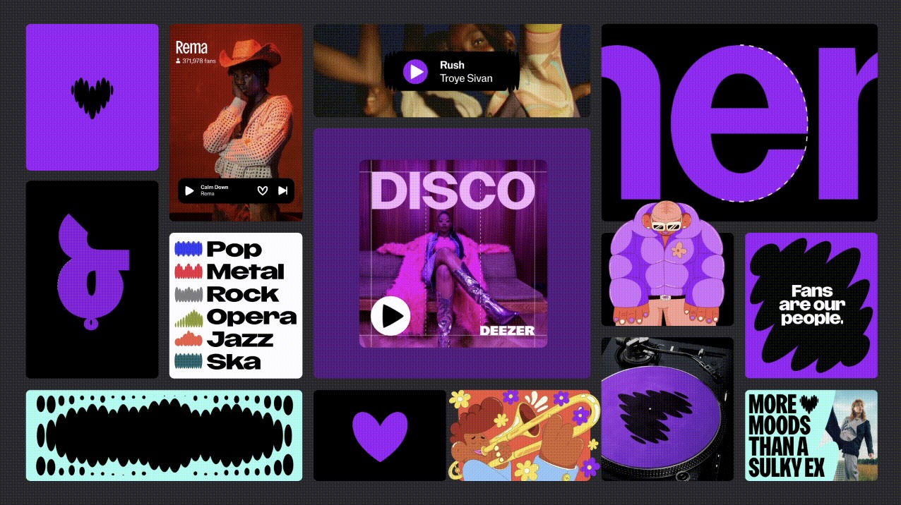
“Live the music” because “music is the beating heart of life” and “there’s more to music than streaming”. Don’t these ideas strike you right away? This is what Deezer is trying to communicate as a brand, and we think they’re nailing it!
Deezer’s brand guide provides detailed instructions on how to use their visual and verbal identity. It includes the usual guidelines on logo usage, color palettes, typography, and imagery, ensuring that all brand communications reflect Deezer’s dynamic and vibrant personality.
Formula 1
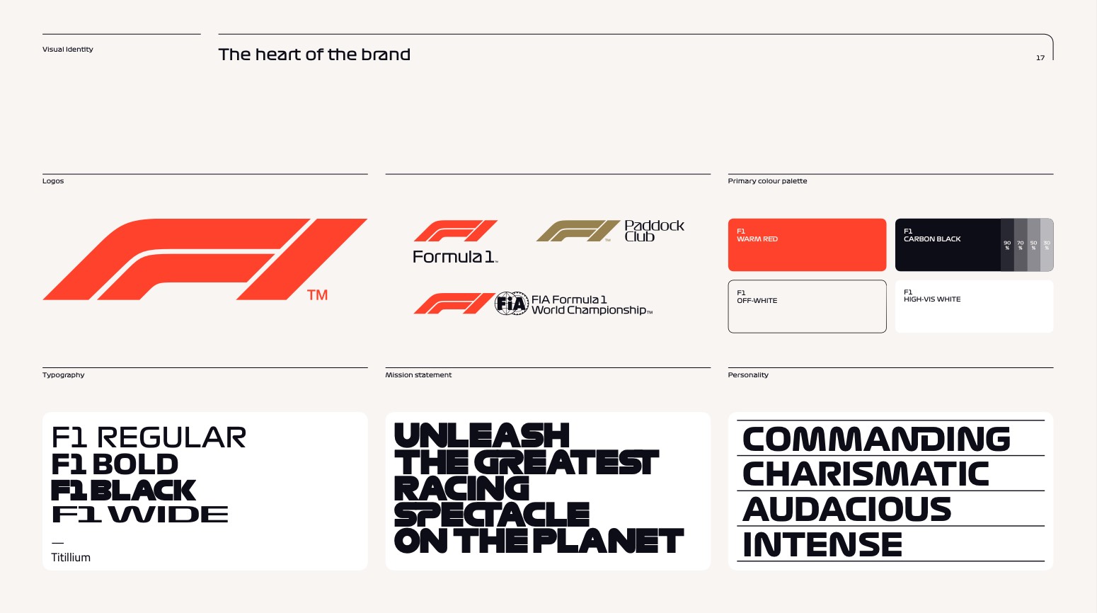
Formula 1’s brand guidelines focus on conveying the excitement and prestige of the sport. The guide includes their story and key staples of their visual identity. Being one of the most detailed brand guides we’ve seen (like Apple’s or Google’s), F1’s instructions include rules on the use of logos, colors, typography, grids, and graphic patterns, so that all brand materials capture the high-energy and elite nature of Formula 1 racing.
Formula 1 as it should be. Coming at you full-tilt, packed with grit, speed, breathless drama and glamorous fun.
Bang & Olufsen
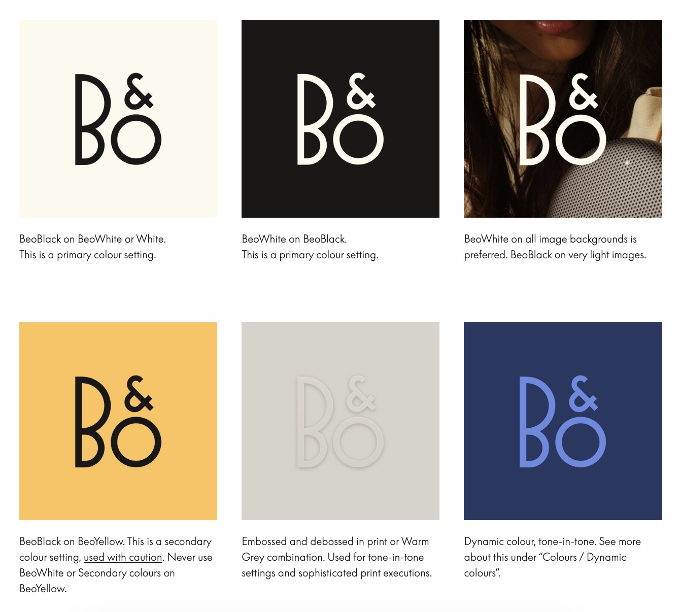
Bang & Olufsen’s brand guidelines are meticulously crafted to reflect the brand’s commitment to luxury and high-quality audio products. The guide covers brand and visual identity (logos, typography colors, imagery, patterns, and iconography), print and digital application, and product assets for a stable brand presence.
McDonald’s
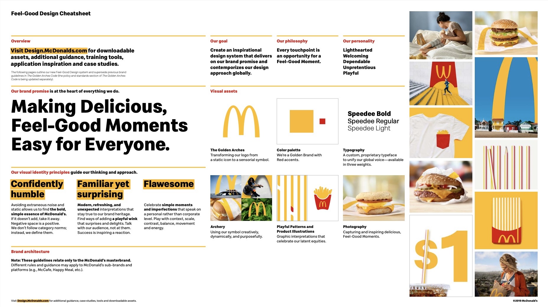
McDonald’s calls their brand guidelines “Feel-Good Design Cheatsheets”. The document has a lot of details, remaining compact at the same time. The brand emphasizes its commitment to quality and consistency. The guide includes detailed instructions on the use of logo a.k.a. “the golden arches”, color schemes, typography, and photography.
The highlight of this guide, for us, was the “Archery Cheatsheet” on the use of the iconic golden arches, which spurs a flow of ideas on how you could implement them in creative campaigns. After seeing their style guidelines, you understand how MacDonald’s managed to build a globally-successful, familiar, and trusted brand.
McDonald’s is a great example of a brand using emotional lifestyle photography in their communications. What’s awesome, no one will stop you from using high-quality photography for your own branding! Explore a huge variety of licensed files at Depositphotos, or jump straight to 600+ curated collections if you’re looking for something specific.
Stan’s Grill
Stan’s Grill’s brand guidelines focus on creating a bold and exciting brand presence. The guide includes a lot, but in a cohesive way: instructions on logo variations, color palettes with a major shade being a specific Flaming Red, typography rules, cute character illustrations, tone of voice, artistic direction, and real-life application. All working wonders for the brand, conveying the friendly atmosphere of the grill. 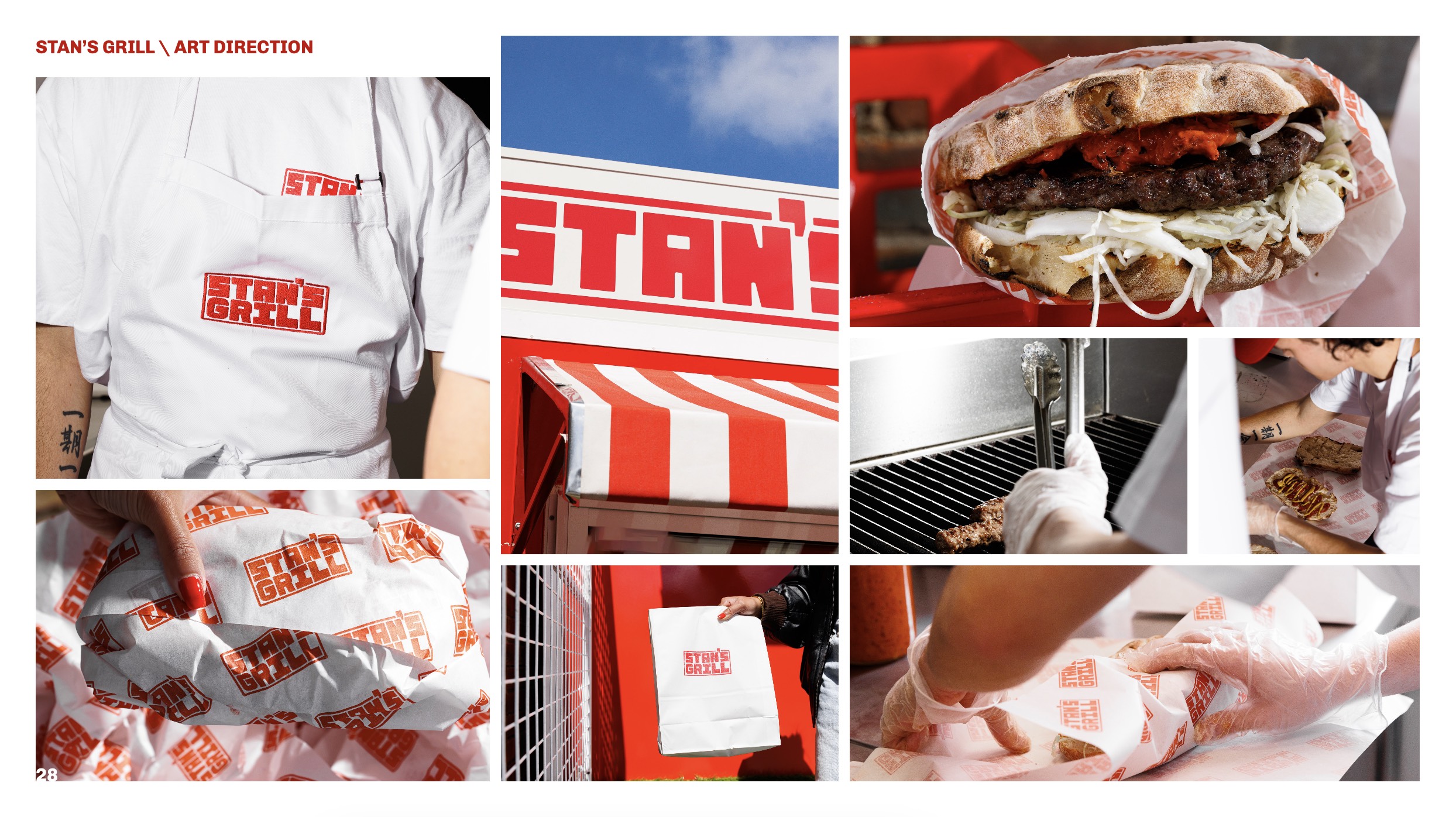
Netflix
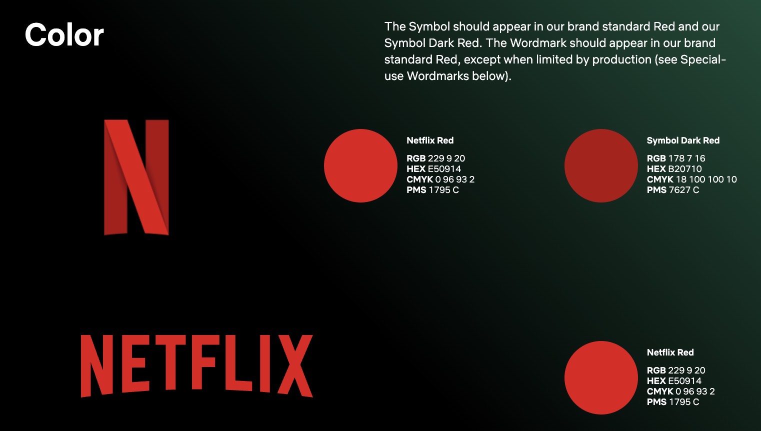
Netflix’s brand guide requires you to actually work at Netflix to access the detailed rules of the world’s most popular streaming service. What we can access is their high-level logo, color, readability, and co-branding principles, which sometimes is completely enough if you’re providing a very specific service. Netflix’s innovative and dynamic personality can’t be denied, and they make sure it’s also highly consistent across all communication channels:
In high-awareness markets, we lead with the N Symbol. There is power in owning a letter of the alphabet: it’s universal and instantly identifiable as shorthand for our brand. However, without Netflix Red, the N Symbol might not read as Netflix, which is why it always appears in its signature color.
Discord
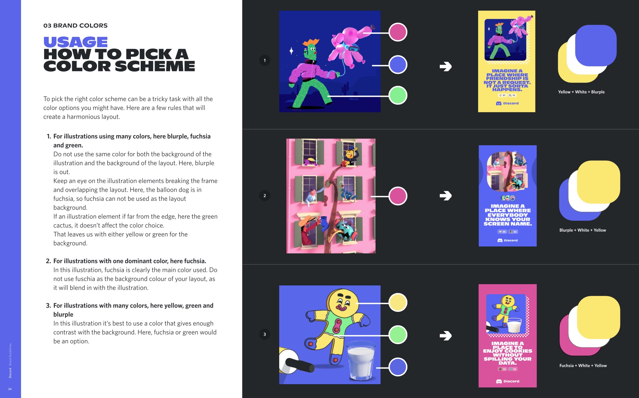
Discord’s style guidelines focus on maintaining a recognizable and engaging brand. The guide aims at building a product that is inclusive, generous, and available to everyone. The style guide includes regular rules on logos, color combinations (their key brand color is called Blurple, if you’re wondering), tagline, typography, brand in use, and asset library, helping to create a cohesive and recognizable brand identity. Discord’s tone is easy-going and friendly, which perfectly suits the brand’s philosophy:
Discord is a million things. And that’s okay! Just like our users, we cannot be put in a box. Discord is what you bring to it. It’s like a potluck, online, but not a meal. And you share it with friends, but also some friends of friends you just met, and you’re like “she’s cool”.
Coca-Cola
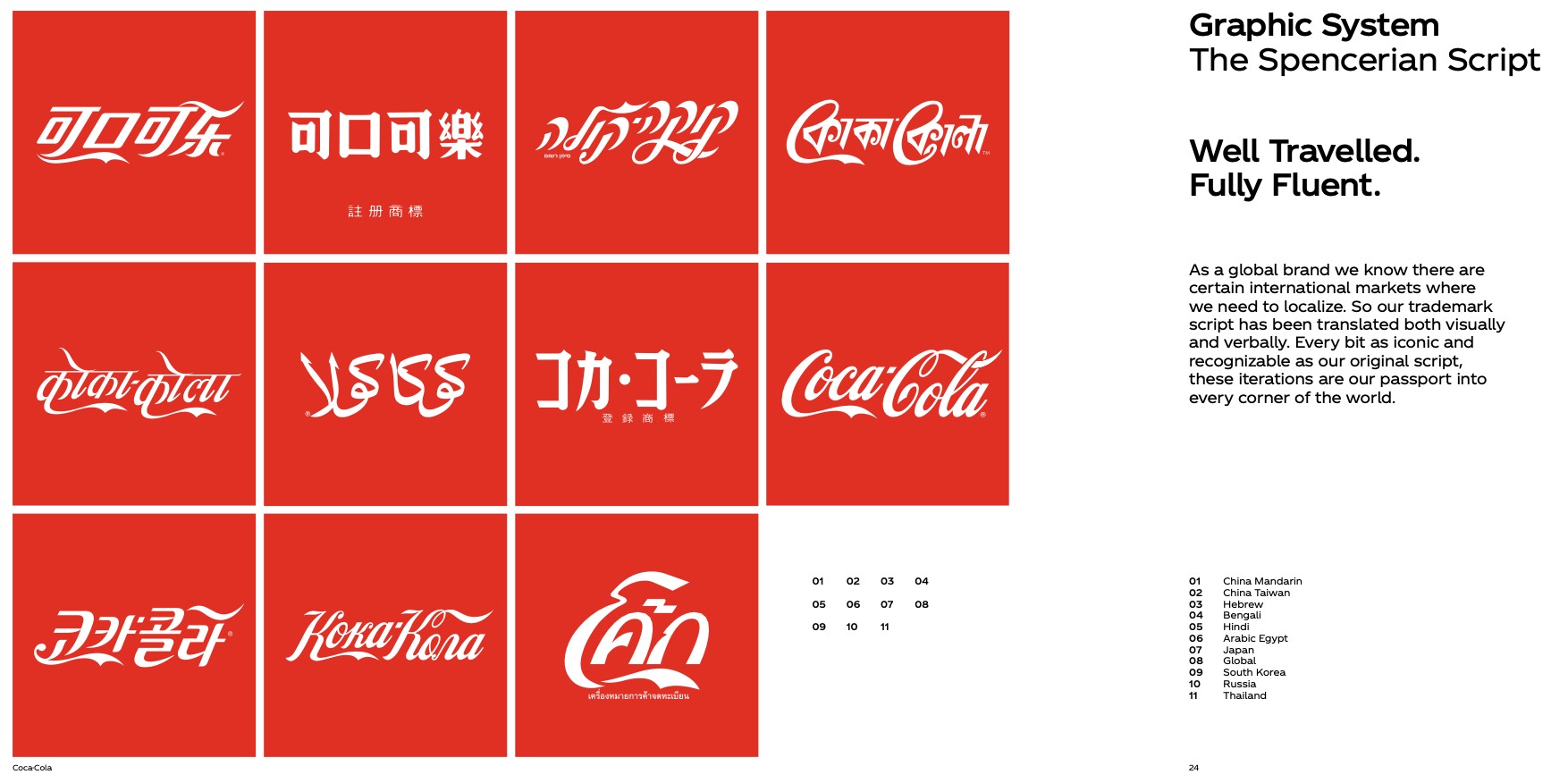
“Meet the next level of deliciousness,” Coca-Cola states in their brand guidelines from the get-go. If there is a perfect example of brand consistency through the years of its existence, it’s Coca-Cola. Their guide is designed to maintain the brand’s iconic status and includes Cola’s key design principles, graphic elements, impactful typography, color palette, icons, and more branding details.
What speaks of Cola’s ultimate success for us—their Dynamic Ribbon, which you can immediately picture without even seeing the logo or the actual bottle of Coke.
Final words
A well-crafted brand style guide is an invaluable tool for maintaining a consistent and recognizable brand presence. Let’s recall the guidelines of the best players in business. Why are they so good? The key recipe for success is usually in the following steps:
- understand your brand
- keep it simple
- use visual examples
- be consistent
- make it accessible
- update your guide as your brand evolves
By clearly defining the visual and communicative elements of your brand, you can ensure that all related materials align with your values. Follow our tips and build a comprehensive guide that helps your brand stand out and connect with your audience.
Stay tuned for more delicious insights on photography, marketing, and technology! 🙂
Read more about branding
How Strategic Color Choices Can Skyrocket Your Brand Identity
From Corporate to Geographic: 6 Types of Branding to Empower Any Business
Brand Consistency Across Platforms: What It Is and Why It’s Important


![Your Guide Integrating Audio Into Brand Communication [Infographic]](https://depositphotos-blog.s3.eu-west-1.amazonaws.com/uploads/2020/11/A-Guide-Integrating-Audio-Into-Brand-Communication-Infographic.png)
