Summer Color Trends 2024: Curated Image Collections, Palettes, and Mockups
New season—new color trends! Summer is perfect for experimenting and introducing new colors into your visual communications. With our carefully curated collections of images, it’s easy as pie.
Discover Summer Color Trends Collection
Four colors to inspire your designs this summer
Summer is here, and it’s bringing us a dynamic mix of shades, evoking a warm feeling of nostalgia. We’re stepping into the season with a relaxed vibe that encourages your audience to be authentic, appreciate nature, and create meaningful connections, whether with brands or each other.
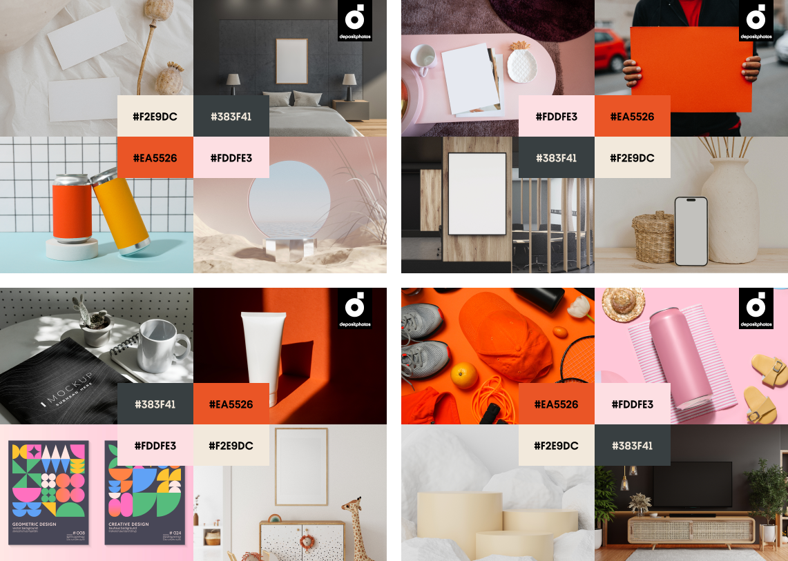
Welcome the four main colors of the hottest months: Sand Castle, Summer Rain, Fire Flame, and Pearlescence. Incorporate these trendy colors into your brand palette to join the global design conversation. Create your own visual narratives using our curated collection of licensed images.
The key aesthetic trends pervasively remain #cottagecore, #old money, and #gorpcore. This means we will continue seeing many pearls, lacy dresses, iconic Ralph Lauren polos, and cargo pants in fashion photography and on the streets. We can already see how these trends influence color choices when it comes to both offline design and digital creative projects.
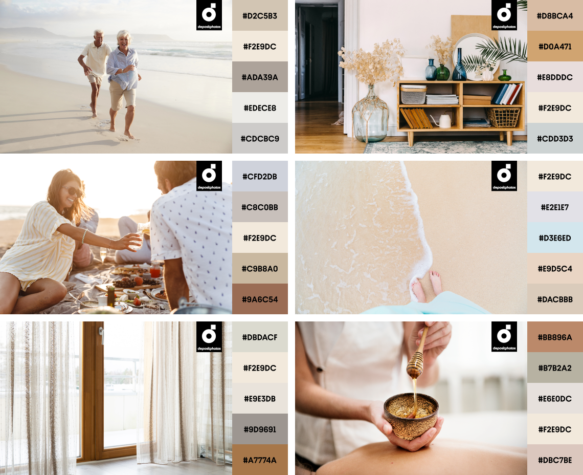
Sand Castle
#F2E9DC
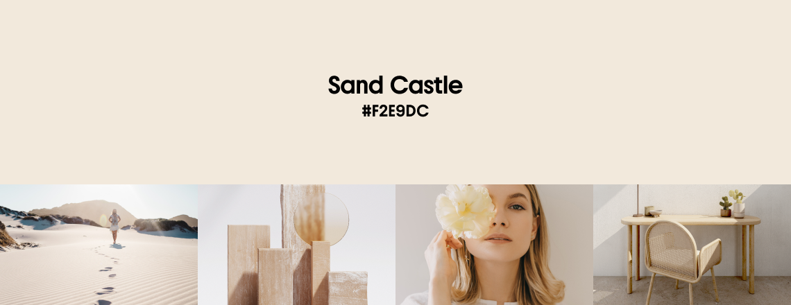
Sand Castle or greige is the first prominent color of this summer. The color of dry sand and linen, it is a timeless shade born from blending gray with beige. It can be seen in multiple visual representations—from nature to clothes and interiors. Sand Castle is a go-to for both a classic look and if you want to support the #cottagecore trend. Use it to convey minimalism, nobility, and purity.
Don’t be afraid to use this color in big amounts, as it’s not overwhelming and goes well with many shades, including blues, greens, pinks, reds, oranges, and browns. When designing for digital, remember that the devil is in the details, and accents will help you build a certain character along with neutrals. We love Sand Castle for its versatility and timeless appeal, and now it’s your turn to experiment with it in your visual content.
Explore Sand Castle Collection
Sand Castle is best paired with complementary blues and purples or matching browns to achieve a balanced, minimal look.
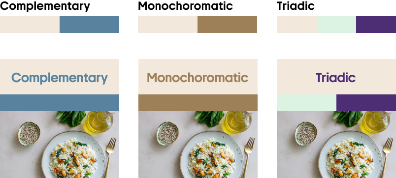
Combine Sand Castle with other neutrals to communicate warmth, realism, and nostalgia.
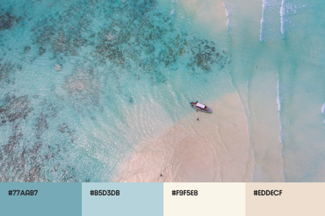
Summer Rain
#383F41
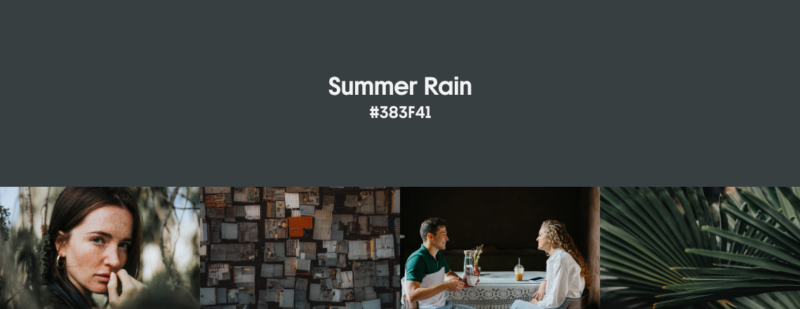
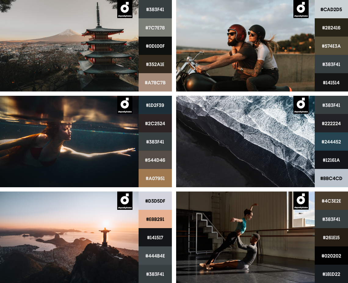
Summer Rain is a dark gray that’s on the verge of being blue. Imagine asphalt after rain, which looks cold but is, in fact, still warm from the summer heat. The color of stone, metal, and charcoal—this shade is elegant and grounding at the same time. Summer Rain represents dignity and strength, and is the perfect color to express a serious attitude.
You can notice Summer Rain a lot in the fashion industry, especially driven by the recent #old money trend—with suits, jackets and coats being frequently made of a dark gray fabric. It’s also relevant for interiors since Summer Rain is an all-time favorite when it comes to refined, contemporary aesthetics. This shade is also great-looking on screens, helping images build depth and brands look professional. With such a significant representation on catwalks and in our homes, it’s no wonder we have this almost noir color in our summer palette. Pair it with contrasting, lighter shades such as whites, pastels, and metallics to achieve a balanced look.
Explore Summer Rain Collection
Pair Summer Rain with vivid oranges, yellows, and pinks, or add a muted blue to keep your design on the cooler side.
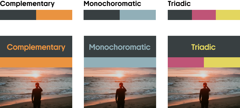
Use Summer Rain in combination with neutrals, browns, and lighter blues to add depth and contrast to your designs.
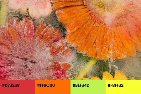
Fire Flame
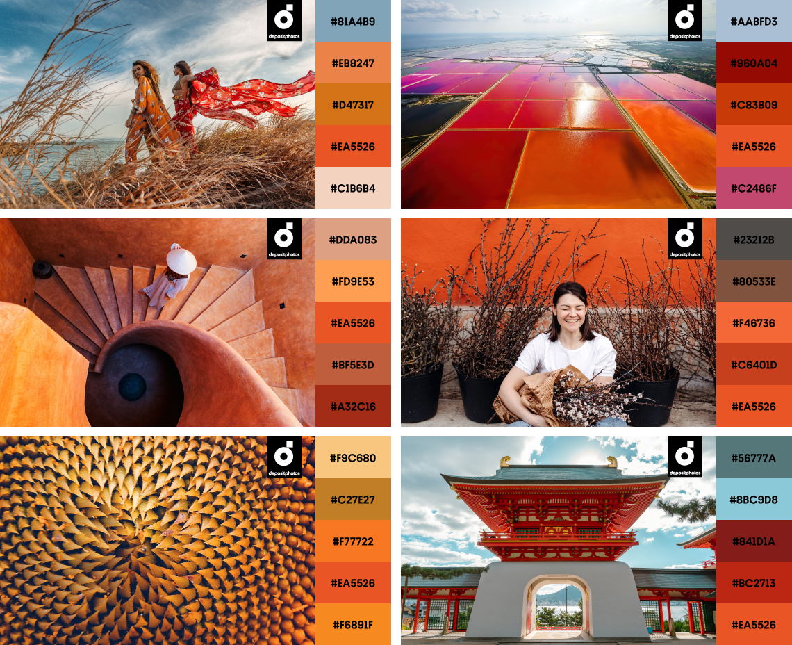
#EA5526
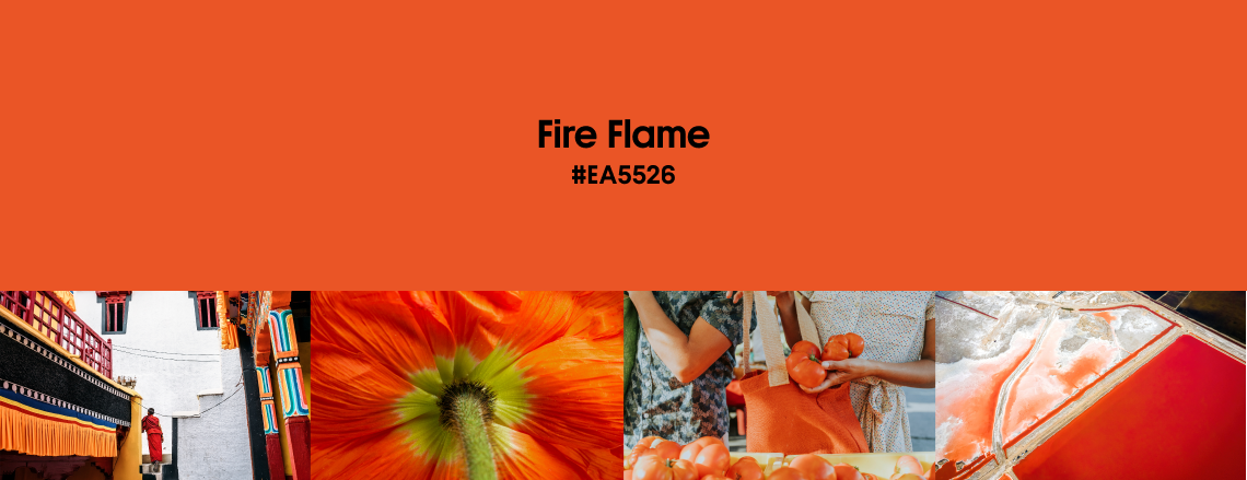
The most summery color in this year’s palette—Fire Flame. It is a bright orange bordering with red and slightly tilting toward brown. This vivid color is reminiscent of sunsets, fire, and citrus fruits. It won’t leave viewers indifferent, quickly drawing attention and evoking feelings of warmth and excitement. Fire Flame is a go-to shade for brands that want to make a statement.
This bright shade is incredibly versatile! But since it’s so saturated, you’ll often notice this color being used as an accent rather than a primary color. When it comes to fashion and interiors, Fire Flame can be seen in furniture textiles, art pieces, and accessories because it perfectly adds that necessary pop of color to an otherwise dull look. On the web, you can often see this orange shade in logos, call-to-action buttons, and other design elements that must catch your eye. If you want to create a visually striking effect, combine Fire Flame with contrasting blues and greens or blend it with yellows and reds. For a softer look, choose neutrals like white, beige, or gray for a backdrop, and add a pop of Fire Flame to highlight important parts of your design.
Match Fire Flame with cooler tones for contrast, or use it along with neutrals and pinks for a pop of color.
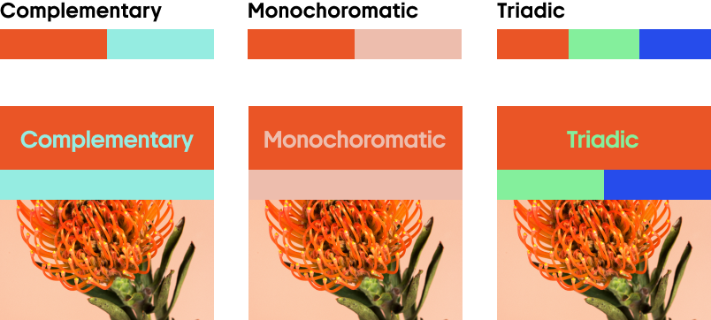
Fire Flame is a saturated color, so it’s great to balance it with browns and blues for a natural look.
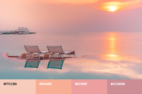
Pearlescence
#FDDFE3
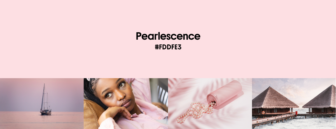
Pearlescence, or light pink, is the last key color trend of summer 2024. This delicate hue reminds us of early sunrises, blooming flowers, and shimmering pearls. It’s romantic and charming, making us feel warm and calm. When used smartly, Pearlescence brings a sense of elegance, sophistication, and modernity to your designs. It can often be seen in interior design and fashion, but especially in the beauty and wellness industries. In recent years, pearls have made a solid comeback to our wardrobes. Being featured in both male and female fashion collections, they are a timeless unisex piece of jewelry.
Pearlescence can be used for logo design and as part of your brand color palette. Be careful, though. This color is great for accents, but it can also add a touch of childishness if overused. If you don’t want that effect, avoid using Pearlescence for backgrounds and other elements that take up lots of visual space. It works perfectly with other pastels and neutrals or contrasting dark colors. Either way, this gentle shade can add balance to a complex composition.
Explore Pearlescence Collection
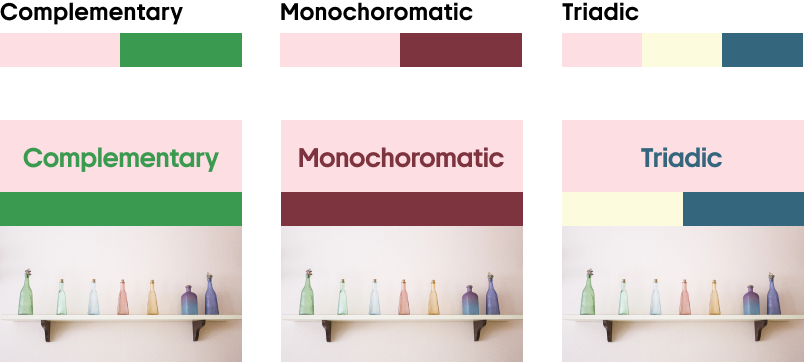
Combine Pearlescence with complementary greens and blues, or add dimension with a touch of burgundy.
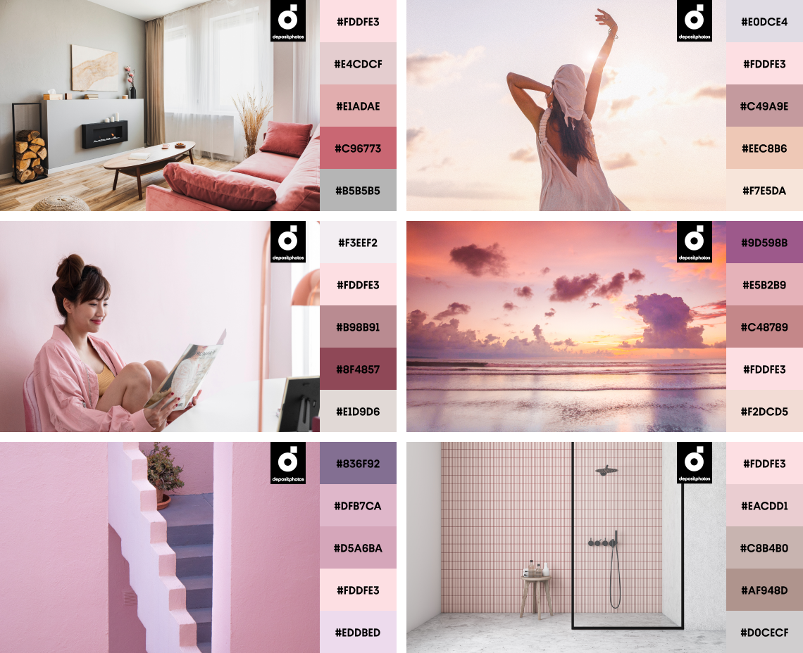
Paired with other pastels and neutrals, Pearlescence brings a dreamy look to your designs while helping darker tones stand out.
Stay on trend with this color toolkit: vectors and mockups ready for your designs
Want to integrate trendy summer colors into your own projects? We at Depositphotos always aim to simplify the creative process and save your precious time, so our team carefully selected vectors and mockups for this curated collection.
Check out dozens of visuals that are ready to use, or can be easily edited to meet your unique needs. Use images in trendy summer colors to design a new website, plan a rebranding, or create campaign materials.
Let’s sum up
Compared to last year’s summer color trends, we’re heading towards a minimalistic palette this year. This makes us rethink the whole concept of ‘summer colors’ as we’re used to thinking of them. When it comes to contemporary design, it seems that the focus has shifted from neons to more grounded, timeless color choices.
With muted Sand Castle and dark Summer Rain in our 2024 summer palette, who knows what to expect in 2025. We can only guess now, but meanwhile, let’s enjoy the warmth of the upcoming season and use the latest colors to express our creative visions.
Discover Summer Color Trends Collection
Related articles
7 Creative Design Trends in 2024
Color-Blocking: How to Mix and Match Bold Colors Like a Pro
How Strategic Color Choices Can Skyrocket Your Brand Identity
