Your Advanced Web Design Guide: Definitions, Examples, & Best Practices
What is web design for businesses? It’s a way to deliver exceptional user experience, boost sales, and enhance overall brand awareness, even if these practices may seem unrelated. After all, visual appeal and website structure influence consumer behavior and first impressions.
If you wish to attract more clients and boost your business through strong website designs, look no further! Dive in to explore best practices, main rules, fascinating examples, and the newest trends.
What is web design?
Web design is a practical discipline that revolves around shaping a website’s visual identity. This includes selecting harmonious color schemes, fonts, images, icons, and more. From font style to icon size, every detail matters when it comes to how users interact with your website. That’s why it isn’t only concerned with aesthetics; it also has a strong focus on user-friendly approaches.
The definition of web design has evolved over time. In the early 1990s, during the dawn of the internet, websites had relatively simple designs. They mainly consisted of static elements and basic text and graphics. Back then, designers aimed to create projects that looked good on low-resolution monitors. Fast forward to the early 2000s—digital design became more sophisticated thanks to the introduction of video and Flash technologies. Today, it involves creating projects that can adapt well to various devices, from large computer screens to small ones for smartphones.
Why should you invest in appealing web design?
1. First impression
According to recent studies, it takes only 50 milliseconds to form an initial impression of a website. This directly impacts whether a user will continue browsing the site or choose to leave. From a business point of view, a lower exit rate increases the likelihood of becoming familiar with your brand and making a purchase. So, what is web page design’s role in this process? Think of it as akin to meeting a new person, where you tend to notice their appearance first. Besides, ResearchGate reports that 94% of business first impressions are based on its web design. Since a significant aspect of appeal revolves around visual elements, it can have a profound effect on people’s emotions, beliefs, and intentions.
2. Web search optimization
When it comes to SEO, businesses strive to rank at the top to attract more users to their websites. Nonetheless, it’s impossible to achieve without a well-planned web designing approach. For example, if your pages are overloaded with heavy files, it will result in a slow loading speed. Based on Think with Google, 53% of users will leave a website if it takes longer than 3 seconds to load. SEO performance is also affected by readability and accessibility across various devices. Imagine a user visiting a site on their smartphone, only to find content that’s too small for them to read—they are highly likely to abandon the website.
3. Great user experience
One of the key basics is functionality; a well-structured website serves as a guide, gently leading users toward their intended goals. According to data gathered by Toptal, 88% of consumers will be discouraged from returning to a website if they have a poor interaction experience. A functional website consistently offers guidance and interacts with users. It can inform them about the number of steps left to complete a purchase and draw their attention to important details using visual cues.
4. Brand consistency
One web design objective is brand recognition establishment. This can be achieved through maintaining a consistent and coherent style, meaning incorporating a unique corporate identity. During project development, elements such as logos, color schemes, and fonts are carefully chosen. All of these components work together to create a unified image, making it easy for the audience to remember the brand and differentiate it from countless others. Consequently, this boosts brand loyalty.
5. Increased conversion rates
While marketers are primarily responsible for conversion rates, web designers also contribute to this process. Based on Forrester research, Forbes asserts that a well-designed website can increase conversion rates by up to 200%. Visual elements, like colors, shapes, and object placement, have the power to influence user behavior. For example, positioning a red CTA button on a light background makes it more likely for users to notice and click it. A well-crafted website also incorporates visual cues that naturally guide a user’s attention toward key elements. Furthermore, web design is pivotal for effective navigation. When this aspect of your site is well-thought-out, it becomes much easier for users to locate and absorb the information they need.
What is web design and web development?
Web design and web development can be easily confused since these processes are interlinked. Nonetheless, they are not interchangeable, they just complement each other.
Web designers are responsible for overall website structure, including visual appeal and customer journey. They generate concepts and craft user interfaces. In comparison, web development is about the technical side. Coders take mockups and employ markup and programming languages to transform it into a functional webpage, essentially bringing the website to life.
To make things even more clear, let’s delve into the website development process. It begins with designers creating a prototype, which serves as an interactive draft showcasing how the main elements will be positioned on the page. Once approved, a full version is designed. Subsequently, front-end developers step in, responsible for translating the designers’ layouts into a functional web page using code. Afterward, the focus shifts to back-end development, which manages user interactions with internal data. At this stage, server logic is meticulously planned, and databases are integrated.
What are the most powerful web design examples?
Apple
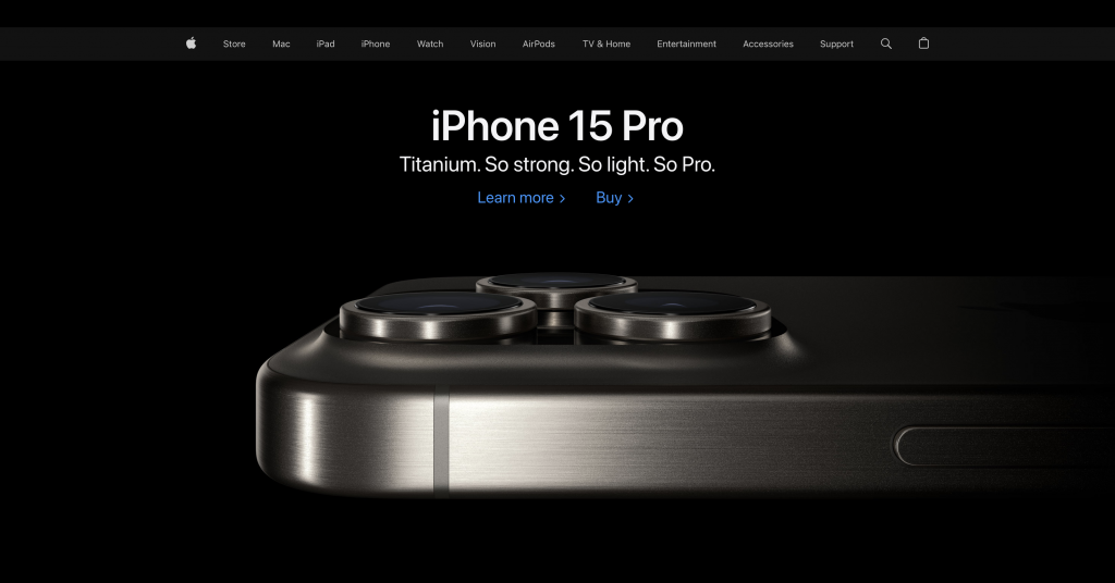
As one of the most recognizable global brands, Apple holds substantial influence not only in the tech world, but also in shaping web design trends. Since its inception, the company’s website has continuously evolved to mirror the ever-changing preferences of users.
When examining the current version of the website, you can immediately notice its absolute minimalism. The interface avoids unnecessary details and focuses on incredibly high-quality graphics and essential functional elements. To achieve the utmost simplicity, Apple’s designers have embraced the concept of negative space. The main page typically showcases a large image of their latest product, a slogan, and a few links to articles. This avoids overwhelming users with information and encourages them to explore products. Apple also maintains brand consistency. Their website features recognizable fonts, minimalistic icons, and product images displayed from various angles.
Spotify
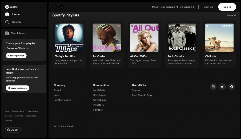
Spotify’s slogan, “Music for Everyone,” is greatly reflected in its web design. The streaming service was created to help users dive into their favorite tracks and discover new ones. To tailor the user experience, Spotify analyzes musical preferences and customizes its playlists for each individual listener. Moreover, the homepage includes sections like “New Releases” and “Top Charts,” making it a breeze to explore new music.
In terms of aesthetics, Spotify chooses simple and minimalist solutions. The website predominantly utilizes a dark color palette, with vibrant contrasts introduced by elements in shades of red, purple, and orange. Furthermore, this music platform consistently rethinks web design meaning. The brand has even shared its principles, which are continuously evolving.
Nike
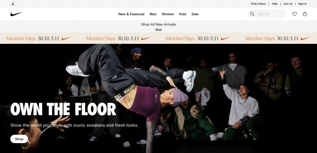
Nike’s online store places a strong emphasis on user-friendliness. When you navigate the sneakers category, you’ll find filters adapted to various needs, such as training, lifestyle, walking, golf, and more. When you visit a product card, you’ll encounter high-quality images of products from various angles.
The online store’s interface is designed with a black-and-white color palette, dominated by light shades. This allows users to fully concentrate on the shopping process without distractions from unnecessary elements. Another distinctive brand feature is its high-quality storytelling narratives. In its marketing materials, Nike frequently features athletes and their accomplishments, which deeply resonates with the brand’s philosophy.
What are the elements of a good web design?
Designing for the web requires harmoniously combining both visual appeal and functionality. When a website looks good but doesn’t offer the information or assistance that its audience seeks, aesthetics alone can’t make up for the lack of functionality, and vice versa. As a result, web design encompasses two crucial aspects: visual aesthetics and functionality, both playing equally important roles in making your website stand out.
Visual elements of web design
- Fonts. Different typefaces and text styles influence overall visual perception since they can enhance readability, improve user experience, and contribute to a brand’s visual identity.
Colors. When combined properly, different shades can convey information, create aesthetics, and influence user perceptions. - Layouts. They determine how content is structured and presented to users. By accurately arranging graphics, designers can achieve great overall aesthetics and functionality.
- Icons. These small graphic symbols can represent information, actions, and concepts in an easily understandable way. Since icons are recognizable on a subconscious level, they’re a great way to simplify website navigation.
- Logos. If there is one element that can showcase a whole brand, it’s a logo. Each logo is unique, delivering a company’s mission and affecting visual identity and recognition.
- Content. Textual, visual, and multimedia components are utilized to convey necessary information, engage users, and communicate messages.
Functional elements of web design
- Navigation. Good navigation is essential for a positive user experience, as it guides visitors to the information they seek and allows for interaction with web pages.
- User interaction. This can include clicking, scrolling, filling in a form, etc, implying the ways in which visitors can respond to a website’s content, features, and functionality.
- Speed. When building websites, you need to stay focused on opting for graphic elements that do not overload web pages to achieve higher loading speed.
- Structure. Good web design includes creating a clear and logical information hierarchy throughout a website to organize content properly.
- Responsiveness. Your website needs to be able to automatically adapt for various devices and screen sizes to achieve a better interaction experience.
What are the main principles of good web design?
Every designer establishes their own working principles. Yet, there are some fundamental principles of good web design. According to Don Norman, a researcher, designer and usability engineering expert, there are six of such pillars outlined in his book “The Design of Everyday Things.”
- Visibility. When developing a project, designers should ensure that the most important elements on a page are easily visible. For example, if you want users to fill out a form, the call to action for it should be prominently displayed. You can also create a button that, upon clicking, automatically takes a visitor to the relevant section.
- Feedback. As users interact with your website, it’s important for them to receive continuous feedback from the system. For example, when a customer completes an order, you can include an additional page to confirm the action.
- Constraints. To prevent users from having a frustrating experience, it’s necessary to introduce certain restrictions. For example, you can design a button that leads to the next step in a form submission, but keeps it inactive until all required fields are properly filled.
- Mapping. This design principle emphasizes that the relationships between various elements of the system should be clear and easily understandable. For example, if your text states that a link will take users to a specific product page, it should indeed lead to that page. If the user ends up on an FAQ page, it would create confusion.
- Consistency. This principle is about maintaining a uniform style throughout the design system. For example, if you format product cards in a specific way, it should be consistent for all elements.
- Affordance. According to this principle, designers should create interfaces that make it evident to users what action is required to achieve a specific result. For example, when designing buttons for your website, they should visually indicate that they can be clicked.
What are the main trends for web design in 2024?
1. Microinteractions
Microinteractions are subtle, small-scale moments where users and interfaces communicate with each other. With the growing popularity of mobile and smart devices, microinteractions play a crucial role in enhancing the intuitiveness and user-friendliness of tech products. A straightforward example of microinteractions is Google—when you type in a search query, the search bar automatically suggests possible options. This way, the system offers feedback to the user and facilitates the discovery of relevant information much more quickly.
2. Content-first designs
Historically, design frequently began with frameworks, layouts, and color schemes. Content was considered a secondary element, frequently squeezed into predefined spaces. However, this approach often resulted in a disjointed user experience where content seemed contrived or detached from the design.
Content-first design reverses this situation. It places content strategy and creation at the forefront of the design process, allowing interfaces to evolve around the storytelling, information, and messages. For example, Meta designs are centered around adapting the interface to the content that users consume—Facebook’s News Feed, Instagram’s Explore Page, and WhatsApp’s Status features.
3. Dark mode
It’s been widely known that bright colors on a screen can have a negative impact on human vision. Moreover, they can significantly increase a device’s energy consumption. As modern design prioritizes user comfort, dark mode has become more relevant than ever.
In its user interface recommendations, Apple states, “Dark mode delivers greater perceptual contrast, making foreground content stand out against darker backgrounds.” Many well-known brands have already created alternative versions of their platforms using a dark color palette, including Instagram, Microsoft, Meta, Twitter, Netflix, Amazon, Spotify, YouTube, Reddit, and much more.
Wrapping up
Without a well-planned and visually appealing web design, you might be putting your business at risk of losing traffic, potential customers, and brand recognition. Global companies like Apple, Nike, and Spotify have demonstrated that web design is a vital element for any business. Hopefully this article shed some light on what web design is and how you can use it effectively. It is a complex system, but the goal of a skilled professional is to piece together various elements, such as content, visuals, navigation, and more into a cohesive and unified composition.
FAQs
What do web designers do?
Web designers conceptualize, create, and manage visual aspects of websites. Their role involves planning, ideation, and the construction of web pages that incorporate various visual elements, such as text, images, graphics, and videos. Web designers are responsible for building customer journey maps and ensuring great user experience. Prior to crafting designs, creative minds engage in discussions with clients and stakeholders to gain a clear understanding of a website’s objectives and requirements. They then proceed to design websites and layouts that present a company in a favorable light to its target audience.
What is the first step in the web design process?
The first step in a web designer’s work is information gathering. Since every business has its unique objectives and target audience, data collection and processing allow creators to build solutions that meet a company’s needs and requirements. The easiest way to collect necessary information is through project briefs or online interviews with a clear set of questions.
What is UI and UX in web design?
User interface (UI) and User experience (UX) are two closely related aspects of web design. UI is all about visual attractiveness, achieved through the right blend of colors, fonts, and graphics. Meanwhile, UX is all about the experience users have when they interact with your website, emphasizing convenience and a well-structured system.
What software is required for web design?
Designers rely on a range of software for their work. For example, to create prototypes and website layouts, Figma or Sketch are commonly used. For image editing, designers often turn to Adobe Photoshop or GIMP. If a designer is closely collaborating with developers, they might consider using Zeplin, which greatly simplifies communication between teams.
What is visual hierarchy in web design?
Visual hierarchy is a key principle that is based on arranging elements to convey their relative importance. Designers manipulate visual attributes, like text size, to make information easily understandable for users. Through logical and intentional element placement, designers influence how users perceive information and guide them toward specific actions.
Other articles you might find interesting
What is Digital Design? A Comprehensive Guide on its Types, Tools, and Best Practices
Details Matter: How Microinteractions Enhance Interfaces & User Experience
The 9 Most Popular Types of Websites to Make [+Examples]
