How to Win Over Your Clients with Visual Content

When you choose a photograph to compliment your content, you are making important design decisions. The visuals that you choose to support your website, blog or other advertising material will determine which of your clients will stay, and which will go. With so much pressure on you as a curator (you are dealing with an art form after all), how should you go about selecting your visuals? This article will help you get a clear overview of how customer psychology works and how you can improve your visuals and stay ahead of your competition.
A few visual content marketing statistics
– Content with relevant images gest 94% more views than content without relevant images. (Source)
– 46% of marketers say photography is critical to their current marketing and storytelling strategies. (Source)
– 65% of senior marketing executives believe that visual assets (photos, video, illustrations and infographics) are core to how their brand story is communicated. (Source)
Much like the content on your website is an investment, so are visuals. Quality should always be a priority. Aside from quality, good taste is one of the determinants of whether your business succeeds or not. Customer engagement is guaranteed if your business reflects good aesthetics. Here’s how you should go about it:
1. First impressions
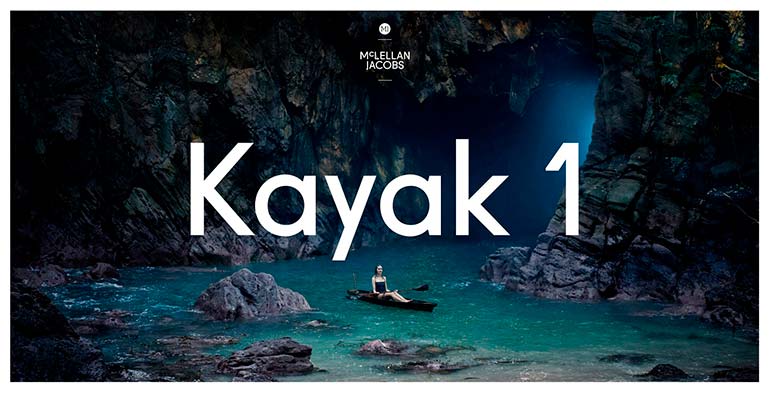
If you are choosing visuals for your website, take extra time to find images or videos for your homepage. This is the face of your company, and the single photograph (or video) that is going to resonate with your clients. Give you clients a chance to learn something from your landing pages, based on images alone. Think about what your company represents, what it stands for and the main message you want to communicate.
Stunning visuals will make clients stop and think. A great visual is one that evokes some emotion from your clients be it awe, admiration or excitement. What will help you make this special connection between the buyer and the brand is professional photography. Professional photography differentiates from amature photograph in lighting, composition and quality. If you’re unsure about a certain visual, chances are your customers will feel the same way.
If you make it a point to make a good first impression, you will undoubtedly be rewarded with visitors that linger longer on your page and you will begin to see reduced bounce rates.

2. Establishing trust
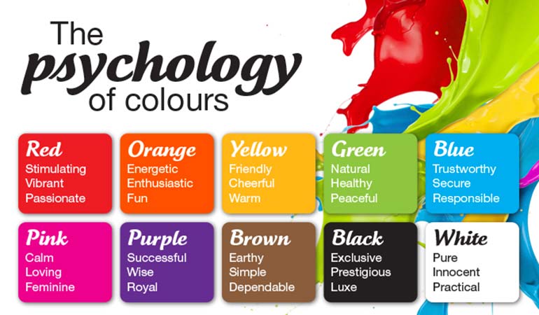
Regardless of the nature of your business, one of your priorities is to establish trust with your clients. Here is where visuals come into play. Visitors should be able to see a unity in your brand through your choice of visuals. This means picking a style and being consistent with the quality and the message of your brand. How do you go about establishing trust through visuals? One of the secrets is the color palette that you choose. The psychology of color on customers is subject that should be studied inside and out. Your color scheme alone is capable of communicating to your customers that you are a trustworthy brand.
Similarly, other messages are communicated through color schemes. For instance, blue reinforces trust and dependability, red communicates energy and excitement. You can read up more about this and expand on the topic with this infographic on color psychology in film. Generally, choose your colors wisely:

3. Consistency in style
If you choose the right visuals, your photographs will set the mood. If you choose to include people in your images, make sure their emotions are sincere and the pictures are relatable. With time, you will be able to choose images that go well together because you will begin to see patterns and edge closer to establishing a personal style in your choice of visuals.
Even if you’re not a photographer, understanding the basics of photography that determine good style is essential. Here’s a great resource to familiarize yourself with elements and principles of design and what makes for a great photograph.


4. Choose images that communicate without words
Often times, people opt for images that are literal representations of some of the key words or concepts in the content. This is one of the ways to go about it but it’s not necessarily the best. As people read your content, giving them obvious visuals isn’t going to enhance their understanding of your content. This is why you should use your visuals to further emphasize some key points. Choose clever images that will speak to your clients in more ways than one.
In the following example, the brand SCR chose a mood setting image to further emphasize on the atmosphere their product evokes. They didn’t just choose coffee, they chose an image where one is surrounded by all things that are comforting and it certainly won’t be complete without a mug of coffee.

5. Learn from your competition
It isn’t an uncommon practice to observe how your competitors are approaching visual content marketing. If anything, this is a great way to learn how to improve your own visual content. Study your competitors, learn from their successes and mistakes and find a way to make your visuals stand out based on your research.
If you’re on the lookout for some inspiration, take a look at Blacknegative and Humans of New York. Both websites showcase excellent aesthetics and visual design. Study how photography and design is used in these websites. When quality content meets good aesthetics and excellent supporting images, you are guaranteed to hook your clients. Be attentive to how you use your visuals and give your clients a reason to stay on your website or blog for longer.
Are you ready to enhance your content and win over clients? Start by surfing through the Depositphotos database where you will find an abundance of high quality, professional and relevant images for your projects.
![Content Marketing Guide for 2020 and Beyond [Infographic]](https://depositphotos-blog.s3.eu-west-1.amazonaws.com/uploads/2020/08/Content-Marketing-Guide-for-2020-and-Beyond-Infographic.jpg)


